
Contrast Tutorial
Introduction: This is a simple tutorial that introduces some interesting techniques that will help you modify an image to improve contrast. All these techniques utilize the concept of contrast. Contrast can mean many different things. In photographic terms, we think of high or low contrast as the comparison between light and dark areas of an image. In design terms we think of contrast as how a subject or message stands out from the other elements of an image. In this tutorial, the objective is to blend both these concepts by taking a typical photo using photographic contrast to make seletions and then enhancing the contrast so that the subject stands out and in doing so we clairify our message as to what we want the viewer to see.
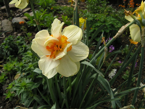
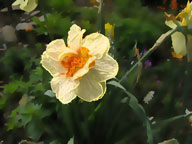
Start by downloading this image: Click here to download: daffodil.jpg
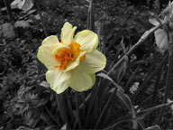
Before>After
|
|
1. Open the daffodil.jpg. I took this image in my garden..it's typical of the close-ups we all take that have a strong subject but include too much background. OK let's have some fun with it.
2. For all these techniques we'll need to isolate the central bloom by selecting it. Of course you can use the selection tools and get a hand cramp while you navigate the edges of the bloom...this will certainly work. Here is another option that works expecially well when there is reasonable contrast between a subject and its background.
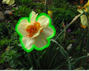
a. Go to Filter>Extract. A window will open with your image and a new set of tools. Select a brush size of 10-15 pixels and draw around the edge of the daffodil. Be sure to cover the edge of the daffodil and include a bit of the background. This is very important! (see below)
b. Once outlined, get the paint bucket and click inside the outline area. The
fill preserves the area. Now go to preview to see what you have selected. Wow!
OK will complete the process. Save this file as extract.
Note: There are lots of other features in the Extract Palette...you can add
or subract from selections. This is an especilly good technique for selecting
a people or animals with fine hair detail from a background..something that's
almost impossible with standard selection tools.
3. Now we're going to open both the extracted image and the originall daffodil image. On the extract image use the magic wand to select the background. It's transparent or white so you will see marching ants around the flower and border. With the marquee tool selected drag the selection over to the original image. So now you'll have the liquify selection marquee over the flower image. (see below)
4. This set-up is the basis for all the other techniques we'll apply. Make a snapshot of it so you can go back when necessary. Note: A selected area is the only area that will be effected by adjustments or filters. So depending on whether we want to modify the background or flower we can switch the selection by going to Select>Inverse.
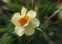
5. Now it's simply a matter of trying some different effects to improve the contrast of the flower from its background. As you try some of these techniques, save the file with a new name..you can then go back to your origianl snapshot and try something else. Here are a few ideas to try...after trying a few pick the best one and send to me for credit on this tutorial...perhaps you can use one of these technique on your projects.
 Filter>Blur>Radial
(background)
Filter>Blur>Radial
(background)
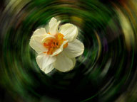
 :Filter>Stylize>Diffuse
 background
Image>Adjust>Desaturate
background
Image>Adjust>Desaturate
One of the great new features of Photoshop CS is the Filter Gallery..if you've got CS give it a try.
Send me your best flower! Have fun