Mixing Tints in Illustrator
Tints are ligher values of a color. When printing, a tint simply means that you apply less color on the paper so that more white, from the paper, shows through. The default swatches palette in Illustrator does have a few tints of the basic colors, but you may want more or tints of a new color you mix. Here's a simple technique for mixing a "set" of tints. This would be a good way of mixing colors for a monochormatic color palette or you can make tints to use as highlights for your analogous or complimentary palettes.
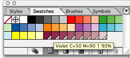
First create your starting color either by selecting an existing color in the swatches palette or mixing a starting color in the color plaette and dragging it into the swatches. It's best to start with a saturated color rather than a lighter value. This will give you a wider range of tints.


Note: The Spot vs. CMYK color issue can be confusing...especially if you're not familiar with commercial color printing. . (A process color is a color that's printed with the four colors CMYK, this is the "standard" for printing. It's called four color process printing. A spot color is a special color that cannot be mixed with the CMYK inks. If you include a spot color in an Illustrator project all the way to the end file output it would be printed on its own color plate on the printing press. An example of this would be a special logo color, metalic or flouresent. These are inks that are specially compounded.) Back to mixing tints...we used the spot color capability to easily mix a set of tints. If I used the spot tint colors I mixed to colorize my variations project and printed to my home printer they would automatically be converted to CMYK and come out looking fine. But, let's say I wanted to send my project to a commercial color printer, as is. Illustrator would create a series of "plates" or color separation files that would include the standard four colors (CMYK) plus a spot color plate for the spot color I used in my illustration. In this case you really don't need any spot color printing becasue you just used the spot colors to facilitate tint mixing. In most circumstances it also costs a lot more to print with a spot color.You would select each spot color in your palette (opens the swatch option palette) and convert back to a process color. Hope this helps with your tint color mixing! Have fun!
Shades-To add shadows to your illustration you can use darker tints or if necessary add a shade of a color. A shade can be mixed by simply adding a little black to the color. Note: A monochormatice color palette does not have shades becasue the addition of black would not be consistent with the definition of monochromatic (one color).