
BALANCE INTRODUCTION
The desire for equilibrium is a design principle, which can be compared to our own mental and physical sensibilities. We don’t like to be caught off balance. We likewise don’t like to see pictures that seem out of balance. This is a bodily felt sensation. In visual terms, imbalance is disturbing. At worst, it can produce vertigo. At best, it can attract attention or create tension. In the world of 3D art, balance is a physical fact with which artists have to grapple. In 2-dimensional art and design, the concept of balance is based on a different set of concepts. Heavy might mean a bright color, not something that weighs a lot.
In pictorial balance we imagine a centered vertical axis with some kind of equal visual weight on either side. This relationship is like a fulcrum on a seesaw, as in the following diagram. The smaller one at a greater distance from the fulcrum balances the larger square near the fulcrum. This type of balance works as well in real space, as pictorial space.
Balance is also considered vertically. A horizontal axis divides top and bottom. Our sense of gravity impels us to desire more weight toward the bottom than the top, for stability. Putting too much visual weight above this axis can create a top-heavy composition.
This does not mean that imbalance doesn’t have a place in art. It can create disquiet, uneasiness, and lead to a dynamic response.
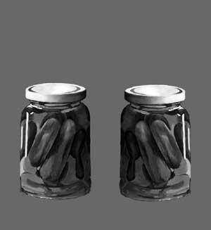
There are several different types of balance: symmetry; approximate symmetry; asymmetry; radial; and allover pattern or crystallographic. Symmetrical balance - identical shapes are repeated on either side of a central axis. The left side becomes a mirror image of the right side. This is also called formal balance.
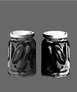
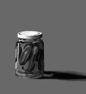
Approximate symmetry is when the design gives the appearance of symmetry, but actually departs from it a small amount.Asymmetrical balance - dissimilar objects have balanced visual weight. Also called informal balance, asymmetry appears casual, unplanned but is actually more complex than symmetry. Asymmetry can be based on value (contrasts of light and dark), shape and texture, position, eye direction, and color.
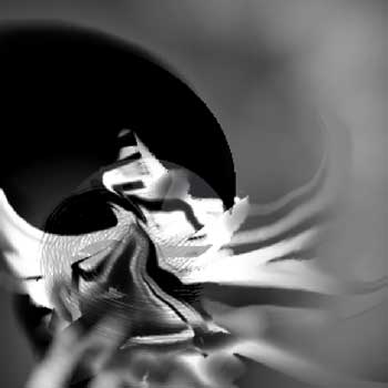
In asymmetrical balance, a smaller amount of black is needed to balance a larger amount of gray on a white ground. We prefer to look at color more than black and white, and a smaller bright color can balance a larger, duller one. Likewise, a smaller busy shape can balance a larger simpler one. A large smooth area is balanced by a small rough (more textured) shape. A large element placed closer to the center axis is balanced by a smaller one placed out toward the edge. This is balance by position and it can lead to unexpected dynamics on the picture plane. Perspective lines can lead the eye and move the viewer to a focal point. This planned directing of eye movement is useful for balance as well as compositional unity. Radial balance - all elements circle out from a common central point. This type of balance creates an obvious and immediate focal point.
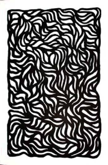
Crystallographic balance - another term is allover pattern, which simply means the same eye attraction everywhere, created by a repeating pattern, but not necessarily an exact repeat.

