EMPHASIS
What comprises a work of art? There are generally three aspects that make up a work of art: SUBJECT, FORM and CONTENT. The subject is the artist’s idea or source. It might be a figure or something less tangible, like sorrow. The form is the process that the artist uses to arrive at
making the object. Form also has another meaning when it refers to the physical embodiment of the work of art. For now, let’s think of it as COMPOSITION, or design. Content is the ultimate meaning of the art. It refers to its ability to communicate the artist’s intentions, and to hold enduring interest.
The emphasis of Design Fundamentals is composition. When artists produce a design or artwork, they use materials (media) and work with ELEMENTS: line, shape, value, texture, color, and space. In addition to using these elements, artists “plan” designs to be able to communicate. Artists use PRINCIPLES of design with knowledge of visual gestalt to purposefully arrange elements that convey their ideas. So what are these principle?
Most artists would agree that the most fundamental ones are Balance, Emphasis (also known as Dominance/Subordination), Movement, Rhythm, Proportion, and Economy. These principles are used within a balance scale of HARMONY and VARIETY to create UNITY.
EMPHASIS is another word for focal point. As with gestalt, the artist desires to control the attention of the viewer. Using this principle is a way of directing the viewer to more deeply examine a design. Emphasis uses three methods to direct this attention: Contrast, Placement, and Isolation.
Contrast is one method to create emphasis. The designer can use one or more elements to accomplish this. If a design is made up mainly of vertical lines, then one horizontal line will immediately attract attention. If a composition is comprised of mostly dark values, one very light value will stand out, etc. Designs can produce emphasis based upon the contrast of color, texture, and shape also.
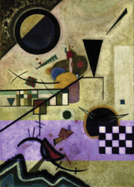
In the Kandinsky painting, the artist is using contrasting shapes, textures, and to a lesser extent, color to create multiple areas of emphasis.
Where do you first enter the painting?
What gestalt is the artist using to help direct our attention?
EMPHASIS by PLACEMENT
Another way to create emphasis is by the strategic placement of an element, or group of elements. The place that generally attracts the most attention is the center of the picture plane. This may not be the ideal choice for placing the most important element of the composition, because it is the most obvious location. A position near the perimeter can attract attention because of its association with the edge. This can lead the viewer to keep on traveling right out of the design if not carefully planned. An element positioned inside a doorway or rectangle, or at the end of lines leading the eye such as the perspective lines of a road or path, or lines radiating toward a center, are all methods to create emphasis by placement.
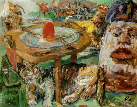
Kokoshka’s painting of “The Red Egg” reveals two dominant objects using emphasis by placement. The first is the red egg on the table with the forks pointing to it. The second area to attract attention is the face along the edge of the picture plane. Why does it not lead us out of the painting?
EMPHASIS by ISOLATION
Positioning an element away from others that are associated by a grouping calls attention to the element removed. This is called emphasis by isolation.
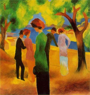
“Lady in a Green Jacket” by Macke reveals a figure in the foreground that appears isolated from the others in the group. Together with the larger scale, bright hue green, and centered placement, she becomes the focal point of the painting.
HIERARCHY
When a composition has more than one area of emphasis, the area that attracts the viewer’s attention most is said to be dominant, and subsequent areas are subordinate. This is another way of using a concept called Hierarchy. It is a lot like a performance where there is a lead actor plus a supporting cast. Areas of lessor interest are called accents.
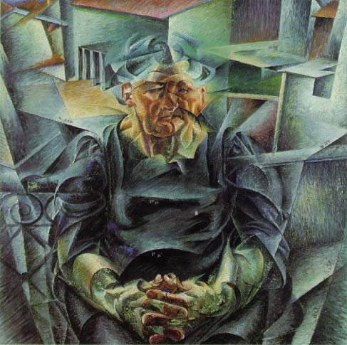
In the Boccioni painting, the figure’s face is
the first form seen, due to placement and the
warm hues. The hands are second and then
one circles around the volumes of the space.
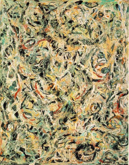
Jackson Pollock painted a sea of eyes in this melting all-over pattern goo.
PATTERN
A compositon that contains no focal points is seen as an all-over pattern. Patterns appear to have no particular area to observe first, second, etc, and therefore, possess a slower, more complex method of engagement.
A design with a strong visual hierarchy is often used by graphic artists, who generally prefer that individual elements communicate quickly.
Hierarchy and emphasis are used along with the gestalts to direct the eye of the viewer, not only in terms of location, but also in terms of speed. The artist directs the compositon like a conductor works an orchestra, controlling the ‘voice’ of individual elements - how long we pause to look and where we look next.