About Typography |
What is Typography???
Paul RandLOGOS
These logos are designed by Paul Rand, a famous American graphic designer. The main design element in all of them is type.This text will introduce type as an important element of design. It is not just words or information . It is a visual element that can enhance the look of your design and will certainly always have an impact.
Good typography is just as important on a web page as it is in any other medium. The fact that it appears on a computer screen and not on a piece of paper is immaterial, it should still be pleasing to look at and easy to read. In every situation where type is used - in publishing, signs, packaging, television etc. - the designer has to adapt his techniques to suit the medium
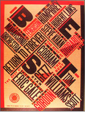
A headline style that works just fine in a magazine spread would not necessarily work on a poster. A magazine is always viewed straight-on at arms length so letter spacing can be as tight as you like and the words will still be readable. A poster is, more often than not, viewed obliquely, which distorts the type to some extent. Here, a little extra letter spacing helps identification of the individual characters, and hence the words.
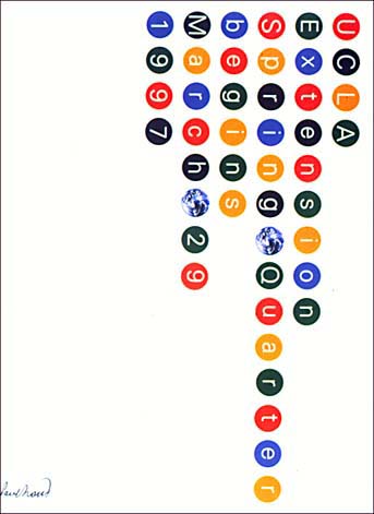
Paula ScherTYPE and HTML
Designing for a computer screen has its own set of problems. Add to these the elastic nature of a web page, which has to work across different computer platforms and screen sizes, and the problems get even worse. It is the designer's job to understand these issues and to address them - to maintain some kind of control when everything else is shifting.
There are many ways to prioritize information in traditional typography but many of those options are not available to Web designers because of the low resolution of the medium. Ninety percent of web pages that you look at have been poured- not designed. Any current browser will take a block of text and display it on the computer screen in a reasonable typeface and size but with considerably less control than an ancient typewriter! The first problem is that the line lengths get too long.
In print, there is a relationship between the length of a line and the 'leading' - the space between lines. If the line is too long, and the leading too tight, it is difficult to read from the end of one line to the beginning of the next - lines will be read twice - or skipped. A typist can use one and a half or double spacing to alleviate this problem, but a web page designer has no such luxury. There is no concept of 'leading' in HTML, but there is in Cascading Style Sheets.
How to format Type using HTML tags
You can't easily control the space between lines with regular HTML, but you can make sure that they don't get too long. Restricting line widths with the BlockQuote feature to give wider left hand margins will help, but even better, you can use tables to split text into narrower columns. The other way to regain control is to dispense with the default 'soft' word wrap feature and put in 'hard' <BR> (break) characters where you want a carriage return. This allows you to keep lines short - and to control the typographic shape of the right-ragged edge, but you need a lot of horizontal space to compensate for the fact that the type could be larger on someone else's monitor.
The HTML specifications allow for a hierarchy of headline sizes. These sizes are relative rather than absolute and are displayed in a bold typeface. They do tend to be rather ugly though. Here, an important distinction must be drawn. There are typefaces which are designed especially for the screen. They are usually san-serif fonts like Verdana and Geneva. San Serif means "without curls". Compare Times New Roman with Arial. Times new Roman is a serif font, has little shapes at the edges of the letters, while Arial is plain and straight, without curls.Typographic tricks like letter spacing are a little more difficult to achieve in HTML as it only allows one space between any two characters. By using the non-breaking space character ' ' you can force extra spaces between characters or words. You can simulate TABs using a run of s. I generally use the form <BR> _ _ _ _ where the underscore represents a regular space. To force extra space between lines, use alternate <BR> and <P> tags. You can letter space a word by inserting a discrete space between individual characters, but when it comes to word spacing in HTML, you need to create style sheets and apply those to your system text.
HTML supports horizontal rules which can be used to separate blocks of text on a web page. In traditional typography, the use of rules is frowned upon by purists. HTML rules are functional rather than stylistic elements although, occasionally they will be used for 'decorative' purposes to liven-up a bland layout. Be aware that each browser treats rules in its own way, they may look quite different in another browser from what you expect - but then that's true of everything.
You can, of course, insert a graphic as a rule. It won't have much of an overhead in loading time because it will compress very efficiently if it is a single colour and you can adjust its width from HTML by adjusting the IMG SRC 'Width' attribute in absolute pixels or as a percentage. Think of rules as 'typographic crutches'. On a Web page, there are no space constraints. It is better to use space to separate elements than lines. Some newer fonts such as Verdana, Georgia and Trebuchet have been designed to look good on a Web page. They have been designed to be sympathetic with the natural pixel grid. Not just their letter shapes, but their body heights and letter-spacing have been optimized for screen legibility.Style Sheets
There are two ways to specify font on a Web page. You can use the <FONT FACE>tag, but that is going to disappear in the not to distant future and I would strongly advise the use of Cascading Style Sheets for future compatibility. You also have to realize that readers will not necessarily have any typeface that you specify installed on his or her computer so you should use ones that are installed by default on the computer. By using a comma-separated list of fonts, either for a <FONT FACE> tag or in a CSS specification, the browser will use the first one it comes to in the list that is installed. If none of the faces in the list are available, it reverts to the default.
Mac and PC users will have different fonts installed so, the very minimum list of fonts should contain the Mac and PC equivalents. If you want to specify more exotic faces, put them first in the list followed by near equivalents and finally, the safest one shown opposite. I say 'exotic', I simply mean fonts that are not installed by default and may not be available to some readers.


