TitleUsing GIS to Analyze Tracer Test Data
at the Geysers Geothermal Power Plant |
||||||||||||||
|
Author Karly McCrory |
||||||||||||||
AbstractOperators at the Geysers Geothermal Power Plant in
Northern California were faced with the challenge of processing a large
volume of tracer test data on a daily basis. Three methods were evaluated for
processing this data: hand-plotting, CAD, and GIS. Researchers quickly
discovered that GIS had value that the other methods did not: functionality.
Utilizing basic GIS features and combining them with customized user
interfaces automated a previously manual process—greatly reducing the amount
of time and money spent on analyzing tracer test data at the Geysers. |
||||||||||||||
IntroductionThe Geysers is
part of the Clear Lake volcanic range in Northern California. As an active
volcanic area, Geysers is well suited for geothermal
energy. Geothermal energy is harnessed through steam and hot water directly
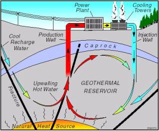
from the Earth, and can be used to generate electricity (Figure 1).
Figure 1. How a
geothermal power plant works. In 1960, a geothermal
power plant was established at Geysers. Gradually, the Geysers plant (below)
grew to become the largest geothermal development in the world (Kious and
Tilling, 1996).
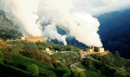
Photograph
by Julie Donnelly-Nolan, USGS At first, steam
production began only in the north-central region of Geysers, but by 1980
production had gradually spread to the entire stream field. In the mid-1970s,
concerns about the abundance of Geysers’ reserves began to emerge. In 1975,
operators began tracer tests at Geysers to track both the dry-out of the
reservoir, and the rate at which the reservoir naturally re-saturates itself
(Beall et al,
2001). When tracer testing began
at the Geysers, tests were only run every two to four years, so there wasn’t
a need for a mapping tool other than hand-plotting. Over the years, the
frequency of tracer tests increased dramatically. Currently, the return time
for a tracer test is often less than one day for nearby wells (Nash and Adams,
2001). The results from a day of testing must be analyzed to
determine which wells are tested the following day. Each tracer test
generates a large amount of data that must be mapped and interpreted
efficiently. This paper discusses the different methods used for visualizing
tracer test data, and how GIS reduced costs and increased efficiency at the
Geysers. |
||||||||||||||
BackgroundGIS has many
capabilities and a wide variety of applications, such as the ability to tie a
location on a map to a table of attributes, and the ability to query said
table. Yet given the obvious benefits and applications of GIS in the
geothermal industry, it has not been widely adapted. The Energy & Geoscience Institute (EGI)
in Salt Lake City, Utah has been at the forefront of bringing GIS to the
geothermal industry. The data
used in this project was not hard to find, however it was also not plentiful.
The literary and data sources used for this project were available over the
Internet. The two main publications used came from the Geothermal Resources Council Transactions, a collection of papers
for a given year. I also tried to find information about other geothermal plants that
may use GIS to map tracer test results, but I could not find any. It seems
that although the geothermal industry has a great need for this tool, they
are far behind in actually utilizing it to its fullest extent. |
||||||||||||||
|
Methods The Geysers operators tasked the
researchers at EGI with finding a way to effectively manage tracer test data.
The researchers decided to evaluate three approaches to solve the Geysers
problem: (1) hand-plotting, (2) computer aided design (CAD) software, and (3)
GIS. First they evaluated the approach that
the Geysers operators were already using: hand-plotting. The first drawback
of the hand-plotting method was an obvious one—the large amount of data from
a single tracer test was overwhelming to conquer with such a slow and tedious
process. Researchers also found that many times the map maker would try to
draw the map to a degree of accuracy that goes beyond the definition of an
isoline, adding even more time to an already lengthy process (Nash and Adams,
2001). Researchers
then decided to look to computers to solve their problem. They decided to
evaluate two types of computer mapping programs: AutoCAD LTâ 2000i with Autodesk CAD Overlayâ versus ArcView 8.1
with ArcView Spatial
Analystâ. While both
programs provided a method for digital mapping, thereby decreasing the amount
of time spent on map creation, ArcView offered functionality that CAD did
not. With ArcView, not only could the user create and isarithm
map quickly, they could also link points on the map to an attribute table.
Even further, they could superimpose the isarithm map on satellite,
topographic, or geologic maps of the area (Nash and Adams, 2001). By
utilizing the query function in ArcView, operators were also able to quickly
and efficiently analyze the results of the tracer tests. |
||||||||||||||
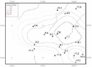
ResultsUsing ArcGIS Spatial Analystâ to create isolines, researchers found that with
some initial experimentation, good statistical surfaces could be generated
very quickly (Figure 2). Numeric values are given next to sampled wells for
comparison to the computer-generated contours. Because the contouring
parameters can be reset, several new maps can be created for comparison in a
matter of a few minutes. The user only has to repeat the process a few times
to get a feeling for the proper parameters, enabling them to generate new
maps even more quickly (Nash and Adams, 2001). |
Figure 2. Isarithm
map. |
|||||||||||||
|
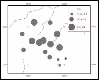
Figure 3.
Classified graduated circle map. |
Researchers also experimented with classifying attributes in different
ways, along with different visual representations of those classifications.
They found that if a high degree of spatial accuracy was needed, graduated
circles were preferred (Figure 3). Because the human eye is able to easily
differentiate between the sizes of the circles, visual comparisons of the
data were made much easier. Researchers also experimented with combining
graduated circles with other shapes and graduated color to represent multiple
data sets per sample point (Figure 4) (Nash and Adams, 2001). |
|||||||||||||
|
Figure 4. Combination of multicolored graduated
circles and graduated symbol map. |
||||||||||||||
|
GIS was proving to be a useful tool for
analyzing and mapping the tracer test data. However, researchers soon
discovered that the Microsoft Excelâ spreadsheet they were using was not
the best method for importing data into ArcView. Because the Excel format was
not favorable, the data had to be reformatted and exported into a dBase table
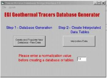
or comma delimited text file for import into ArcView. Researchers decided to
develop a new database format that would be used as an input for a new bridge interface
(Figure 5) (Nash and Adams, 2001). |
Figure 5. Bridge interface. |
|||||||||||||
The bridge interface is then used to create a new
database in Microsoft Accessâ. Both raw tracer and steam flow data are needed for the bridge
interface to generate the new database and tables. The bridge interface tool
makes the process of database generation very fast and easy to use. In
addition, the interface can be used with any GIS software that facilitates an
SQL connection to Access. The format for input of the data is:
The Well_Names field
is used as the unique identifier for any table relations or joins. When the Access
database is generated, it contains the following seven tables: 1) raw tracer
data, 2) normalized data, 3) log transformed normalized data, 4) interpolated
data, 5) cumulative values of interpolated data, 6) normalized interpolated
data, and 7) log transformed normalized interpolated data. The user defines
the normalization value, and the interpolation process estimates missing
values. |
||||||||||||||
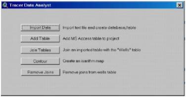
The bridge interface is linked to the Tracer Data
Analyst (Figure 6), a customized object oriented user
interface within ArcView. This interface can call up the bridge interface,
rapidly create SQL connections to tables that have been generated, and
facilitated automatic joins to generate isarithmic maps. To make map
generation possible, a table consisting of well names and XY coordinates must
be added.
|
|
|||||||||||||
ConclusionsIn the end, GIS proved a far better solution for the
Geysers Geothermal Power Plant than either hand-plotting or CAD did. The main
reason behind this is the functionality that GIS brings to cartography. By
giving the users the ability to join and query tables, use different
attribute classifications to increase visual effectiveness, and the
capability to overlay maps, GIS became a very effective solution to the
Geysers problem. Researchers furthered this effectiveness by customizing user
interfaces; thereby greatly reducing the man-hours needed to process tracer
test data. |
||||||||||||||
ReferencesBeall, J.J., M.C.
Adams and J.L.B. Smith, 2001. Geysers Reservoir Dry Out and Partial
Resaturation Evidenced by Twenty-Five Years of Tracer Tests. Geothermal
Resources Council Transactions, v. 25, p. 725-729.
Kious, W.J. and R.I. Tilling, 1996.
This Dynamic Earth: The Story of Plate Tectonics. U.S. Geological Survey
General Interest Publication. Nash, G.D. and M.C. Adams, 2001.
Cost-Effective Use of GIS for Tracer Test Data Mapping and Visualization. Geothermal
Resources Council Transactions, v. 25, p. 461-464. Data Reference: http://www5.egi.utah.edu/Geospatial_Data/The_Geysers__California/the_geysers__california.html |
||||||||||||||