Background
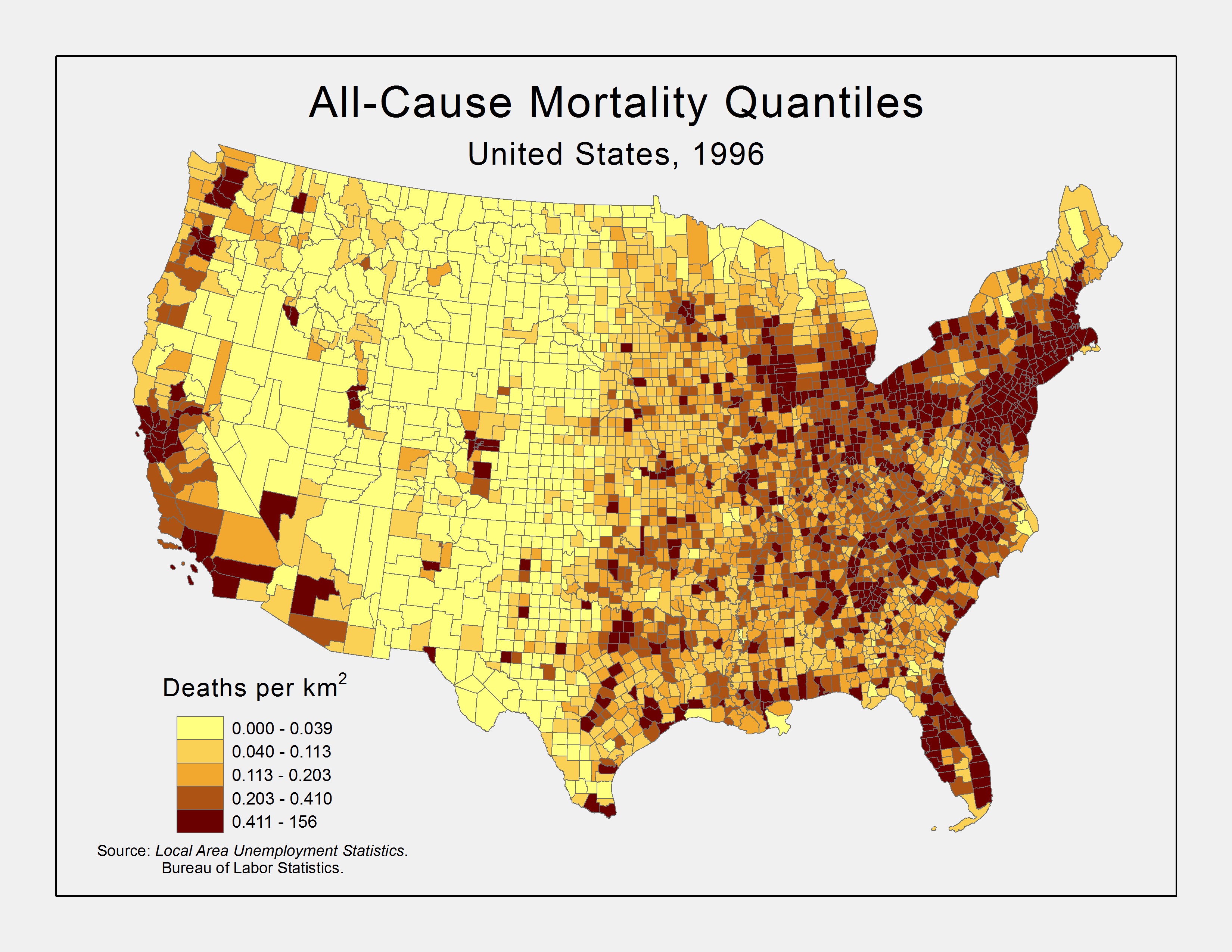
Figure 1. All-Cause Mortality Density, 1996 by County
There is a common sense idea that had some historical support that as the economy does better, so does the health of the population. However, more recent research suggests that the state of the economy, at least in the short-term, has the opposite effect on population health. This study aims to reproduce similar results and explore the spatial distribution of this relationship. If the thesis that the economy and mortality rates are positively related is correct, we should expect to see an increase in mortality rates as the economy improves. The spatial distribution of this pattern is suspect. Death density, at least for all-cause mortality, tends to have the highest percentiles on the coasts, possibly due to the concentration of people in the larger cities (see Figure 1). It is hard to say if this will impact the state level effect of economy on mortality, but it does suggest that differences exist.
The pinnacle epidemiological research that exposes this relationship comes from (Ruhm, 2000). In business-cycle theory in economics, a phenomenon is called procyclical if it bears a positive variation to the state of the economy; it is countercyclical, otherwise. In this context, Ruhm argues that mortality rates are procyclical in the short-run. In other words, when we experience temporary economic upturns, we should expect to see increases in mortality rates.
Subsequent research explores these changes at various scales and including other countries (Gerdtham and Ruhm, 2006; Neumayer, 2004; Ruhm, 2005a; Ruhm, 2005b; Tapia Granados, 2005). Often the source is sought with regard to behavior and physical activity as they link to bad behaviors that influence health (Finkelstein, et al., 2005; Ruhm and Black, 2002). The theory suggested by Ruhm is that leisure is costly when the economy is doing well. Since physical activity is part of our leisure time, people will tend to forego physical activity when making money is more valuable. The same applies to regular health care usage and similar expenditures. To put it another way, the behaviors that keep us healthier diminish when working takes precedence. On the reverse, when the economy is not doing well, eating out and driving become more costly. Therefore, people will generally budget by eating at home, which tends to be healthier. Automobile accidents may also decrease.
The one major exception to the trend in (Ruhm, 2000) is suicide mortality rates. Suicides are a marker for psychological distress, which has always been supported by evidence that as financial anxiety gets worse, so does psychological health. This result is not unexpected, and it should prove as a useful comparison in this analysis to benchmark the results.
Methodology
The aggregate data cover the contiguous 48 states over the decade 1990 to 1999. The outcomes are total all-cause mortality rates, and deaths due to 2 specific-causes: endocrine related diseases,[1] for they most closely align to behavioral variations influenced by the economy in the short-run; and suicide or intentional self-harm,[2] as they will be used as an intended countercyclical comparison. These data come from the compressed mortality file published by the National Center for Health Statistics.
Using the subscripts j and t to index the state and year, respectively, the primary model for this analysis is
(1) 
for H the natural log of mortality rate, E proxies for the economic conditions, and ε the error term. The fixed-effect S controls for time-invariant state characteristics, γ captures the impact of within-state deviations in economic conditions, and α accounts for nationwide (state-invariant) time effects. Observations are weighted by the square root of state populations to account for heteroskedasticity.[3]
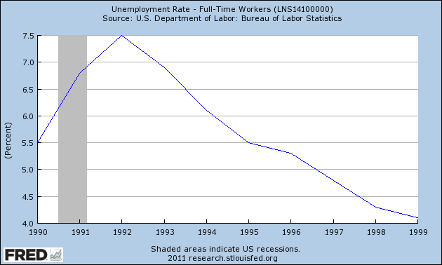
Figure 2. National Unemployment Rate
Unemployment rates will proxy for the economic conditions. These data come from the Bureau of Labor Statistics local area unemployment series. Other proxies could have been used here, such as gross domestic product, national gross product, or even the employment-to-population ratio. It was assumed that unemployment rates were sufficient and most easily to utilize and interpret.
To simplify matters, mapping will be done at two periods that reflect the extremes in unemployment. The recession peaks with regard to unemployment at 1992. By contrast, the unemployment rate steadily dropped throughout the rest of the decade. Therefore, a short-run change can be reflected by the year 1996, a point when the change in unemployment rate had a temporarily leveling (see Figure 2).
This model and its results were analyzed using R.[4] The data were merged according to state FIPS codes and ultimately merged to Census state boundary TIGER files for mapping in ESRI ArcMap 9.3. The state FIPS and year values acted as factor levels in the linear model along with an intercept and state annual unemployment rate.[5] As outlined above, the response term in this model was the natural log of the mortality rate, per 100,000 persons.
An additional model was fit to better explain the relationship between unemployment and mortality. This model was standardized to put the values on an equivalent scale.[6] This standardized model is,
(2) 
For h the standardized mortality rate, e the standardized unemployment rate, and the rest is the same.
Results
Exploratory Results
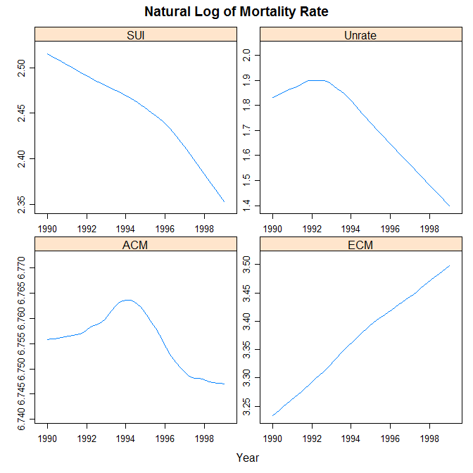
Figure 3. National Trends
Before the models were used to analyze the theory and explore its spatial implications, an exploratory analysis was performed to investigate the theory and its expectations at both the national and state levels. The natural log of specific-cause mortality rates against time show the expected trend. Suicide rates tended to go down as the economy got better later in the decade, whereas endocrine-caused mortality rates tended to go up as the economy got better later in the decade. In the case of all-cause mortality rates, it eventually tended to get lower, but only after a temporary rise mid-decade, similar to unemployment rates. Figure 3 groups these three trends for comparison.
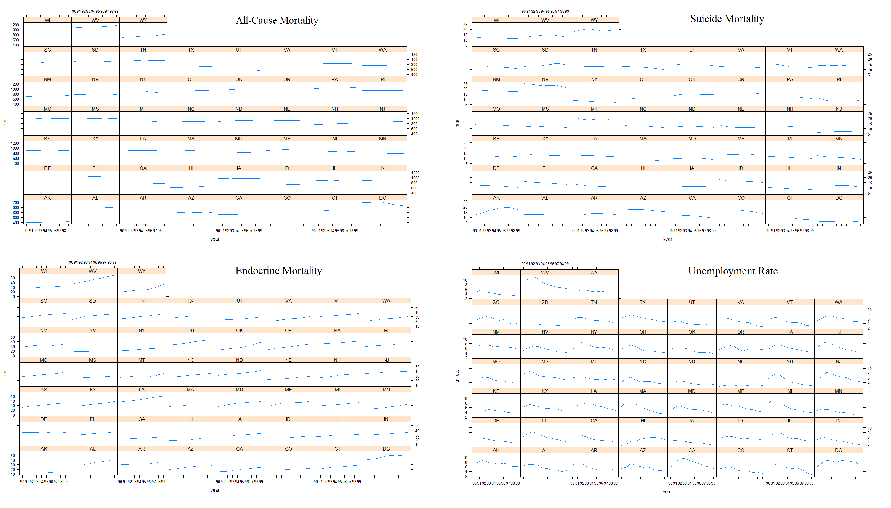
Figure 4. State Trends
Since the national trends appear to follow theory during this decade, an analysis of the state-level trends should reflect, in large part, the same phenomena. A look at a plot of the moving average (loess smoothing) of the mortality and unemployment rates against time by state show that, on the whole, each state does tend to follow their expected patterns. As anticipated, all-cause mortality is more flat and barely shows an increasing pattern. Figure 4 shows each of these instances each of these instances.
The next step in the exploratory analysis was to look at the relation of standard deviations in unemployment to their relation to standard deviations in mortality rates. Here the concentration will be on the cause-specific mortality rates. Since the standardized variables are on the same scale, a plot of them together over time should follow two general patterns according to this theory. If they are negatively related, as is expected of unemployment and endocrine-cause mortality, then we should expect to see a helix like pattern where as one increases, the other decreases. On the other hand, if they are positively related, we should expect to see them moving together over time. As figure 5 shows, these patterns are confirmed for these two cause-specific variables.
Analytical Results
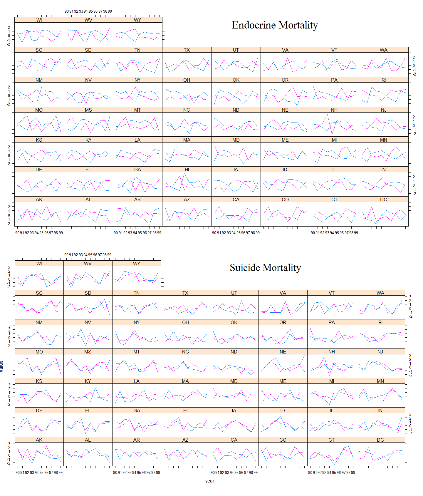
Figure 5. Standardized Unemployment vs Mortality Trends
While the general trend appears to match theory, we needed to explore if that trend was distinctly related to the proxy for the economy. Therefore, an analytical view was sought using model (2). It was fit for both specific-cause mortality rates. Both models had a statistically significant standardized unemployment rate coefficient at the highest level. The coefficient for the model with endocrine-cause mortality was -0.41, indicating that a one standard deviation increase (decrease) in the unemployment rate would elicit a 0.41 standard deviation drop (increase) in endocrine mortality, per 100,000 persons.[7] By contrast, the coefficient on the model with suicide-cause mortality was 0.37. Thus, the positive and negative nature of the coefficient confirmed theory. In both cases, the independent variables jointly only accounted for about 10 percent of the variation in the response.
The results from model (1) did not result in an unemployment rate coefficient matching theory in terms of positive/negative values. However, as will be shown below, this is most likely a result of the effect each year had on the response within each state. In other words, the effect of unemployment from the way this was modeled on the response was washed out by the contributing effects of state and year. To see the impact unemployment has on mortality requires looking at the fitted values this model provides for each year.
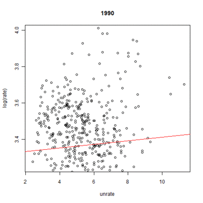
Figure 6. Model Indicated Time Effect for Endocrine-Cause Mortality
To summarize the results, for endocrine-cause mortality, a one percent increase in the unemployment rate results in a 0.010 percent increase in mortality rate per 100,000 persons. By contrast, for suicide-cause mortality, a one percent increase in the unemployment rate results in a 0.016 percent increase in mortality rate per 100,000 persons. These results were statistically significant at the 90 and 95 percent levels, respectively.
These numbers, however, ignore the nationwide time effect each year has on mortality rates. Figures 6 and 7 demonstrate the linear fit of mortality rates expected by the model for each year.[8] The inclusion of the unemployment rate times the coefficient from the model gives the full effect of the model, save for the individual state effect. The results show a clear trend over time: endocrine-cause mortality rates are expected to go up whereas suicide-cause mortality rates should slightly drop. As expected, the change is much more pronounced in the case of endocrine-cause mortality. All years were significant at the highest level.
Geographical Results
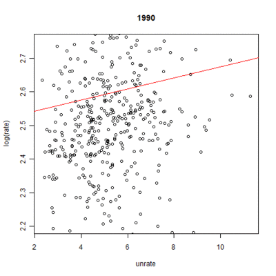
Figure 7. Model Indicated Time Effect for Suicide-Cause Mortality
The results particular to the geography of this phenomenon involve the coefficients on the state factor levels. There are two ways to look at this. The most basic is to take the fitted estimates from the model for each state in the respective years for this study and map them according to some classification. Figure 10 demonstrates this for one such classification. That map demonstrates a deviation from the decade national mean during those two periods. The classification is based on standard deviations from the national mean. Everything within a half standard deviation from the mean is neutral white. From 0.5 to 1.5 standard deviations below the mean are light blue, and everything beyond that is dark blue. The same is true for those deviations above the mean being red.
As predicted for endocrine-cause mortality, we should see a transition in states from dark blue to light blue, white, or red; from light blue to white or red; from white to red; and from light red to dark red. Anything in the other direction is a case contrary to theory. There does not appear any gross pattern of locality or clustering, but what changes did occur matched expectations.
The subtle changes we anticipated with suicide-cause mortality only showed up in the East in a few states. There was only one instance where the state appeared procyclical, moving from a white to a red between the two years No gross changes were prevalent.
That map showed one way to approach the results of model (1). The other approach is to ignore the actual phenomena that the fitted values estimate. This approach is similar to viewing Table 1. If we ignore unemployment rate differences that existed--something that is wholly unrealistic--and merely look at the model coefficients for unemployment effects, state effects, and the contribution of the respective years, we will see a whole other picture that conforms to theory--albeit, it confirms precisely because it is contrived. Figure 11 demonstrates the expected state outcomes in terms of the model. If the state plus year effect is overall negative, the state is colored blue; otherwise, it is colored red. In 1992, for both causes, nearly all states conform to theory; we expect reduced mortality rates due to that state for that given year.[9]
In both cases, we should expect to see a transition in 1996. This is confirmed as in the case of endocrine-cause mortality, the expectation overwhelmingly shifts to a positive (increasing) influence amongst the states. It is not nearly as universal as in 1992. We see the opposite effect, per theory, in the case of suicide-cause mortality. We also see an obvious clustering. The Western part of the country did not see the clear transition that the Eastern side demonstrated: the West that was blue (red) stayed blue (red).
Discussion
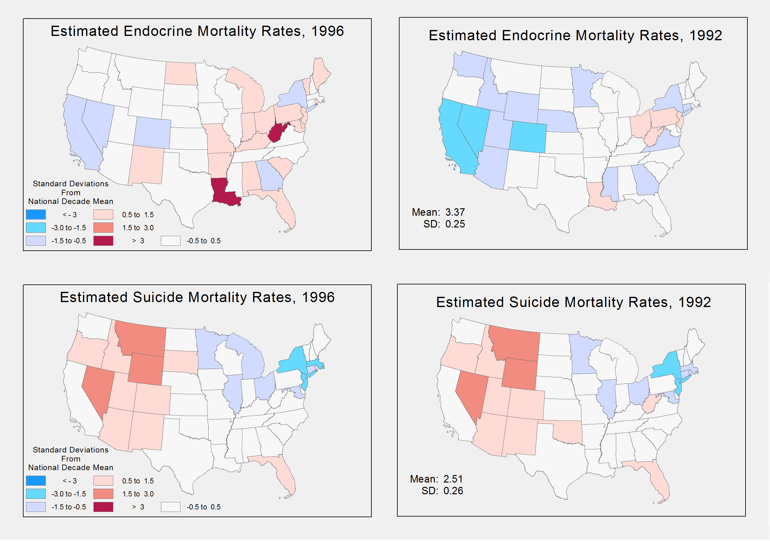
Figure 8. Differences from National Average in Estimated Mortality Rates, 1992 compared to 1996
The question sought in this analysis was what, if any, spatial pattern might be discernable from the relation between mortality rates and the economy. Theory suggests that the relation is procyclical, except in the case of suicide, a proxy for psychological distress. Given the disparity in mortality rates amongst the states, it would come as no surprise that differences should be expected. The aim of a good analysis is to derive a way to best make those differences emerge. This study failed in a number of ways to make that happen, and it will characterize the discussion of these results.
To start, the model may have been oversimplified to the point that the expected mortality changes sought did not manifest. The results of the model were that unemployment rate did not bear the anticipated relation to mortality rates. While the form of the model chosen here maintained it was a significant relationship, a more accurately specified model reveals this model was not significant.
A number of responses could be taken. For one, age-adjusted rates may have proven more appropriate given the age distribution in the different states over the years. Another response may be that a different measure of mortality could have been chosen, such as cardiovascular disease. Yet another response may be the inclusion of missing variables that led to a misspecified model used here, such as variables regarding national unemployment rates, variables to reflect age groups or their distributions, or state characteristics with time variance, such as education or incomes.
The model in (Ruhm, 2000) included such "covariates" to account for additional variations that the simplified model (1) did not. Instead, the fixed-effects of year and state "absorbed" these other variations, making them contribute far more to the variation. Thus, this could explain for the insignificant and counter-theoretical results the model produced.
While unemployment did not bear a significant relationship to mortality rates, the trend of an improving economy over time to increasing endocrine-caused mortality rates over time did exist. It was attempted to show this trend in a number of ways that appear successful. However, the geographical variation was not apparent. The reason there is not a large depiction of changes that might demonstrate the locality of this phenomena can be due to two things, not mutually exclusive.
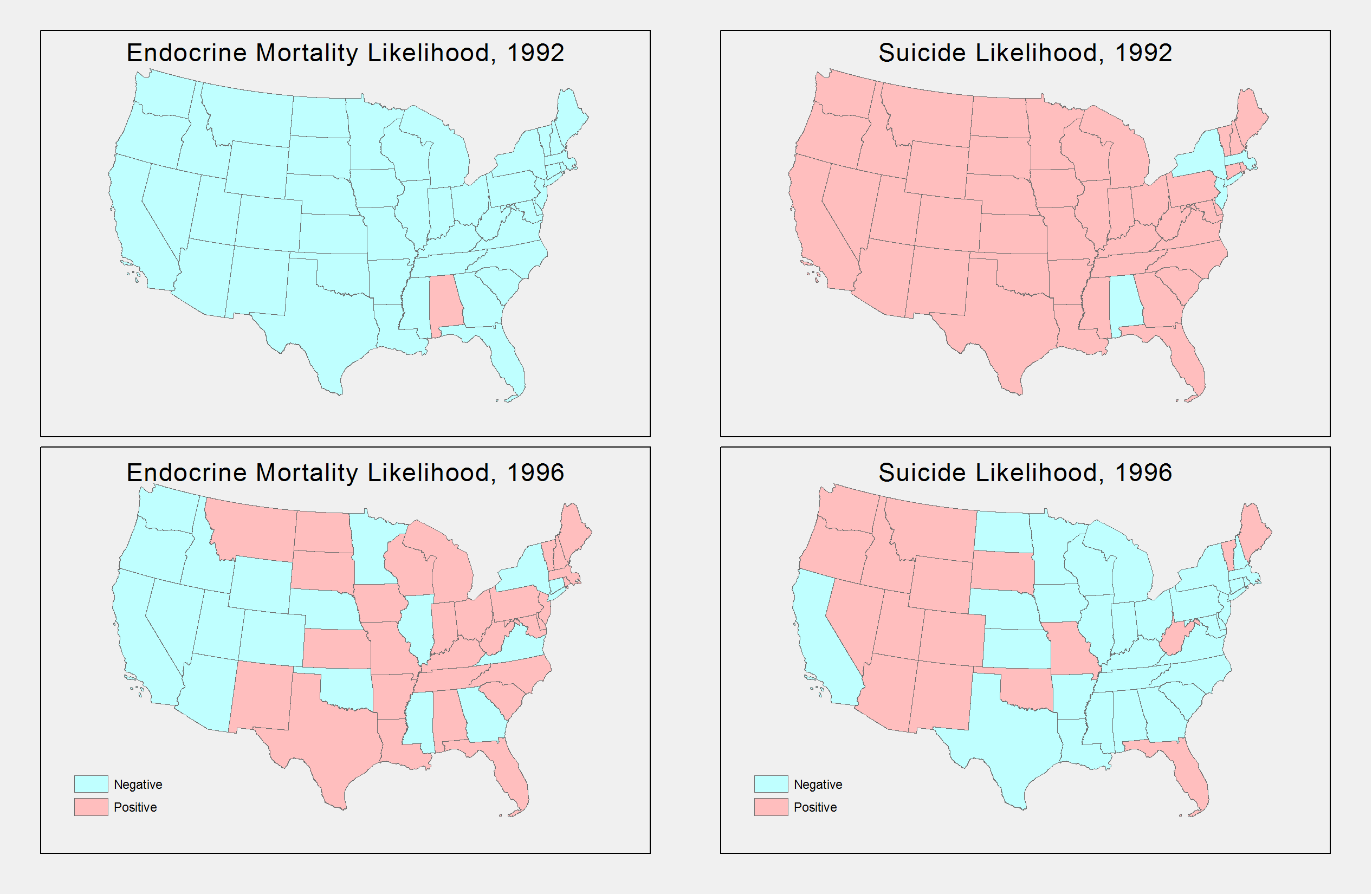
Figure 9. Predicted Effect in Mortality Rates, 1992 compared to 1996
For one, it could be the classification scheme. Maybe more levels or looking at more subtle changes would have been more appropriate. The one standard deviation widths of the levels in Figure 10 can be considered large and only depicts gross changes that were not systemic. On the other hand, the spatial pattern of changes, at the margin, may be more significant, and it is not brought out in this map. The phenomena may be one that should be viewed in terms of more refined variations that require another approach, both in modeling and in symbolizing. For instance, county level analysis may bear more fruit on a spatial analysis of this sort.
Working with the model that garnered this analysis, the conclusion we can draw from the results is that within-state effects and national effects over time were the predominate source of changes in mortality rates. Nevertheless, which states in which year did result in differences as shown in Figure 11 that have resemblance to the all-cause mortality density at the county level showed in Figure 1; there is a clear difference in distribution. While there is obvious clustering in coastal regions, there is a higher density clustering in the East compared to West. This larger density may account for some of the regional differences by resulting in an increased sensitivity to variation that the model expressed.
Since within-state and time effects played a predominate role, it would make sense that further investigation should consider factors that impact national trends and changes between states. This model used fixed-effects. A random-effects model may have proven more appropriate, and in fact, tests for such appropriateness suggest it. Nevertheless, other things to consider might be transitory effects. For instance, people may be more willing to relocate during economic upturns. If so, changes in the health of state populations may change simply because healthier people are relocating. On the other hand, maybe traffic accidents increase by unfamiliar drivers entering a new area. In any case, these are effects that could be further investigated.