| Name: | Todd Puckett |
|---|---|
| Class: | Geog 350 |
| Date: | Fall 2012 |
| Email: | iamtodd84@gmail.com |
Abstract
Articles concerning Google Fiber and Verizon’s FiOS have piqued my interest in the availability of internet services. And with publicly available shapefiles for broadband services, this presents an opportunity to analyse services in Sacramento County. Using the provider name and advertised download rates, I look for a correlation between the number of providers in an area and the advertised maximum download rate.Introduction
When I first needed to purchase a broadband service for myself, there were only two choices. I heard poor reviews about one well before being faced with this decision, and I haven’t heard anything at all regarding the other. I chose “the other.” For the first year, this worked out well, and then I moved to an area several miles away to live with some friends. When deciding on the most appropriate broadband service, the very same two choices were again available (and no more). They both advertised decent speeds for what we needed and the price was a bit steep either way. We discovered that both services have their problems (e.g. outages, slower than advertised, etc.), and compared to other areas, we were in a relatively good situation to have any choice to begin with.
In this paper I shift my focus to broadband in Sacramento according to the latest broadband availability data provided by the State of California (found here). I try to find if people are still faced with too few choices and if the number of choices correlates with the advertised speed or anything else that can be quantified.
Background
While current broadband services easily handle email and some web browsing, there is certainly a present and increasing need for good performance. FCC Chairman Julius Genachowski stated, “These networks must meet performance criteria that enable the use of common applications such as distance learning, remote health monitoring, VoIP, two-way high quality video conferencing….” (Genachowski, 2011)[1] This isn’t just about streaming movies online—which is a big enough industry. Online learning may be a great reason to provide better internet services to more people. Stanford University has been seriously pursuing distance learning as a modern solution to providing better education to more people (Henn, 2012)[2]. But the global availability of internet services and the uses thereof are beyond the scope of this paper; the point is simply that there is need for better internet service. I would like to begin by assuming that competition will improve service and cost.
An FCC analysis from 2008 shows that the number of wireline (DSL, cable, etc.) competitors effects an increase in advertised download speeds.
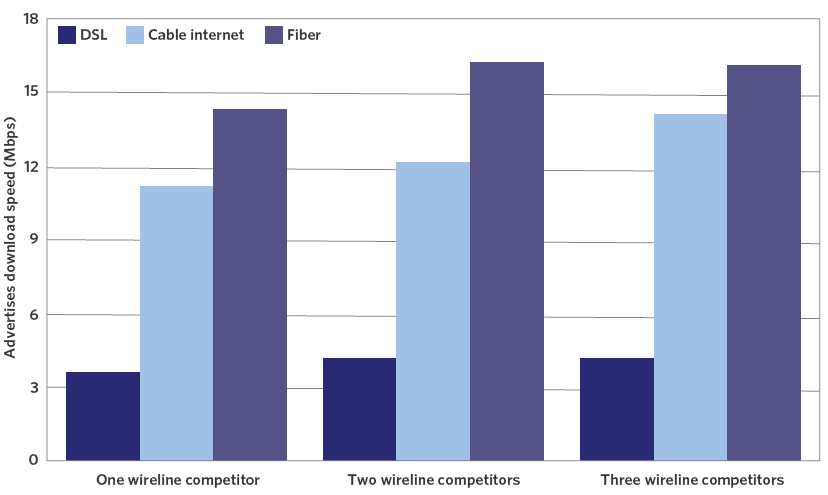
Figure 1: The advertised download speed seems to increase with the number of competitors.
Because competition appears to have a positive effect, I would like to investigate the current state of offerings by location in Sacramento County.
I focus mostly on advertised speeds and availability—some typical speeds are included in the broadband shapefile—because it is difficult to conduct accurate statistics on the cost of broadband. Services also tend to get bundled, which further complicates estimation.
Generally speaking, however, I can say that the cost of high-speed internet in Sacramento is generally between $29.95 and $74.99 and with an average cost of $47.24[3]. This average cost is very nearly equal to the national average. That’s not to say that it couldn’t or shouldn’t be more affordable. But I will be examining availability in relation to the location of “Residential” parcels
Methods
The State of California provides publicly-available shapefiles with information on internet services throughout the state. This includes who provides wireline services, what kind of wireline, which neighborhoods, the advertised upload and download speeds, and so on. This data was last updated on June 30, 2012.
First, I want to check the availability of broadband internet and limit my scope to wireline service aimed to consumers (not businesses). For example, Covad (MegaPath) and Integra Telecom offer facilities-based wireline service, but they advertise specifically to businesses. To make my analysis manageable, I identify providers in my attribute table that definitely sell to residential consumers. Specifically, I picked the following:
- Pacific Bell (AT&T)
- SureWest
- Comcast
- Citizens Comm (Frontier)
- Sonic
Second is speed. The California Technology agency recently considers customers with a choice of no more than 6 MegaBITS per second (Mbps) (not to be confused with MegaBYTES per second or MBps) to be underserved. For the purpose of this project, I consider areas with better available services than that and have even thrown out areas where the typical download speed (not always given) is less than that.
To show these areas within the county that have good advertised download rates available to customers, I start with two datasets: the broadband dataset from the California Technology Agency and a parcels dataset from Sacramento County. The parcels layer in figure 1 only shows residential parcels, and the broadband layer shows the availability of these better speeds.
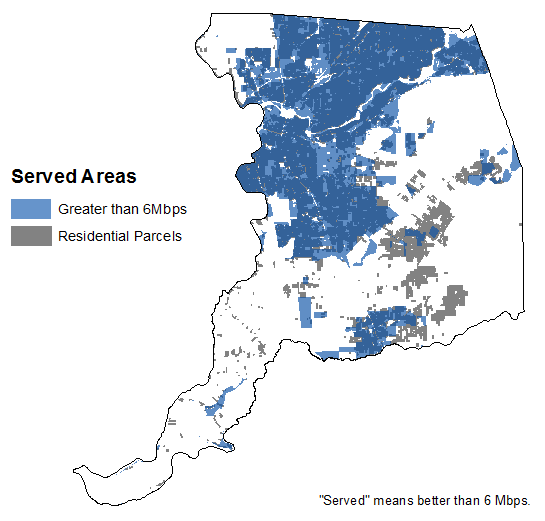
Figure 2: The availability of better download rates than 6 Mbps is shown on top of residential parcels.
Third, being able to choose from more than one provider is great for customers. So a map was produced to show the number of options available to customers by location and with average speeds calculated, too.
To produce this map, I first converted to raster each layer representing the above providers—that’s 5 layers, though they came from the same dataset originally. The pixels represented the maximum advertised download rate. Null values and values of 6 or less were converted to zero, other values were changed to one, and for each layer, this was saved to a separate raster. These resulting rasters were added using the raster calculator and the output represents the number of alternatives that customers can choose from. Specifically, this resulting map has zones 0–4 each representing that many options.
Maybe I can see for myself if the number of choices correlates
well with the advertised download rate, so finding the average
rate for each is the next task. A conversion needs to be made
first: the download rates are given as a string. To correct this,
a new field is added called INT_DL. The field calculator fills
each row with the following formula:
Int ([MAXADDOWN])
Then the “Reclassify” tool is used to create a raster with these values and with zeros instead of “NoData.” Finally, the “Raster Calculator” is used to average the five inputs for each of the aforementioned zones. The calculation looks something like this:
Con("zones" == 4,("Provider1" + "Provider2" + ... + "Provider5") / 4) The math may not look quite right at first, but I divide by 4 because when considering zone 4, one of the 5 inputs does not contribute to the average. Likewise, in zone 3, I divide by 3 because two of the inputs necessarily do not contribute. And I proceed until I have an average raster for each zone. My summary table is shown in the next section.
Results
Wireline broadband appears to be highly available in Sacramento County, even after excluding slower services. Broadband adoption in the county is another story.
The number of direct competitors was found, and the method was explained earlier. Figure 3 below shows the different “zones” that were mentioned.

Figure 3: These areas represent areas served with wireline broadband. Providers that serve businesses are excluded and services with a typical or advertised speed of 6 Mbps or less are also excluded.
In each of these zones, the advertised download rates of the competitors were averaged. The use of “Reclassify” and the “Raster Calculator” were explained earlier. The results are tabulated here.
| Choices | Average Mbps |
|---|---|
| 1 | 5.18 |
| 2 | 7.64 |
| 3 | 7.72 |
| 4 | 7.86 |
This shows a similar result to the FCC’s chart shown above. The advertised download rate seems to correlate with more competitors.
Analysis
The correlation between competition and advertised speed is pretty clear, and it is good news for those who live in these areas. It is also just correlation, and correlation based on a small sample. Additionally, the advertised speed is not necessarily the typical speed—even on a good day. The broadband dataset does include some typical download rates. One service was advertising 7 Mbps down while the typical speed was recoded as 5 Mbps down. Providers are often criticised for this. More than that, Comcast, for example, has been known to throttle transfers over certain protocols. These kinds of issues don’t show up on the dataset.
One of the technical GIS troubles I ran into involved a datatype.
The “Maximum Advertised Download rate,” MAXADDOWN, was stored
as a string. When I was working with a small enough set of
rasters, I had to convert them. For a while I didn’t know that I
could. It happens to be an easy operation with the field
calculator, which is available in the Attribute Table menu.
Finally, getting a sum of competitors and average available speed involved a fair share of intermediate rasters as well as conversions/reclassifications to get zeros where necessary.
Conclusion
In Sacramento, the availability of internet services that offer 6 Mbps or better are plenty available, there also doesn’t appear to be any services significantly faster than this for residential customers. The fastest consumer-oriented service in the county advertised 12 Mbps, judging by this dataset. Many people are willing to pay for services such as Google Fiber or Verizon FiOS, but Sacramento appears to not have any such offerings.
Some of my inspiration for this project come from articles on Google’s new fiber service offered in the Kansas City area. Verizon also offers their FiOS, which also brings fiber to the home. This differs from hybrid fiber services, or fiber-to-the-node, which do not offer comparable speeds to these fiber-to-the-premises services. These are, of course, quite expensive, but it demonstrates an evolution toward faster internet for digital devices and needs that evolve continually.
Unfortunately, competition in broadband or any wireline service will likely remain limited due to the very costly investments involved. These are infrastructure costs that make wireless services more attractive in this regard. In any case, more available (and affordable!) services are always great.