| Title Using Remotely Sensed Data to Assess the Impact of the King Fire | |
|
Author Spencer Zaputil American River College, Geography 350: Data Acquisition in GIS; Fall 2014 Contact Information: spencerzap19@gmail.com | |
|
Abstract Suffering from what is quite possibly the worst drought in California's recorded history, the state endured over 5000 wildfires in 2014. Using remotely sensed data, I will attempt to assess the impact of the King Fire – one of the largest and most destructive wildfires of the year. After acquiring remotely sensed data from the Landsat 8 satellite, I proceeded to process the data and quantify the results. This work included clipping the large Landsat images into smaller subsets focused around the burn area, creating Normalized Difference Vegetation Index (NDVI) images, and performing both unsupervised and supervised classifications of the land cover surrounding the burn area. In doing so, I observed how the King Fire reduced the range of NDVI values in the project area by increasing the minimum value and decreasing the maximum value. Additionally, I determined that the King Fire burned at least six percent (over 50,000 acres or 78 square miles) of the project area, which created an obvious change in the classification of the land cover. These results, however, were not obtained with ease. I encountered difficulties stemming from the data itself, ArcMap, the NDVI tool, and my laptop's computing power, among others. Despite the setbacks, I was able to obtain some meaningful results and derive a few basic conclusions from the processed data. While I do not possess the time nor resources to conduct a more thorough study, it is my hope that a team of scientists can and will assess the complex impacts of the King Fire over the coming months and years. | |
|
Introduction 2014 was a year scarred by severe drought and unrelenting wildfires in California. In January, California's wettest month on average, a drought-induced state of emergency was declared by Governor Brown. From January to May, firefighters battled approximately 1400 wildfires – twice the usual amount for that same time span (Medina, 2014). By the end of September, CalFire had already fought over 1000 more wildfires than the average total of the past five years (Wilson, 2014). One of the blazes that started in September, the King Fire, was especially destructive. While the link between drought, unhealthy vegetation, and wildfires is undeniable, the post-event effects of large wildfires are not as straightforward. Using remotely sensed data, I will attempt to assess the impact that the King Fire had on the surrounding area. Specifically, I will use ArcGIS 10.2.2 to process this spatial data, derive Normalized Difference Vegetation Index (NDVI) values, and create pre- and post-fire land cover classifications of the area. | |
|
Background Given the slow-developing nature of droughts, it can be difficult to monitor these natural disasters. Unlike their faster-moving counterparts, droughts may be negatively affecting a region for weeks or months before it is recognized by the given area’s inhabitants. While weather data can provide scientists with a good idea of drought conditions, it cannot deliver the full story. In order to obtain the full story, scientists need to supplement weather data with remotely sensed meteorological satellite imagery. The goal of the scientists behind the research presented in this article was to standardize Normalized Difference Vegetation Index (NDVI) values, which were derived from satellite imagery, on weekly and monthly scales. These new Standardized Vegetation Index (SVI) values were developed in order to illustrate how much any given vegetation had deviated from so-called ‘normal’ conditions, as based upon weekly NDVI values over an extended period of time. For this research, NDVI and SVI values were calculated from twelve years of Advanced Very High-Resolution Radiometer (AVHRR) satellite imagery between 1989 and 2000. AVHRR imagery was selected due to its low (1 km) spatial resolution, high (twice-daily) temporal resolution, and synoptic (large scale) view. Using AVHRR imagery thus allowed the scientists to acquire bi-daily imagery for the entire earth. For the purpose of their research, however, the scientists were mostly focused upon the Great Plains region of the central United States. In terms of NDVI, higher values are better, as they indicate that more photosynthesis is occurring in the vegetation being observed. Likewise, higher SVI values are better, as they indicate that the vegetation has deviated above normal conditions. For mapping purposes, the scientists compiled their SVI values into five, easily understandable groups ranging between zero and one. The five groups, as follows, are: very poor = 0 – 0.05, poor = 0.05 – 0.25, average = 0.25 – 0.75, good = 0.75 – 0.95, and very good = 0.95 – 1. In comparison to the Drought Monitor maps, which are not based off of satellite imagery, the maps produced using SVI values had a higher spatial resolution and could be produced more frequently. This, however, is not to say that Drought Monitor maps and other drought monitoring techniques are now obsolete and no longer required, just that satellite imagery-calculated NDVI and SVI values aid scientists in making quicker, better informed drought-related decisions (Peters, Walter-Shea, Ji, Viña, Hayes, and Svoboda, 2002). Although this research was conducted over a decade ago in the Midwest, I believe that the methods used in this study could have an even greater impact in present-day California. Being a state with extremely varied geography and thousands of microclimates, California could benefit greatly from the high temporal resolution of AVHRR-based drought monitoring. Daily drought maps produced in this manner could potentially aid agencies, such as CalFire and the US Forest Service, in predicting areas that might be at exceptional risk of wildfire. Initially, I had planned upon using NDVI as a means to measure the drought conditions in my project area, but I soon realized that this was beyond my scope of knowledge. Instead, I chose to use NDVI for its intended purpose of measuring vegetation health, as this has direct correlations to drought conditions anyway. This process will be explained further in the following sections. | |
|
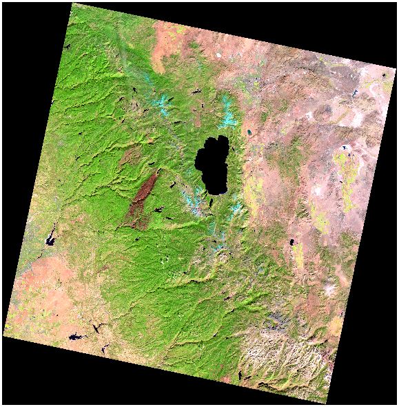
Methods First and foremost, I needed to acquire high quality remotely sensed data for my selected area of interest. I was able to acquire all of the necessary data from the USGS EarthExplorer website. Luckily, the entire perimeter of the King Fire was contained within one Landsat 8 scene (path 43, row 33). For the purpose of image processing, I acquired two GeoTIFFs – the last image captured before the fire occurred and the first image captured after the fire was fully contained. These were both nearly 1 GB each in a compressed GZ file format. 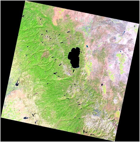
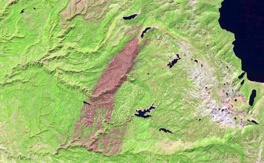
Additionally, I acquired three georeferenced “LandsatLook” TIFF images, which were much smaller, on the order of about 6 or 7 MB each. Two of the LandsatLook images were captured during the fire and another was captured a few weeks after the fire had been contained. I did not use these LandsatLook images in any of the image processing work – simply for reference, as they only contained three bands each. 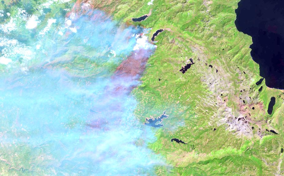
Having acquired the necessary imagery, I now needed to manipulate the data in a suitable manner for my project. Loading the two GeoTIFFs into ArcMap, I clipped these large images into smaller subsets. To do this, I zoomed in to a scale of 1:275,000 and clipped both images using the Clip tool in the Image Analysis window. At this scale, I was able to capture the entire area of the King Fire, but without a superfluous amount of the surrounding area.To view the original images at full extent, I needed to zoom out to a scale of 1:1,500,000, so I had clipped the images down to about 20% of their original size. This helped out tremendously in the subsequent image processing steps. 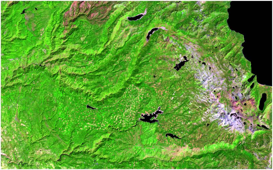
With the images clipped to an appropriate scale, I could now move forward with the data processing. The first data processing step was to create two new NDVI images. Initially, this was attempted through use of the NDVI tool in the Image Analysis window, but later with the Raster Calculator tool. This will be discussed further in the Analysis section of this report. The second data processing step was to create two new unsupervised land cover classification images. This was performed using the IsoCluster Unsupervised Classification tool in the Image Classification toolbar with the parameters set to: ten classes, ten sample intervals, and a minimum class size of 80 (ten times the number of bands). In an attempt to classify the land cover better than ArcMap had just done, the third data processing step was to create two new supervised land cover classification images. First, I manually created 23 training sample sites for the pre-fire image, 28 for the post-fire image, and two unique training signature files. Once this tedious work was completed, the processing was performed using the Maximum Likelihood Supervised Classification tool in the Image Classification toolbar. Once the supervised classifications were created, the final data processing step was to reclassify these two images. This was performed using the Reclassify tool. | |
|
Results Having completed the data processing, it was now time to interpret the results. The NDVI images that were processed with the Raster Calculator tool resulted in some interesting and unexpected values. The pre-fire image resulted in NDVI values ranging from 80.2651 to 163.457, a difference of 83.1919. Meanwhile, the post-fire image resulted in NDVI values ranging from 82.8569 to 159.821, a difference of 76.9641. Although these values are arbitrary in the sense that they are unit-less, some assumptions can be inferred from the minimum and maximum values, as well as the range of these values. Before looking at the results, I had expected that the pre-fire image would produce higher overall NDVI values, the post-fire image would produce lower overall NDVI values, and that the fire would have created a wider range of NDVI values in the post-fire image. As seen in the values listed above, only one of these three expectations was met. I was quite surprised to find that the post-fire image had produced a higher minimum NDVI value and a considerably smaller range. That being said, my assumption is that the King Fire burned a mix of both the driest, unhealthiest vegetation and the healthiest vegetation, which resulted in a higher minimum, a lower maximum, and a smaller range of values. I am not an ecologist by any means, but I think that this might possibly point to a decrease of biodiversity in the area. After interpreting the results of the two NDVI images, I wanted to compare the results of the unsupervised and supervised land cover classifications, specifically for the burnt area of the post-fire image. I found that, out of 3,635,757 pixels in the image, 226,935 were classified as burnt in the unsupervised classification, as opposed to just 119,576 in the supervised classification. These values account for only 6.24% and 3.29% of the unsupervised and supervised classifications, respectively. Viewing the original post-fire image, however, it seems readily apparent that much more than 6.24% of the land cover has been burned in the image. Wanting to verify this thought, I decided to measure the KML that I had downloaded from InciWeb and converted into a File Geodatabase Feature Class. Using the Measure tool, I measured both the polygon representing the burn scar and the image itself. This resulted in areas of 96,357.4 acres (150.56 square miles) and 808,960 acres (1264 square miles), respectively. Based on these numbers, the burnt area occupies approximately 11.91% of the land cover in this image. Comparing this percentage to those derived from the unsupervised and supervised classifications leads to burnt areas of just 50,484.5 acres (78.88 square miles) and 26,617.6 acres (41.59 square miles), respectively. Not to mention the fact that InciWeb and CalFire’s website both list the King Fire as having burned 97,717 acres (152.68 square miles). So where did all of this burnt area go in the unsupervised and supervised land cover classifications? First and foremost, one can clearly see that every single pixel within the polygon was not burned. ArcMap recognized this as well, and classified these pixels in accordance to their spectral properties. Unfortunately, the burnt area does not appear the same universally throughout the image. While this is easily noticeable to humans with normal color vision, the same cannot be said for ArcMap. Therefore, thousands of pixels were incorrectly classified in both the unsupervised and supervised classifications. In the unsupervised classification, for example, many of the dark pixels where the fire had burned in the deep canyons were classified as water. Despite this spectral confusion, ArcMap still achieved a better unsupervised classification than I did with a supervised classification. In fact, the unsupervised classification picked up almost twice as many burnt pixels, even with the water mix-up in the deep canyons. | |
|
Processed Images 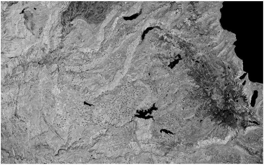
Above: Successful pre-fire NDVI image. 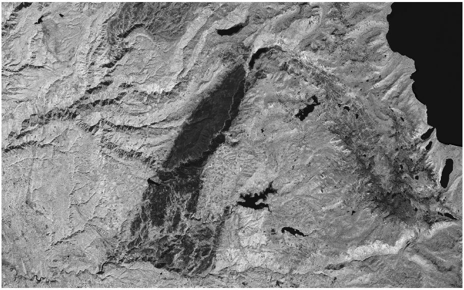
Above: Successful post-fire NDVI image. 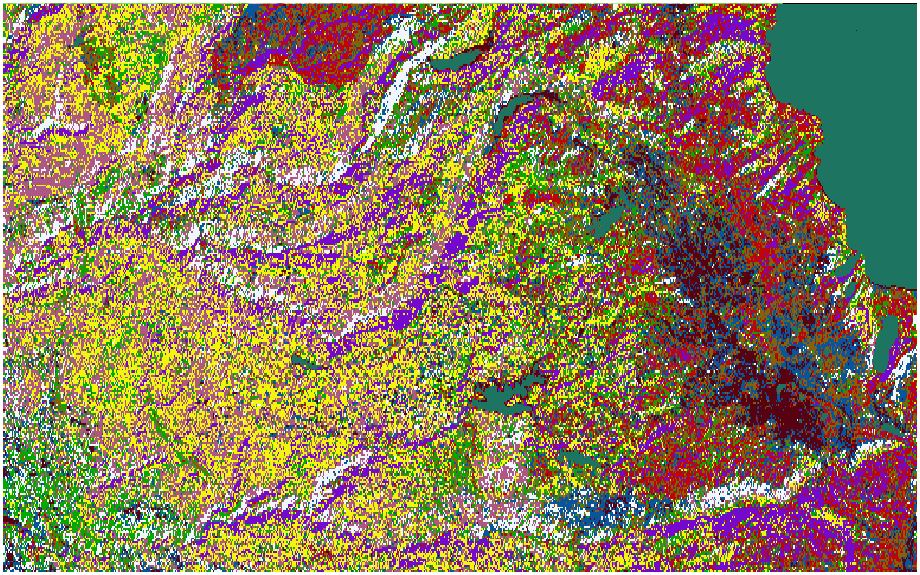
Above: IsoCluster Unsupervised Classification of pre-fire image. 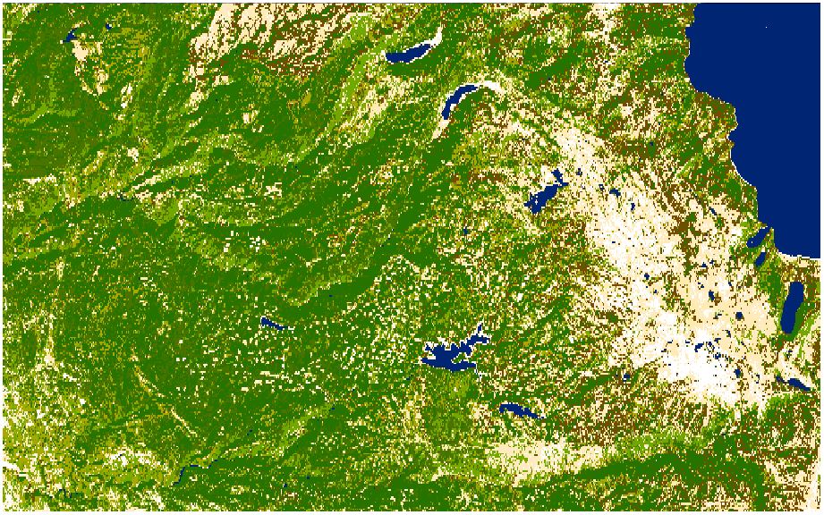
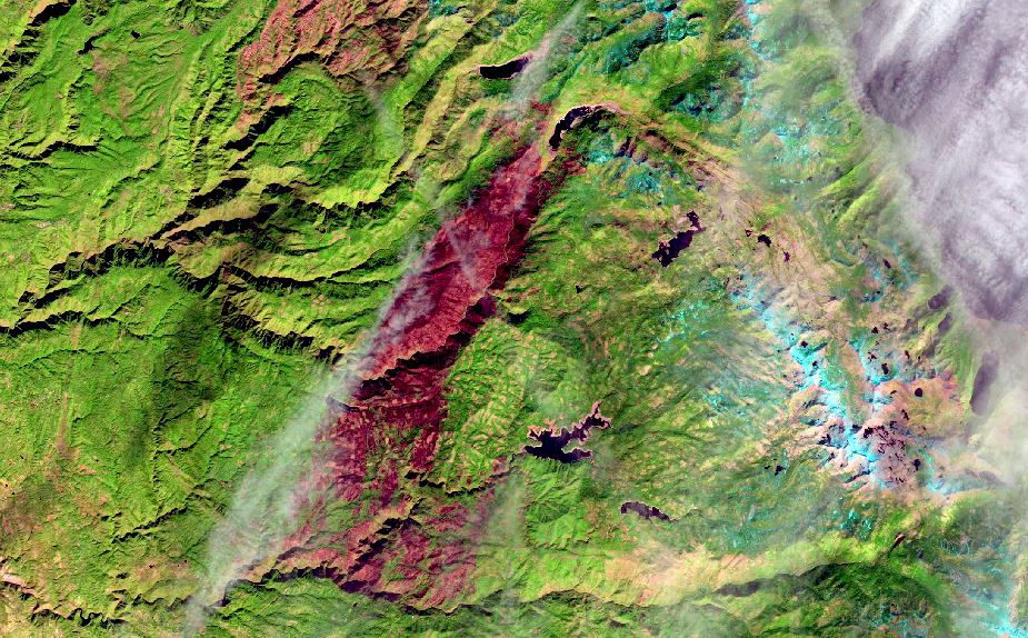
Above: Pseudo-true color reclassification of unsupervised pre-fire image. 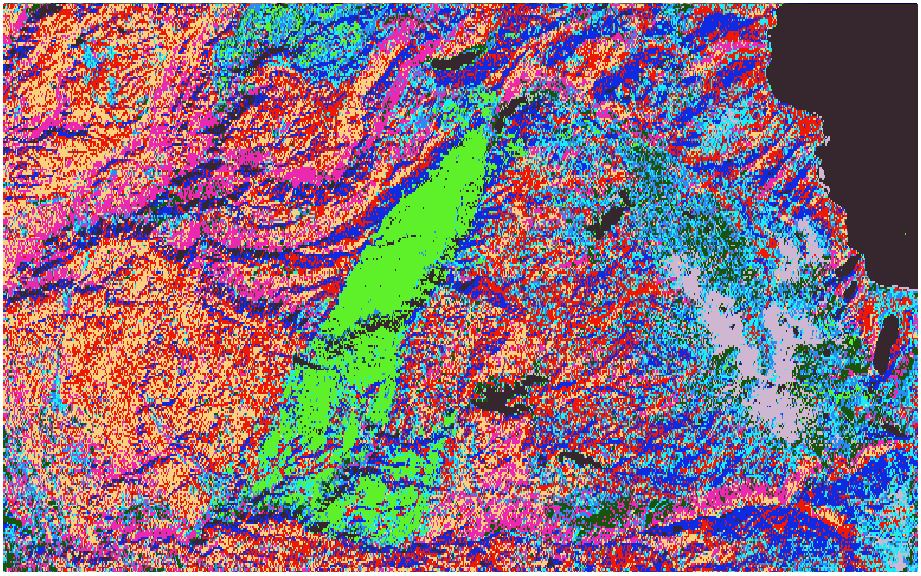
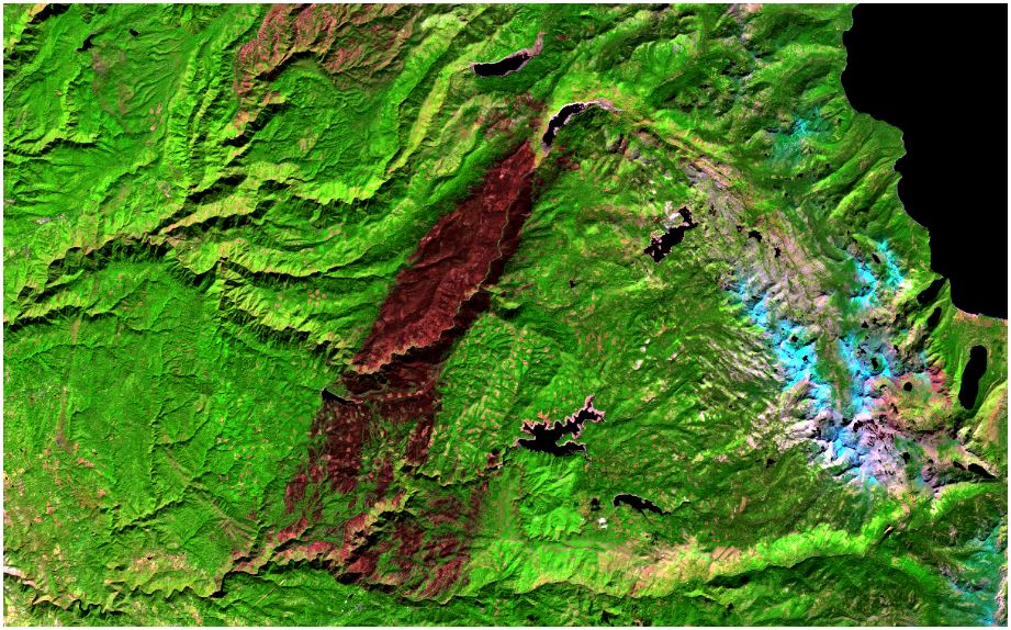
Above: IsoCluster Unsupervised Classification of post-fire image. 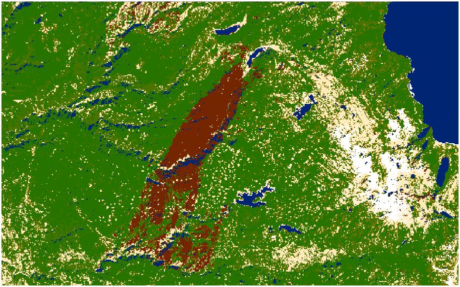
Above: Pseudo-true color reclassification of unsupervised post-fire image. Notice the deep canyons that were misclassified as being water. 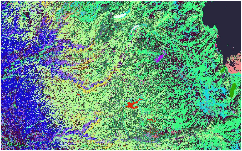
Above: Maximum Likelihood Supervised Classification of pre-fire image. 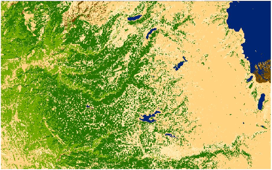
Above: Pseudo-true color reclassification of supervised pre-fire image. Notice the odd brown blotch in the southern portion of Lake Tahoe. 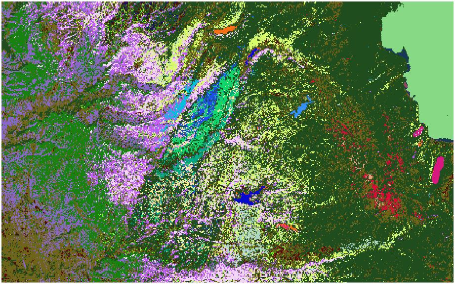
Above: Maximum Likeliehood Supervised Classification of post-fire image. 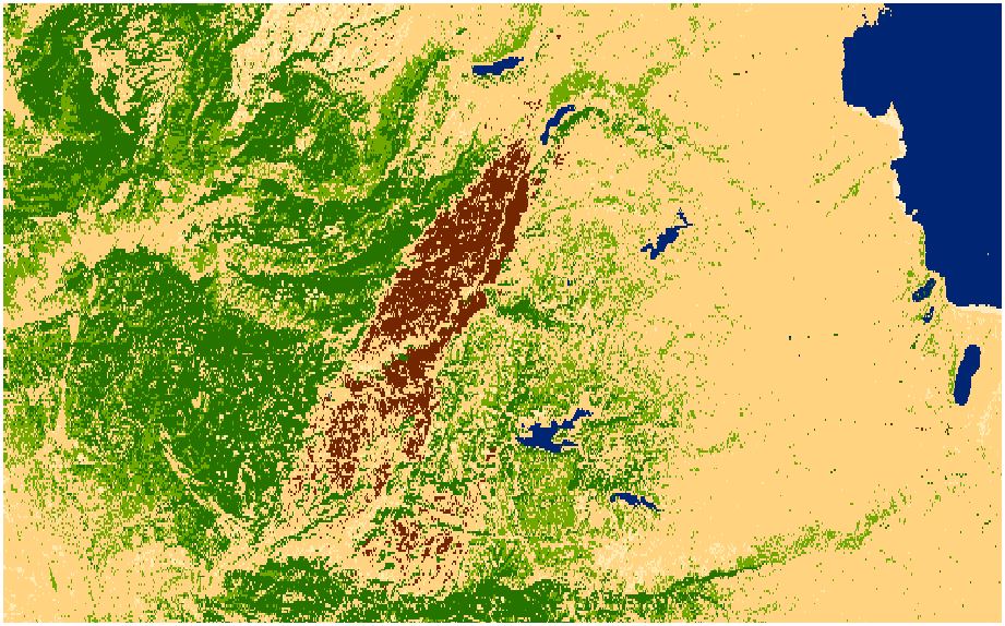
Above: Pseudo-true color reclassification of supervised post-fire image.
| |
|
Analysis While this project was not overly difficult, it was extremely time-consuming. However, that is not to say that I did not experience any difficulties along the way. The first major roadblock came during the NDVI step in the data processing. When I clipped the original images, two temporary image subsets were created. Wanting to use these temporary images in the subsequent data processing steps, I naturally saved them to my working folder. For some unknown reason, however, I could not create NDVI images from these saved images. I attempted to do so about five times, and without fail, ArcMap crashed every single time. I even tried restarting my computer, but ArcMap kept crashing. Finally, I decided to attempt this task with the temporary images, and for whatever reason, it worked! While ArcMap did not crash when using the temporary images, it also did not produce the proper results. The resulting images were light orange in color and almost entirely feature- less, aside from Lake Tahoe in the northeast corner of the image. 
Switching the images into grayscale via the Symbology tab of the Layer Properties made the features appear, but it did not fix the incorrect NDVI values. 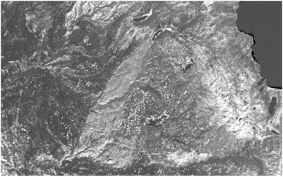
Areas with high NDVI values should have been portrayed by light colors, whereas areas with low NDVI values should have been portrayed by dark colors. Unfortunately, the grayscale image portrayed the King Fire burn scar, Desolation Wilderness, the American Fire burn scar, deforested plots, and the receding shorelines of the nearby lakes and reservoirs as being very light, if not white, in color. This is the exact opposite of how these features should have been displayed. Oddly though, the lakes and reservoirs were properly portrayed as being black, so I could not simply flip the color ramp. With the NDVI tool producing incorrect results, I decided to switch over to the Raster Calculator tool. This tool produced proper NDVI images, but required the added step of importing the individual red and near-infrared bands for both images. The IsoCluster Unsupervised Classifications were performed without any major problems, but did not produce as high of quality land cover classifications as I had expected. As stated in the results section, ArcMap had some trouble differentiating between water and the burn scar in the post-fire image. Additionally, it took a fair amount of time to decipher the classes that were created and set appropriate color schemes for the two images. The Maximum Likelihood Supervised Classification took much longer to execute and produced even worse results. In the pre-fire image, for example, a large portion of southern Lake Tahoe was classified as under the same color as the burn scar from the American Fire at the top of the image. Additionally, both images featured way too much barren soil and not nearly enough vegetation in the classifications. Looking at the reclassified versions of the supervised land cover classifications, I could tell that the results were poor, but I intended to perform an accuracy assessment to verify this, nonetheless. While attempting to view the histograms of the training samples, ArcMap froze on back to back occasions. In this particular case, I think that my laptop's computing power, rather than ArcMap, was to blame. If I had a more powerful machine, I firmly believe that I would have been able to perform an accuracy assessment on the supervised classification images. By this point, however, I was running short on time and patience, so I decided to forgo the accuracy assessment altogether. | |
|
Conclusions While I did not make any groundbreaking discoveries in regards to the impact of the King Fire, I was able to derive some valuable information. Most notably, I observed that the fire raised the minimum NDVI value in the project area and lowered the maximum value. By effect, the fire also reduced the overall range of NDVI values found in this area. This infers that the King Fire burned through some of the unhealthiest and healthiest vegetation in the area. I am unsure as to what this means for the ecosystem in the coming months and years, but I can only hope that a healthier forest will eventually grow back in its place. It would be interesting to see the results of a more in-depth study conducted by a multidisciplinary group of professional scientists comprised of biologists, ecologists, foresters, geologists, and so on. The NDVI values and land cover classifications derived from this remotely sensed imagery simply scratch the surface of the complex web of interactions taking place behind the scenes. While these results provide a helpful glimpse of the King Fire's impact, time and further research will be required in order to paint a more complete picture. | |
|
References Medina, Jennifer. "Fire Season Starts Early, and Fiercely." The New York Times. 2014.05.15 http://www.nytimes.com/2014/05/16/us/as-california-battles-fires-fears-of-worse-ahead.html?hpw&rref=us&_r=2 Last accessed 2014.12.16 Peters, Albert J., Elizabeth A. Walter-Shea, Lei Ji, Andrés Viña, Michael Hayes, and Mark D. Svoboda. "Drought Monitoring with NDVI-Based Standardized Vegetation Index." Photogrammetric Engineering & Remote Sensing 68.1 (2002): 71-75. The Imaging & Geospatial Information Society. American Society for Photogrammetry and Remote Sensing, 2002.02 http://www.asprs.org/a/publications/pers/2002journal/january/2002_jan_71-75.pdf Last accessed 2014.12.03 Wilson, Reid. "California’s Fire Season Has Been Going Nonstop for 18 Months, and There’s No End in Sight." The Washington Post. 2014.09.23 http://www.washingtonpost.com/blogs/govbeat/wp/2014/09/23/californias-fire-season-has-been-going-non-stop-for-18-months-and-theres-no-end-in-sight/ Last accessed 2014.12.16 | |
|
Additional Links NASA on NDVI || USGS EarthExplorer || InciWeb || CalFire || National Geographic || LA Times |