Encroaching Vegetation on Power Lines and Poles (Supervised Classification with NDVI) | |
|
Author Created by: Brandon Hodgkinson American River College, Geography 350: Data Acquisition in GIS; Fall 2016 Contact Information (bdhodgkinson@yahoo.com) | |
|
Abstract Hopefully the the following information will provide insight for the methods used to analyze healthy and non-healthy vegetation. | |
|
Introduction The following presentation is an example of using supervised classification on an image. I selected a section of Highway 50 in California to show vegetation in close proximity to power lines. | |
|
Background I choose to show where vegetation is in relation to power lines and poles. I used a section of Highway 50 in California that has power lines running along it. The section is located between El Dorado Hills and Cameron Park. Because I wanted to show vegetation in relation to power lines I was going to need high enough resolution to see power lines. I tried several different sources to find images that I would be able to use. Cal-Atlas Geospatial Clearinghouse and the USGS Earth Explorer seemed to best selections and at a great price...Free! Landsat7 images were available for the area that I wanted to do but the resolution was not quite as high as I was looking for. There were however higher resolution NAIP (The National Agriculture Imagery Program ) images on their site. | |
|
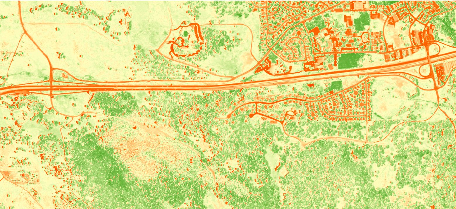
The normalized difference vegetation index (NDVI) is a simple graphical indicator that can be used to analyze remote sensing measurements, typically but not necessarily from a space platform, and assess whether the target being observed contains live green vegetation or not. Here is an example of an image with an NVDI filter applied. Notice the green areas this is the healthy vegitation in the image. |
 |
|
Methods The images I found are three and four band images. The IR band will help in classifying the vegetation. Because I only have the satellite images for my source for the line and pole locations I had to create my own data for the power lines and poles. 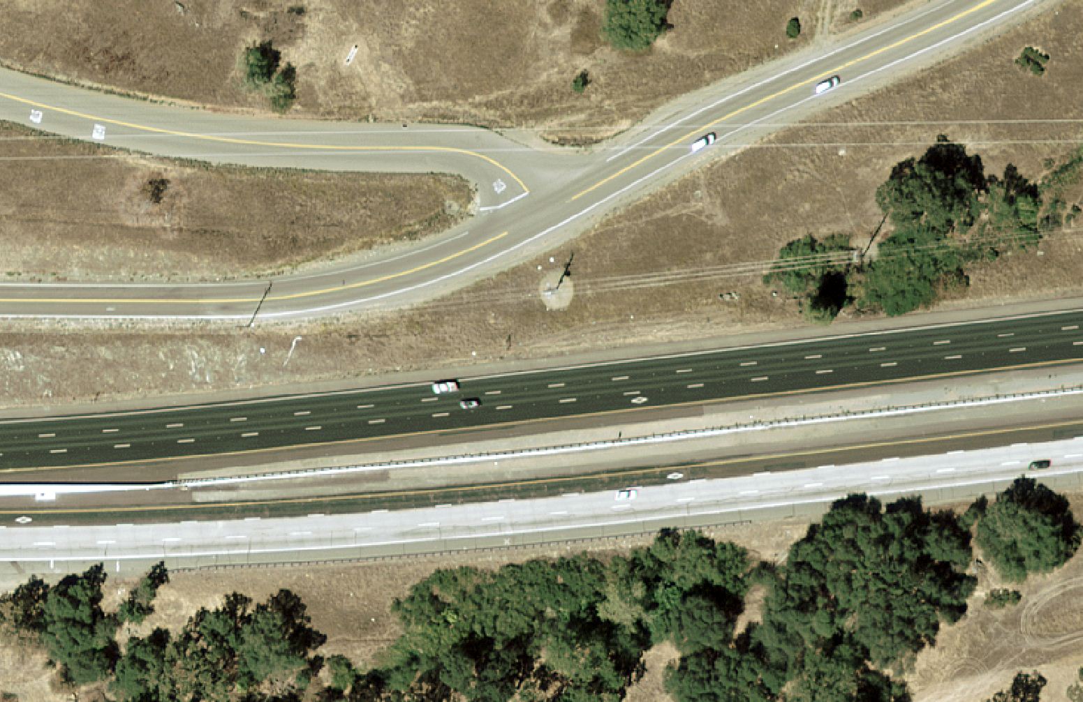 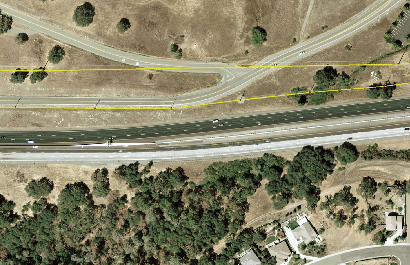 I first tried to digitize on just the 3 band image. I was hoping that since I could see the colors better than in the IR images that I would be more successful in my classification process. I put the samples into 6 classes trees, grass, water, roads, urban, and barren. 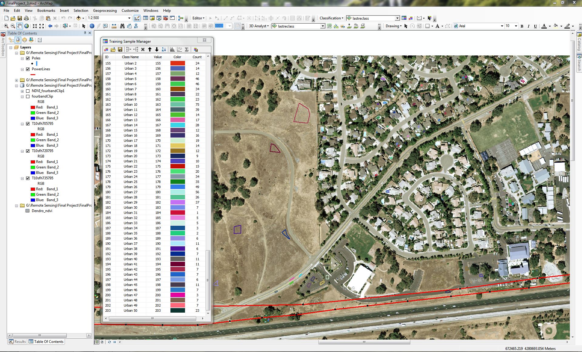 After the digitizing process I created a signature file and then ran the dendrogram tool to look at the way the samples related to each other. The information I got back seemed a bit overwhelming. 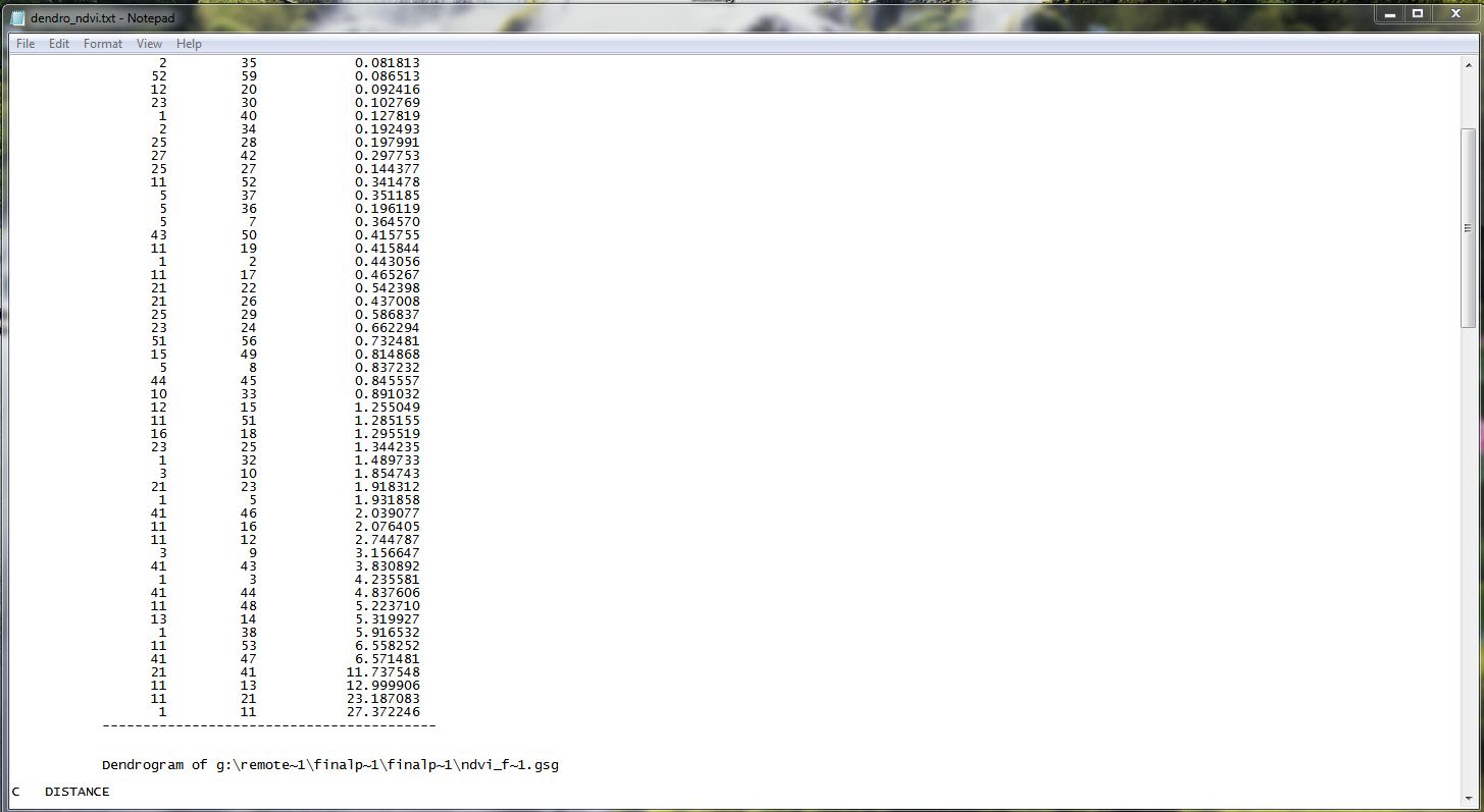 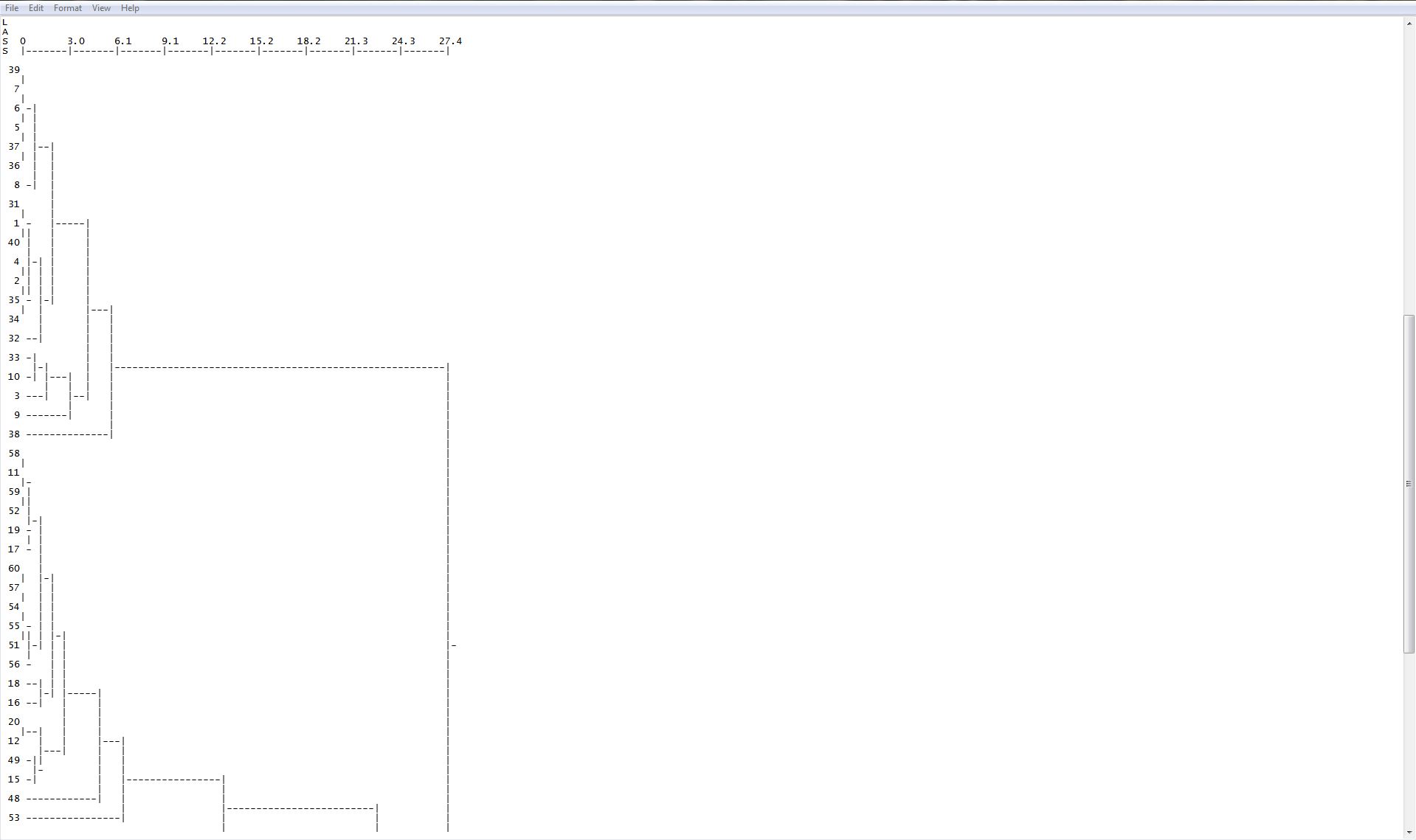 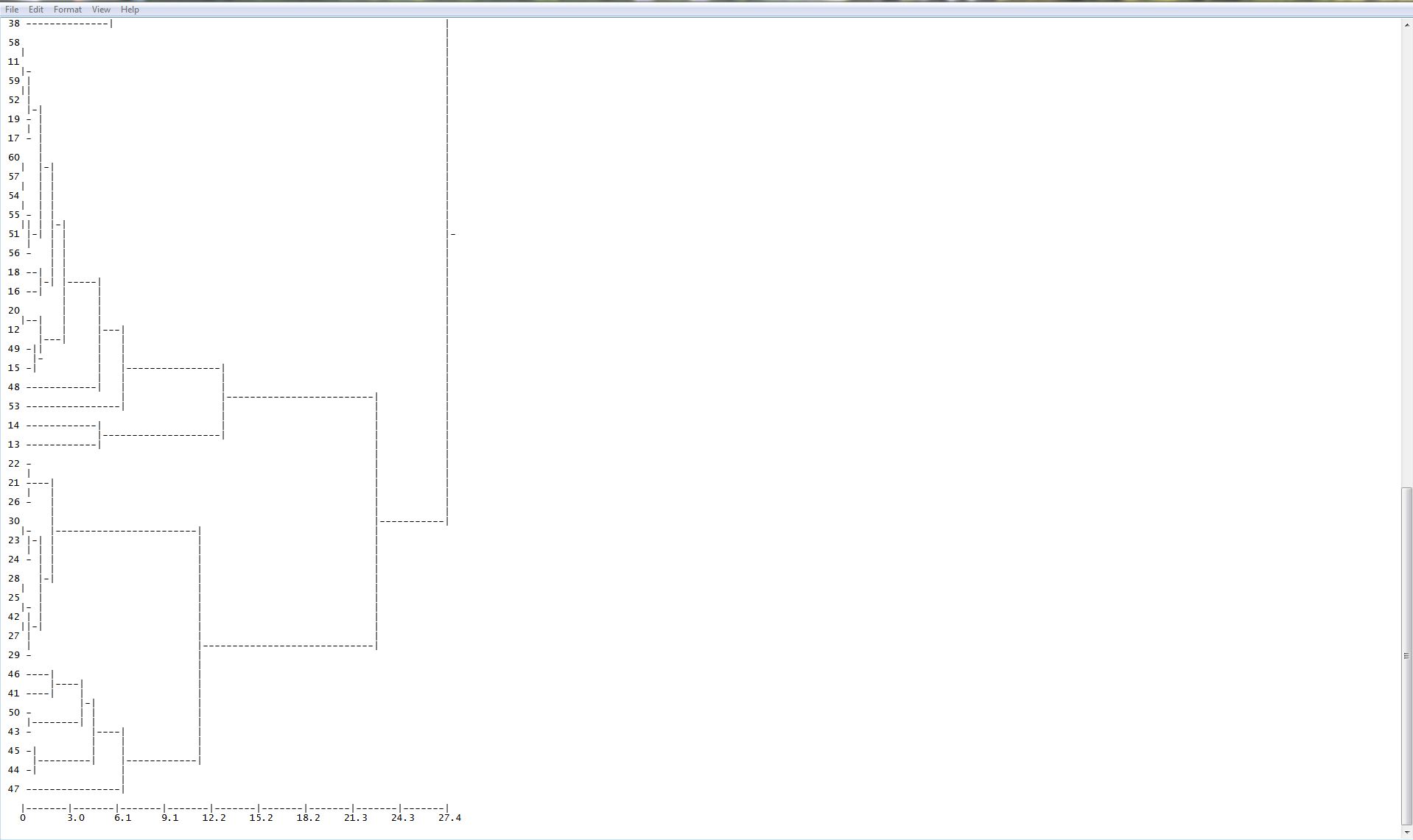 With this information I should have seen that there was to many samples that did not work but I ran the Maximum Likelihood Classification tool. As you can see in the following image the barren, roads, and urban classifications were to similar in my sampling process. The tool was still able to distinguish the vegetation fairly well. 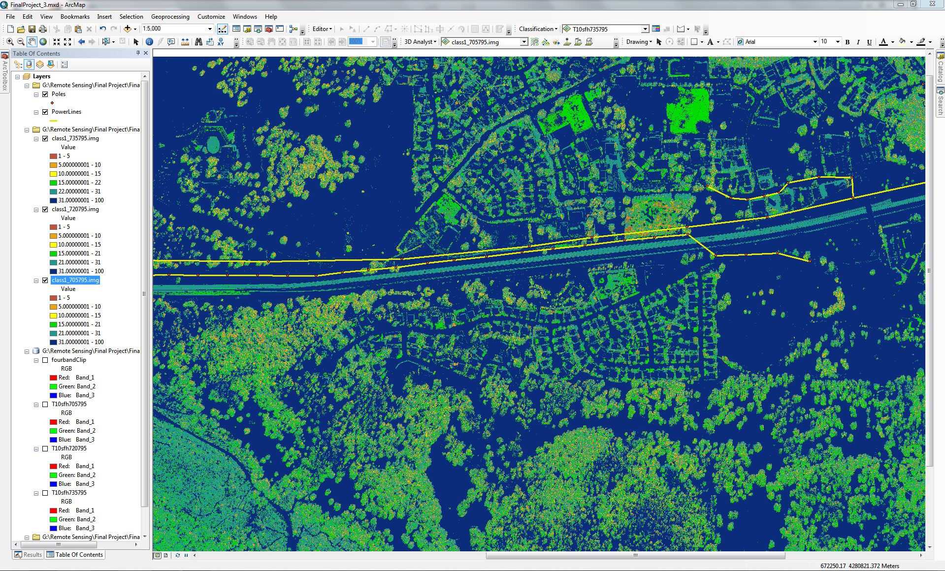 I decided to utilize the 4th band and use IR to help in my processes. After running the NDVI tool on my image I ended up with this image. 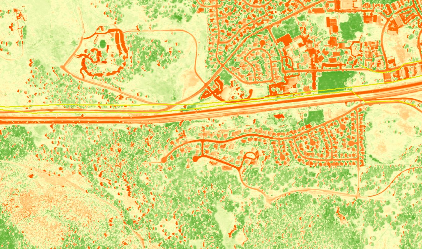 I proceeded to apply the samples to the new IR image but I still seemed to have issues. 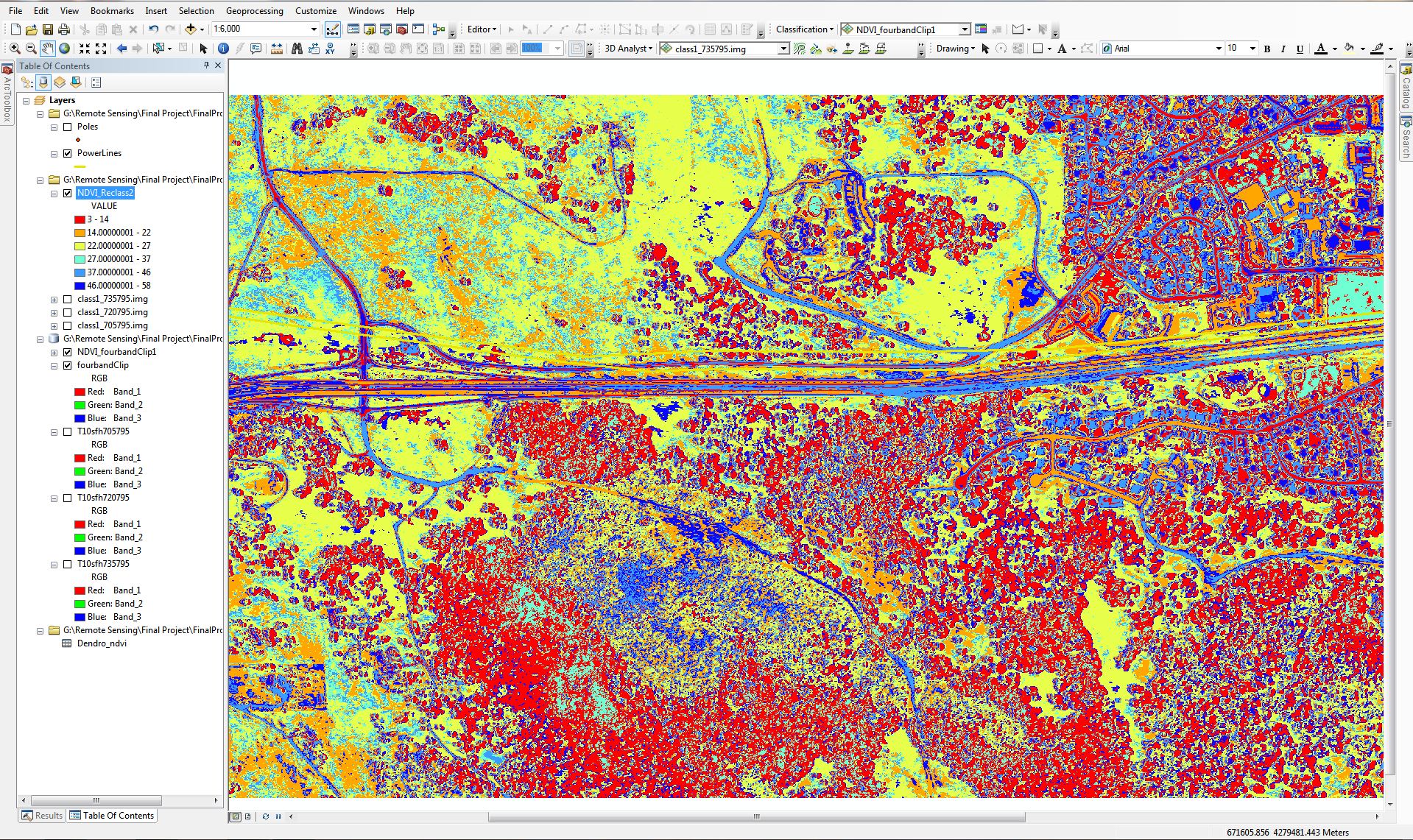 The issue that I am having here is still related to the same issue in the images I originally had. I have way to many samples. Also some of the samples that I took included to many variations in the pixels. I decided at this point it was probably a good idea to start again. I can defiantly say I am getting better at the process. I went through the same steps above 8 or 9 times. Each time I went through the process there would be some samples that would blend with another class. I then took a look at what I was trying to classify. I decided that instead of having 6 different classes I do better with 4 classes trees, grass, urban, and barren. I created new classification samples, dendrogram, and signature files. 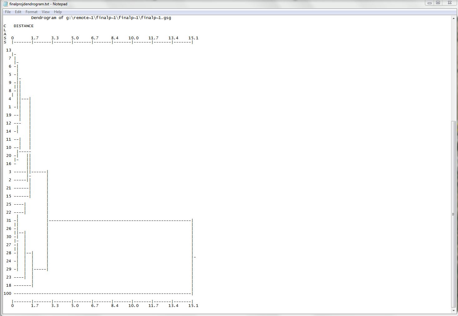 After running the Maximum Likelihood tool I ended up with something that was easier to work with. 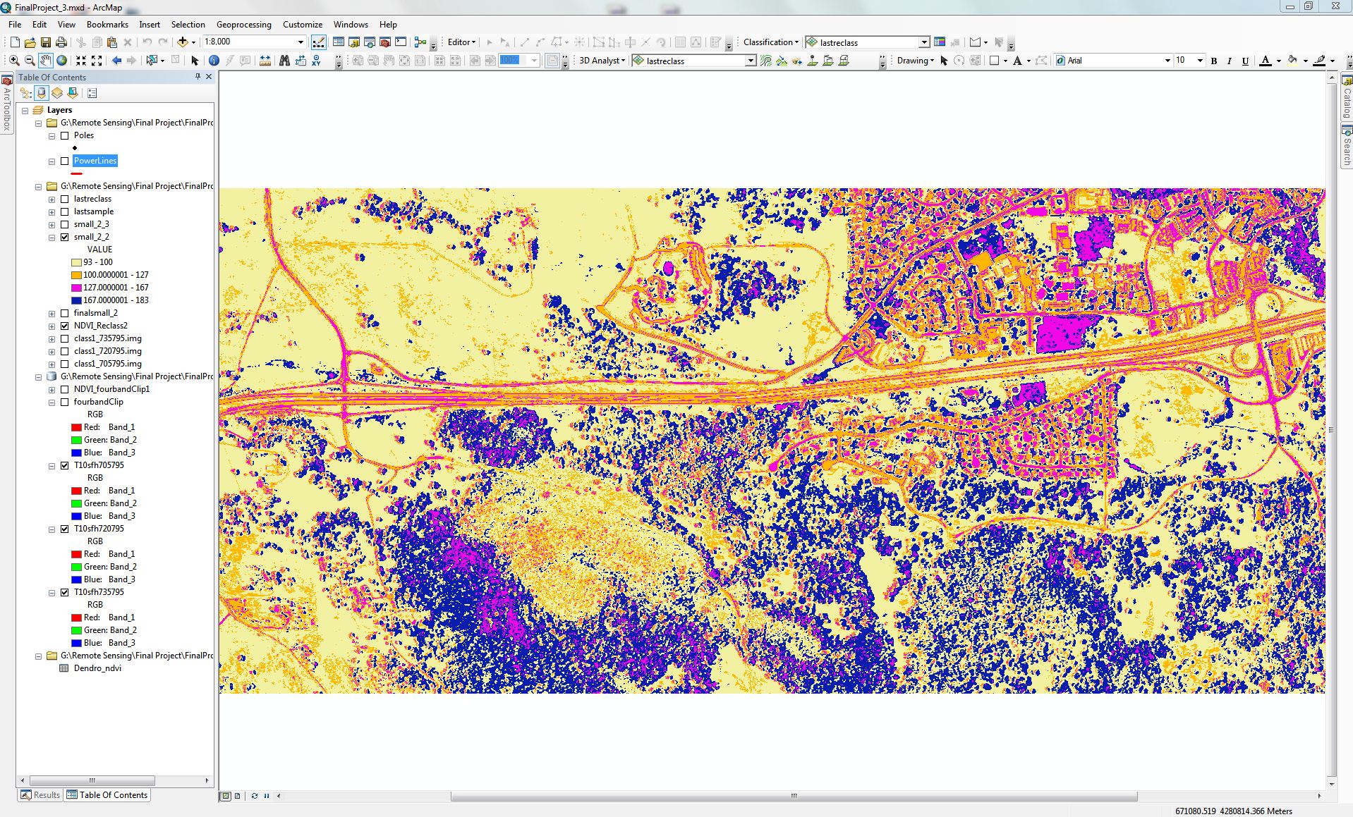 A t this point in the process I had enough to move on to the the next step of reclassifying the values of the samples I took and combine them all into 4 classes. I used the reclassify tool to do this. I then changed the colors of the classifications and labeled them to make more sense. 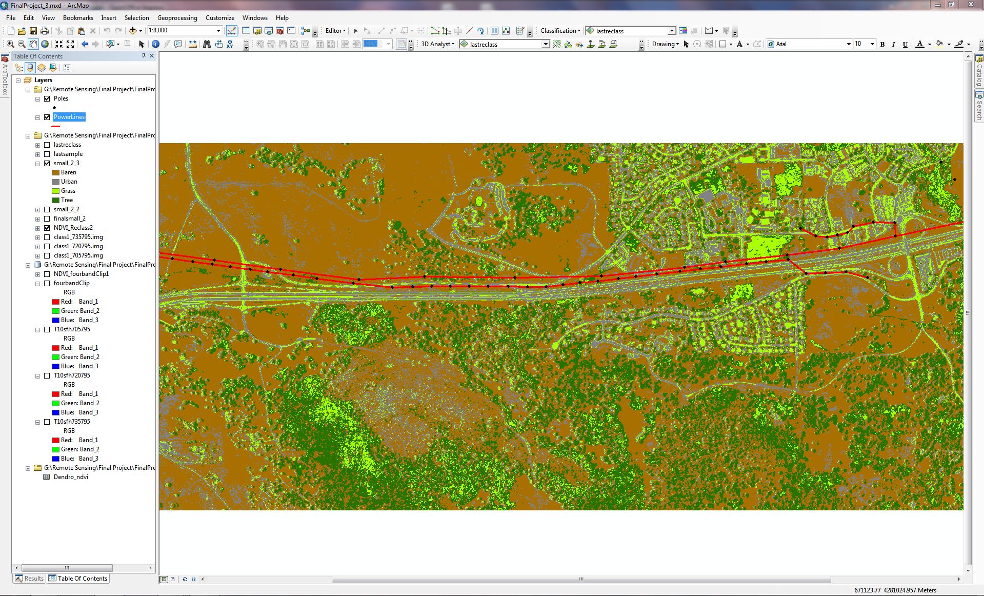 From here I am able to attempt to reach my final goal which is to show encroaching vegetation on power lines and poles. I first created 100 ft. buffer on the power lines using the buffer tool from the Geoprocessing menu. Then I used Data Management Tools -> Raster -> Raster Processing -> Clip. Producing this final image. 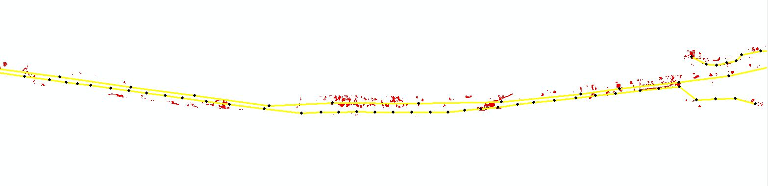 After overlaying this to the original image you can see the areas along the lines that could be checked. If this was done on a large scale you could determine thousands of miles of lines and poles that would and would not need to be checked for encroaching vegetation. 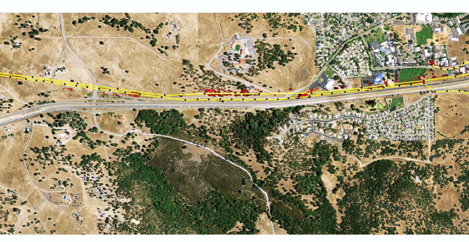 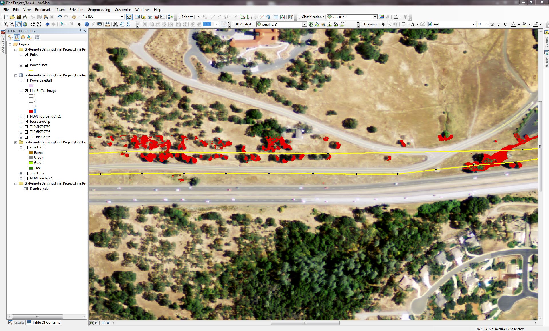 | |
|
Results I was able to accomplish what I wanted from this project. I think that the more I practice the better I become at using supervised classification on images. Clearly the result shows vegitation within a buffered distance of the lines.
| |
|
Analysis Additional research has shown me that there may be better applications to work with the higher resolution images such as eCognition or ENVI
which is other software for image processing. I also think that possibly LiDAR imagery with elevation
models could be incorporated into my data. This would allow the user to see distance between the tops
of trees and the lines elevation levels. | |
|
Conclusions Vegetation management for utility companies could use this
technology to schedule yearly maintenance for territories. They could save time and money by
narrowing down places of greater interest. | |
|
References Normalized Difference Vegetation Index Wikipedia USGS Earth Explorer usgs.gov Cal-Atlas Geospatial Clearinghouse Cal-Atlas ESRI ESRI |