Using GIS to Highlight Environmental Hazards in Sacramento County, CA | |||||||||||
|
Author Informtaion Stefani Lukashov American River College, Geography 350: Data Acquisition in GIS; Fall 2017 Email: stefanipyorre@gmail.com | |||||||||||
|
Abstract The purpose of this report is to understand how GIS can be used to identify common variables between environmental hazards and anthropogenic factors, and use this knowledge to create a comprehensive summary on areas of high hazard in Sacramento County, California. A lot of government datasets have been made public as part of the 2013 Executive Orden, and federal Open Data Policy in an effort to give more power to the general public in terms of transparency and accountability (Data.gov). GIS can not only be used to spatially analyze the distribution of hazard, but to represent the hazards visually as to help the non-scientific population understand the results and help them consider which steps to mitigate hazards are most appropriate. | |||||||||||
|
Introduction Sacramento County is home to many historic cities, including the California Capitol, Sacramento, but it also expanding rapidly in recent years. SFGATE recently published an article on how Bay Area residents are flooding to Sacramento, and U.S. News listed the Sacramento, California metro area #66 of the best places to live (Robertson and Martichoux, 2017; Morales, 2017). Proximity to ocean and mountains, a reasonable cost of living, pleasant weather, and position between the the American and Sacramento Rivers are listed as main reasons why young professionals and middle-class families are flocking to Sacramento County. A higher population means more people exposed to environmental hazards, either in older cities comprised of houses coated in led-based paint, or in newer areas previously not used as residential areas. This study uses just one data source, CalEPA Regulatory Site Portal, as an example to show how hazard data can be analyzed to a create an informational tool for the public. | |||||||||||
|
Background The textbook, Information Systems and the Environment, dedicates a whole chapter to the importance of public access to environmental information (the chapter is named accordingly) (Eagen at al., 2001). The chapter not only highlights the ideas above but includes how the government would be much more effiecient if the public had direct access to the information. This is less of a problem following the recent Open Data Policy of 2013, so the 2001 textbook is outdated in this aspect. However, it summarizes the problem to go further than public access, but educating the public on how to analyze and manipulate such data. The goal of this paper is to provide a framework for a simple analysis of an aggregated environmental database as described in the textbook mentioned above. The CalEPA Regulatory Site Portal is a great aggregated environmental data resource for residents of California that "combines data about environmentally regulated sites and facilities in California into a single, searchable database and interactive map" (CalEPA). While the data is readily viewable, analysis can still be conducted to locate areas of greater or lesser concern, which may help inform anyone from lawmakers to someone looking to purchase their first home so they have the ability to make smarter decisions. The CalEPA Regulatory Site Portal was chosen for this study for a few mains reasons. One, it is published from the California State agency, CalEPA, California Envirnmental Protection Agency, which classifies it as a authorative, relatively unbaised source of data. Two, it is simple for any computer-literate person to download the specific data sets for areas and subjects of interest, with filters readily available from the data portal (i.e. regulatory agencies, originating data system, regulatory programs, evaluation type, enforcment type, and site county). Three, it is specific to the state of California and combines five large following datasets (see below for descriptions): CERS, EnviroStor, GeoTracker, CIWQS, and TRI. Both federal data was not used to minimize the time and effort needed to narrow down data sets that are specific to Sacramento County, and data sets that may not be completely relevant concerns to the area. Research studies were not used to avoid sifting through data that may be too broad or too specific, along with data that may be baised on the basis of the study purpose. From the CalEPA Regulated Site Portal: EnviroStor: Developed for the Department of Toxic Substances Control, this database contains information pertaining to state and federally listed cleanup sites, along with hazardous waste permitted and corrective action facilities. GeoTracker: – Developed for the State Water Resources Control Board, this database contains information about impacted groundwater sites within the state, such as leaking underground storage tanks, cleanup sites, and permitted facilities such as landfills and operating underground storage tanks facilities. CIWQS: The California Integrated Water Quality System (CIWQS) was developed by the State Water Board to manage permitting, compliance and enforcement activities related to sites which discharge to surface water (or otherwise affect surface water quality) throughout the state. Land Use: – The Toxics Release Inventory (TRI) is a federal database that contains detailed information on nearly 650 chemicals and chemical categories that over 1,600 industrial and other facilities in the state manage through disposal or other releases, recycling, energy recovery, or treatment. The data are collected from these facilities by US EPA. The collected data is exchanged to CalEPA and updated automatically through the CalEPA exchange node.
| Methods Before analyzing the dataset of interest, the setting must first be modeled and understood. A recent study on the distribution of lead in Sacramento talks about the importance of urban centers and how it influences traffic density, and thus lead (Solt et al., 2014). While this study is informative about the higher levels of lead in urban centers, the authors could have highlighted the importance of the study by simply quantifying the population at risk, either with graphics or a simple sentence. With GIS, quantifying the spatial distibution of the population allows the reader to draw conclusions about where most of the population resides and which areas of higher concentrations of people line up with areas of higher risk. Three methods were chosen to graphically model the population distribution in Sacramento County as a way to highlight the idea of scale. Starting the the largest scale (smallest units), the 2010 U.S. Census Bureau data on population and housing in California was downloaded for this purpose. To select only the census blocks in Sacramento County, the tool 'Select by Location' was done to select census block features whose centroids fall within the Sacramento County shapefile (www.sacgis.org). This selection was exported and saved as a new shapefile. A new float field was added to the shapefile, and the tool 'calculate geometry' was done as the sizes of census blocks differ greatly and is somewhat dependent on population. With the calculated geometry. a new float field was added, and the 'Calculate Field' tool was used to divide population by the area of the census blocks (Figure 1). Symbolically mapping this with Jenks Natural Breaks, resulted in relatively small numbers, with the lowest field containing hundreds of blocks that had a population of zero, so the smallest range was not visually mapped. At a medium scale (moderate sized units) population was mapped according to zipcode. The census blocks were spatially joined to the zipcode shapefile and the summary field for the populations were used, and again divided by the area of each zipcode polygon (Figure 2). Without dividing by area, each major city besides Isleton was grouped into the same category. For the smallest scale (largest units), population was by city. This shapefile was created the same way as the zipcode, including dividing by the area (Figure 3). This is especially important for this shapefile as unincorperated has a significantly larger area than any of the cities, but does not appear to have the highest concentration of population. Figure 4 is an example of how the data would look is area was not taken into account, using the cities shapefile as an example. Using the CalEPA regulated sites data, a hotspot analysis was performed on the data, along with determining the concenration of sites per school district. After the CalEPA data was downloaded, and the school district shapefiles (www.sacgis.org), the files were brought into the workspace. Just dragging the excel file with the CalEPA data in, and attempting the plot the XY data without defining a coordinate system will lead to the data appearing off the screen. There was no metadata from the CalEPA website on the coordinate system the data was plotted in, but because th XY data were given as latitude and longitudes I tried coordinate systems using degrees as the unit. The EPSG 3857 projection, or GCS_NAD_1983_2011, was a good fit for the data, and the points plotted properly over Sacramento County. However, to conduct the hotspot analysis, the data had to be reprojected to a system that uses smaller units, such as EPSG 26910 projection, orNAD_1983_UTM_Zone_10N, where the linear unit is meters. This is necessary to better define the the search radius parameter with the kernal density tool (ArcGIS, 2016), which was set to 1000, 3000, and 5000, with 5000 (or 5 km) being the fit. Set at a search radius of 5 km, the kernal density tool defines the magnitude-per-unit area of CalEPA sites, with 5 km defining the 'neighborhood' points must fall in to be grouped. The unit size of the returned kernal density raster was set at 100 meters, or 0.1 km, so the scale defines the number of sites per 100 meters (Figure 5). The next analysis done was finding the amount of sites per school district (per area) (Figure 6). This was done in the same manner as representing the population, but using the Count field instead of the Population Field, following the spatial join. Again, area was taken into account. 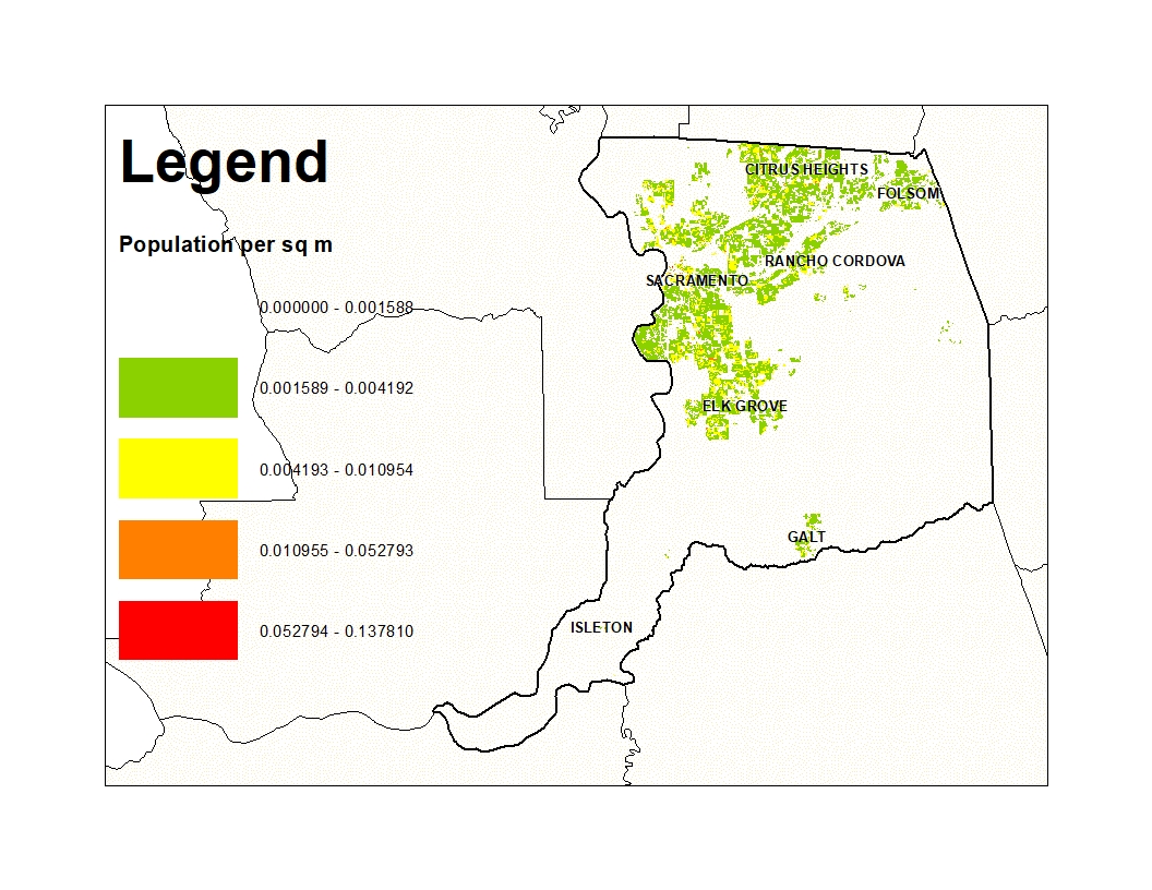 Figure 1: Population by Census Block Area 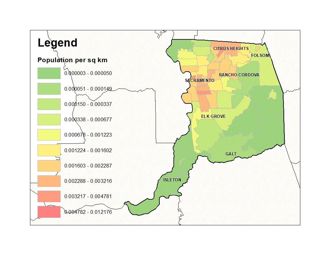 Figure 2: Population by Zipcode Area  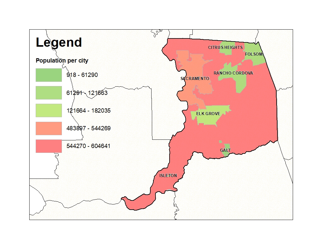
Figures 3 and 4: Population per City Area, and Population of City 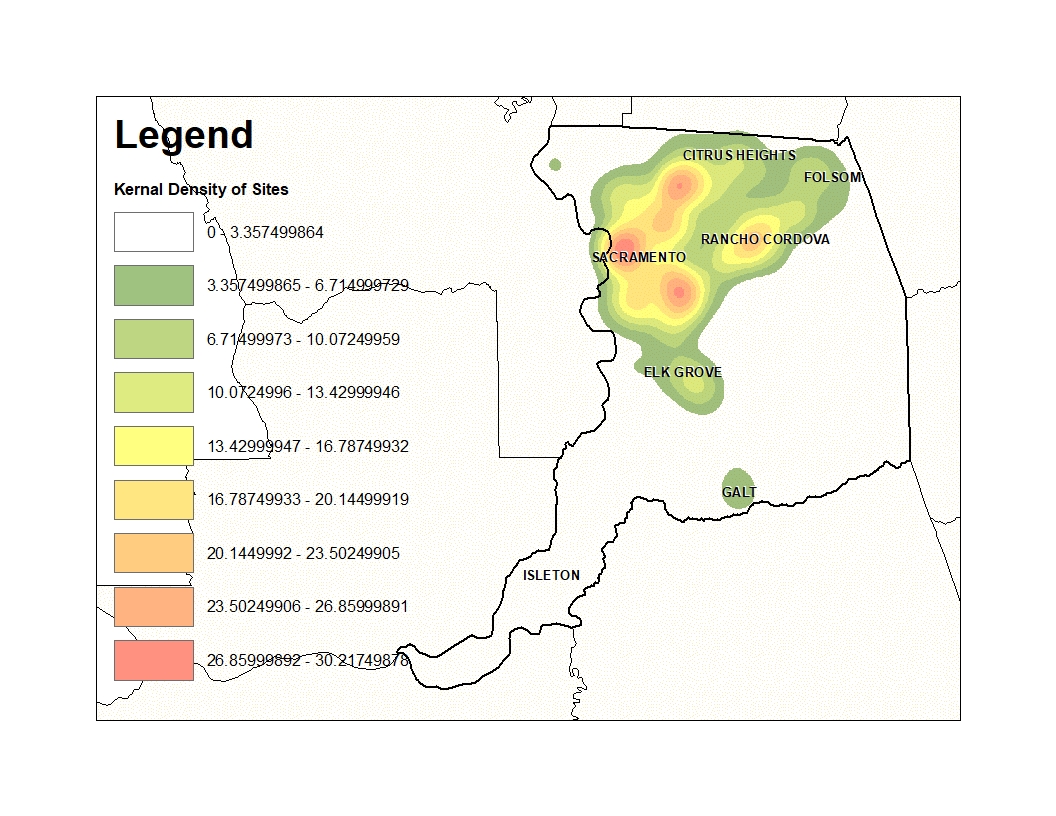 Figure 5: Density of CalEPA Regulated Sites 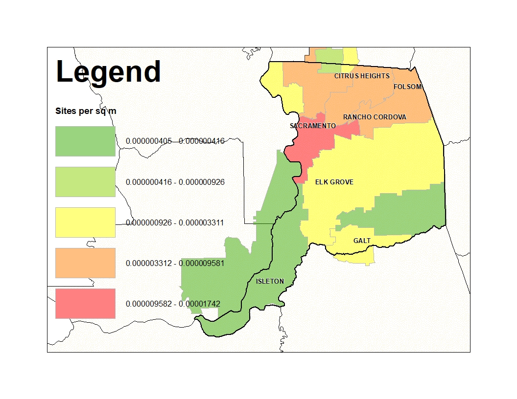 Figure 6: CalEPA Regulated Sites per School District Area
| Results The final results of the analysis give two unique views of Sacramento County, the population distribution, and the CalEPA regulated sites distribution. Again, population was modeled in three ways to highlight how the data looks like at different scales (Figures 1-4). The CalEPA sites were modeled as a function of density and as a relationship to an independent factor, school districts (Figure 5 and 6). All data was projected into NAD 1983, Zone 10N, in order to display the data in a projection made for the study area, and to be able to calculate area with a comprehensible units.
| Analysis The figures highlight areas of higher population concentration in Sacramento County, and also areas of higher CalEPA regulated sites concentrations in Sacramento County. While it is clear, modeling population by zipcode is the best of these three methods, it is certainly not the best way to model population concentration overall. Finding a size between zipcodes and census blocks would most likely be the most informative as it would show the approximate size of neighborhoods within Sacramento County, with their respective population concentrations. Finding a better way to calculate area, so the population per area ranks are in a more understandable format would also make this study better. Providing results that are understandble numerically, beyond just graphically, was the greatest challenge for the study especially with having a substantial size difference between population units. This was attempted better with the kernal density, or hot spot analysis of the CalEPA sites, which is why it is easier to think about the visual data in terms of quantity (such as each pixel represents the a number of sites per 100 meters).
| Conclusions Overall, it is apparent from the data that areas of high population generally correlate with areas of multiple CalEPA regulated sites. There are obviously smaller areas that do not overlap, and another analysis could be done to highlight the areas with a composite ranking map. Different ranks of population density could be assigned a numerical value, and so CalEPA sites could be summarized and ranked for the same defined areas (such as census blocks). These shapefiles could then be spatially joined, and a higher ranking number would signify a high amount of population within an area with a high concetration of CalEPA sites. More time and a better way to analyze population density would be needed further analyze the data as such. Being able to understand the data, what it means, how it can be used, and the best way to graphically model the data can help the public draw conclusions about what the data may mean to them. This study provides a detailed example of ways model data and important spatial concepts to keep in mind when modeling concentrations.
| References CalEPA. 2017. CalEPA Regulatory Site Portal: https://siteportal.calepa.ca.gov/nsite/Dashboard/ . Data.gov. 2017. Open Government: https://www.data.gov/open-gov/ . ESRI. 2017. ArcGIS Pro: How Kernal Density Works: https://pro.arcgis.com . Morales, E. 2017. Best Places to Live: Sacramento. U.S. News Real Estate: https://realestate.usnews.com/places/california/sacramento . National Academy of Engineering. 2001. Information Systems and the Environment. Washington, DC: The National Academies Press. https://doi.org/10.17226/6322 . Sacramento County GIS. 2017. Sacramento County GIS Data Library:http://www.sacgis.org/GISDataPub/Pages/default.aspx . Solt, M. J., Deocampo, D. M., & Norris, M. 2015. Spatial Distribution of Lead in Sacramento, California, USA. International Journal of Environmental Research and Public Health, 12(3), 3174–3187: http://doi.org/10.3390/ijerph120303174 . Robertson, M., and Martichoux, A. 2017. Bay Area residents are flooding Sacramento. What's it really like living there? SFGate:http://www.sfgate.com/bayarea/article/Bay-Area-residents-moving-to-Sacramento-relocating-11243395.php . U.S. Census Bureau. 2017. TIGER/Line with Selected Demographic and Economic Data: https://www.census.gov/geo/maps-data/data/tiger-data.html . |