| Title Love Canal and Chemical Attributed Illnesses | |||||||||||||||||||||||||||||||||||||||||||||||||||||||||||||||||||||||||||||||||||||||||||||||||||||||||||||||||||||||||||||||||||||||||||||||||||||||||||||||||||||||||||||||||||||||||||||||||||||||||||||||||||||||||||||||||||||||||||||||||||||||||||||||||||||||||||||||||||||||||||||||||||||||||||||||||||||||||||||||||||||||||||||||||||||||||||||||||||||||||||||||||||||||||||||||||||||||||||||||||||||||||||||||||||||||||||||||||||||||||||||||||||||||||||||||||||||||||||||||||||||||||||||||||||||||||||||
|
Author Emily Schultz American River College, Geography 350: Data Acquisition in GIS; Fall 2019 Contact Information (email: emily.schultz@usda.gov) | |||||||||||||||||||||||||||||||||||||||||||||||||||||||||||||||||||||||||||||||||||||||||||||||||||||||||||||||||||||||||||||||||||||||||||||||||||||||||||||||||||||||||||||||||||||||||||||||||||||||||||||||||||||||||||||||||||||||||||||||||||||||||||||||||||||||||||||||||||||||||||||||||||||||||||||||||||||||||||||||||||||||||||||||||||||||||||||||||||||||||||||||||||||||||||||||||||||||||||||||||||||||||||||||||||||||||||||||||||||||||||||||||||||||||||||||||||||||||||||||||||||||||||||||||||||||||||||
|
Abstract The Love Canal neighborhood in Niagara Falls, NY was built on top of a 20,000+ ton toxic waste dump during the 1950s (Engelhaupt, 2008). In the following years, residents reported strange substances oozing from the soil, chemical smells in their yards, and children with chronic health issues. Then, in 1978, barrels of toxic waste began pushing through the ground, people’s gardens were dying, and the government couldn’t ignore it anymore (Beck, 1979; CHEJ, 2009; Dabkowski, 2018; Engelhaupt, 2008). After the first round of residents were evacuated, they began testing the remaining residents in the surrounding area, and found a number of them to have various health conditions. These studies were published by the Center for Health, Environment & Justice (“CHEJ,” from this point forward), and were the basis of this project. Though it was believed that these illnesses might be related to historic aquatic features, this project did not find a strong correlation to any one feature, though the geographic data collected was from years post-Love Canal, so it is possible that there are missing pieces lost to history. | |||||||||||||||||||||||||||||||||||||||||||||||||||||||||||||||||||||||||||||||||||||||||||||||||||||||||||||||||||||||||||||||||||||||||||||||||||||||||||||||||||||||||||||||||||||||||||||||||||||||||||||||||||||||||||||||||||||||||||||||||||||||||||||||||||||||||||||||||||||||||||||||||||||||||||||||||||||||||||||||||||||||||||||||||||||||||||||||||||||||||||||||||||||||||||||||||||||||||||||||||||||||||||||||||||||||||||||||||||||||||||||||||||||||||||||||||||||||||||||||||||||||||||||||||||||||||||||
|
Introduction In 1978, the neighborhood of Love Canal in Niagara Falls, NY made national headlines when President Jimmy Carter declared a state of national emergency there after a study performed by the Health Department detected 81 chemicals in the area, resulting from the contents of a buried waste dump in the neighborhood. The area has been found to have abnormally high rates for miscarriages, birth defects, and other health issues (CHEJ, 2009; Dabkowski, 2018; Engelhaupt, 2008). In conducting my research, I came across a publication put out by the CHEJ (2009) with some hand-drawn maps of the Love Canal neighborhood, describing the maladies that struck the residents in this area. It was also mentioned that a creek had once run through the area in the homes that were hit the hardest. Using georeferenced versions of these maps, aerial imagery I found from the area prior to the construction of homes, and an address file from Niagara County, I decided to see if this was is in fact the case in the area, and if there were any other geographic trends with the data I was able to source. Additionally, I was interested in combining the data from each of these maps and representing the full-scale of health issues and having them symbolized on a single map. | |||||||||||||||||||||||||||||||||||||||||||||||||||||||||||||||||||||||||||||||||||||||||||||||||||||||||||||||||||||||||||||||||||||||||||||||||||||||||||||||||||||||||||||||||||||||||||||||||||||||||||||||||||||||||||||||||||||||||||||||||||||||||||||||||||||||||||||||||||||||||||||||||||||||||||||||||||||||||||||||||||||||||||||||||||||||||||||||||||||||||||||||||||||||||||||||||||||||||||||||||||||||||||||||||||||||||||||||||||||||||||||||||||||||||||||||||||||||||||||||||||||||||||||||||||||||||||||
|
Background Love Canal is located in Niagara Falls, NY, not far from the Niagara River. In 1834, a man by the name of William T. Love was aiming to harness the power of the mighty Niagara, and to use it to generate electricity for his “Model City.” He began construction of a canal, however, in 1836, he lost all funding after Nikola Tesla’s discovery of alternating current, and abandoned the project (Beck, 1979; CHEJ, 2009; Dabkowski, 2018; Engelhaupt, 2008). The ditch eventually became a local swimming hole (Dabkowski, 2018; Engelhaupt, 2008), but by the 1920s, the partially dug canal began being used as a dump site. Initially, municipal and industrial wastes were dumped here (Beck, 1979; CHEJ, 2009; Dabkowski, 2018; Engelhaupt, 2008), and in the 1940s, local chemical production ramped up with the growing demand for organic herbicides and pesticides, and the waste products from their production also found their way to Love Canal (Dabkowski, 2018). In the 1950s, development of a residential neighborhood began in the area, and the then owners of Love Canal, Hooker Chemical Company, covered the site and offered it to the Niagara Falls Board of Education for a dollar, who had the intent of building an elementary school there (Beck, 1979; CHEJ, 2009; Dabkowski, 2018; Engelhaupt, 2008). Though reports of weird substances oozing up from the ground occurred over the years in the Love Canal area, and there was a high incidence of various health conditions, it wasn’t until 1976 when the problems started getting really bad for Love Canal residents. The area had received heavy rains for several years, causing the water table to rise. Reports of chemical seepages in yards came in from the residents, and state departments came in and began testing in the area (CHEJ, 2009; Dabkowski, 2018; Engelhaupt, 2008). By 1978, barrels containing chemicals were observed pushing up from the earth, and the landscaping was dead or dying (Beck, 1979). Not only were there chemical pools visible throughout the neighborhood, but the area also had a detectable chemical odor about it (Beck, 1979; Engelhaupt, 2008). The State of New York purchased homes affected by the toxins in the Canal, and evacuations began shortly thereafter. Families with children and pregnant woman were evacuated first (Beck, 1979; CHEJ, 2009; Dabkowski, 2018; Engelhaupt, 2008), and by the early 1980s, over 900 families were evacuated from the Love Canal neighborhood. Research conducted on residents of Love Canal showed they may be at higher risk for liver abnormalities, lung cancer (CHEJ, 2009; Dabkowski, 2018; Engelhaupt, 2008), have higher white-blood cell counts (Beck, 1979), and generally, were more prone to have health issues (CHEJ, 2009; Dabkowski, 2018; Engelhaupt, 2008). Children born in the area were found more likely to have birth defects (Beck, 1979; CHEJ, 2009; Dabkowski, 2018; Engelhaupt, 2008), had lower birth weights, were more likely to have general health issues (Dabkowski, 2018; Engelhaupt, 2008), and women were at a greater risk of having a miscarriage (Beck, 1979; CHEJ, 2009; Dabkowski, 2018; Engelhaupt, 2008). Once the initial evacuations began in the Canal area, residents outside of the evacuated area began to push for studies to be conducted on the rest of the neighborhood to determine the extent of the effects of the toxins, and to help them to get out of their homes. A volunteer scientist, Dr. Beverly Paigen of Roswell Memorial Institute in Buffalo, assisted with the studies, and interviewed families that hadn’t yet been evacuated from the Love Canal area. When the study was completed, hand-drawn maps were created to give the generalized locations of where the reports of health conditions occurred (CHEJ, 2009; Engelhaupt, 2008). It is these maps that I decided to use for my project, in an attempt to quantify the data and present how Love Canal affected the lives of those living here. As part of the remediation efforts at Love Canal, a clay cap (CHEJ, 2009; Dabkowski, 2018) and a leachate system were installed around the original canal (CHEJ, 2009; Engelhaupt, 2008). In 1985, a polyethylene liner was added to ensure that the chemicals were no longer able to leach through the surface (U.S. EPA, 2008), and monitoring stations (in the forms of wells) were set up in the area (CHEJ, 2009; Engelhaupt, 2008). What should be noted is that these wells were installed after the addition of the polyethylene liner (added to the site in 1985), between the years of 1985-1987 (U.S. EPA, 2008), so there is no baseline information for any water quality data they may collect from here (CHEJ, 2009). | |||||||||||||||||||||||||||||||||||||||||||||||||||||||||||||||||||||||||||||||||||||||||||||||||||||||||||||||||||||||||||||||||||||||||||||||||||||||||||||||||||||||||||||||||||||||||||||||||||||||||||||||||||||||||||||||||||||||||||||||||||||||||||||||||||||||||||||||||||||||||||||||||||||||||||||||||||||||||||||||||||||||||||||||||||||||||||||||||||||||||||||||||||||||||||||||||||||||||||||||||||||||||||||||||||||||||||||||||||||||||||||||||||||||||||||||||||||||||||||||||||||||||||||||||||||||||||||
|
Methods The biggest part of this project was data acquisition. Though there are several GIS data clearinghouses that cover the Love Canal Area, not all data is easily – or freely – accessible. I was able to download GIS datasets from both state and county websites, and found aerial imagery not only on the USGS EarthExplorer website and the state links, but also from the State University of New York at Buffalo (SUNY Buffalo), which hosts a historic photo collection of the area. I even contacted library staff at SUNY Buffalo in attempts to gain a free parcel polygon for the area, but they were unable to locate one for me. Once I had more data than I knew what to do with, I began to start sifting through it, trying to determine what layers were of some value, and what were in excess. Some of the datasets I acquired didn’t have any relevant GIS data for the area, others covered the entire state but were treasure troves of information. More than a handful were polygon shapefiles that contained links to external information, and once the shapefile was loaded an additional search on the internet was required to find the desired information. Since I didn’t really know what to expect from a lot of these downloads, I started with them all in a single folder, added them to a map, and looked at each one individually. Once I had the opportunity to assess the file, it was clipped to Niagara County and entered into a geodatabase for reference, and the original file was transferred to the appropriate folder in the catalog system. As I started organizing the files in the Niagara County geodatabase, I began updating their metadata in preparation for export to my final Love Canal geodatabase. Aerial imagery in years of interest (I used these mostly as reference files for editing my address point file) was georeferenced, and those I chose not to use were added to a folder I created to store alternate data that I might want in the future. After I developed my reference files, I was able to go into the address point file and start adding the missing locations from the health study maps. The locations of the missing residences were estimated using aerial imagery mostly from 1978, but occasionally the 1972 and even current imagery was able to help out some. Additionally, included in the health maps was an overview of the study area, and I was able to use this in areas where the homes might have been obscured in the imagery. To make it easier to see the imagery beneath the health maps, I turned off the background values of the raster (this was done by setting the symbology to “stretched,” and I entered a value of 255 for the background color), and added a transparency of 35%. As the maps were originally created to mask the location of the homes associated with the health issues to protect the identity of those in the survey, this task was challenging at times. However, combined with the aerial imagery it still served as a useful tool since my primary purpose was to display the data spatially, and quantify the values. If the locations were a little off, though it was not preferable, it was still workable for my purposes. The address points I added were in approximation, are without any of the attribute data the others might have, and may represent duplicates as not all of the points in the original address shapefile landed exactly on a house, but this was able to convey the general idea of the degree of illnesses this area was dealing with. Any points outside of the study area were removed to reduce clutter. See Figure 1 below for the final point layer that was created. 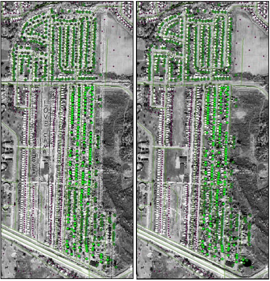 Figure 1. The above image shows how new points were added to the original Niagara County address shapefile. Final Love Canal address points are represented by the large green circles, while the original point file from Niagara County can be observed in the smaller pink dots. The point file layers on the left can be seen displayed over the study area map of Love Canal from CHEJ, and is the basis for my project. 1978 aerial imagery courtesy of SUNY Buffalo's photo archive. Figure 1. The above image shows how new points were added to the original Niagara County address shapefile. Final Love Canal address points are represented by the large green circles, while the original point file from Niagara County can be observed in the smaller pink dots. The point file layers on the left can be seen displayed over the study area map of Love Canal from CHEJ, and is the basis for my project. 1978 aerial imagery courtesy of SUNY Buffalo's photo archive.After the points were added to my satisfaction, I began to georeference the rest of the health maps from CHEJ’s 2009 publication, and as each map was ready to use, I started adding attributes to my address point file (see Figure 2 for an example). To do this, I would add a field reflecting the map I was working on, and then selected points would be given a 2-letter code using the field calculator. Since there were four health maps of interest, and you can only symbolize by 3 attributes in ArcMap, I decided to add an additional field where I did a concatenation of the values from each of the health maps, and used this to display my final representation. Map 5 from the FactPack was not used, as it was unclear as to whether it was representing the combination of the diseases in the previous four maps, if it was other miscellaneous maladies reported in the area, or if it was a combination of both. The only explanation provided in the CHEJ publication was that it showed “all diseases combined,” (pg 10) so it was left out of this analysis, and possibly reduces the actual amount of illnesses reported in this area. This might also account for the areas in Figure 3 below, where homes are darkened but attribute data is not present. Figure 3 shows the final dataset with the CHEJ study area map overlaid on the 1978 aerial imagery. As a final step, I added elevation data to this table using the “Add Surface Information” tool with information from the 1995 DEM layer, for use in later analysis. 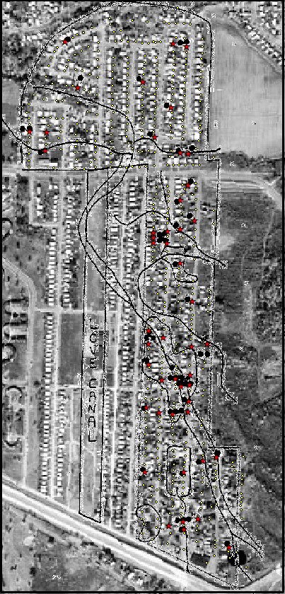 Figure 2. An example of one of the CHEJ maps I took attributes from for my final point layer. Black dots are from the original dataset showing where instances of illnesses occurred, and the red stars are approximations of their locations. Houses not experiencing health issues (in this case, miscarriages and crib deaths) are shown in yellow. 1978 aerial imagery courtesy of SUNY Buffalo's photo archive. Figure 2. An example of one of the CHEJ maps I took attributes from for my final point layer. Black dots are from the original dataset showing where instances of illnesses occurred, and the red stars are approximations of their locations. Houses not experiencing health issues (in this case, miscarriages and crib deaths) are shown in yellow. 1978 aerial imagery courtesy of SUNY Buffalo's photo archive.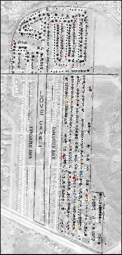 Figure 3. The final point layer, shown with the original study area map in the background. Black dots in the shapefile represent homes where there was no documentation of illness in this study. The darkened locations on the CHEJ study area map not represented in the point file are most likely related to leaving out Map 5 from CHEJ FactPack. The complete map with symbology definitions can be viewed in Figure 6. 1978 aerial imagery courtesy of SUNY Buffalo's photo archive. Figure 3. The final point layer, shown with the original study area map in the background. Black dots in the shapefile represent homes where there was no documentation of illness in this study. The darkened locations on the CHEJ study area map not represented in the point file are most likely related to leaving out Map 5 from CHEJ FactPack. The complete map with symbology definitions can be viewed in Figure 6. 1978 aerial imagery courtesy of SUNY Buffalo's photo archive.In addition to the 1972, 1978, and 1981 aerial image I used for this project, I was also lucky enough to find a photo that covered the lower portion of the study area from 1928. This photo shows the original canal, and a stream that CHEJ researchers thought might be related to some of the illnesses observed in this area, as it might have been a possible delivery system for the contaminants in the area. Figure 4 shows a portion of the 1928 aerial imagery and compares it to how it was developed in 1978. You can see some of the wetter areas were never developed, while others they simply filled in so that they could build houses on top of them. 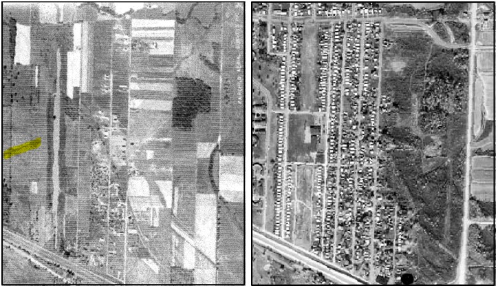 Figure 4. Aerial imagery retrieved from the SUNY Buffalo historical imagery archive. The photo on the left is from 1928, and is marked with an arrow that points to the original canal (highlighting was added to make it stand out). A stream can also be observed in the upper right hand corner of the image and along the right-hand side, as well as running through the middle and heading towards the canal. The photo on the right shows the same area as it was developed in 1978. Any differences that might appear in the location of places on the images are most likely errors related to the georeferencing process. Figure 4. Aerial imagery retrieved from the SUNY Buffalo historical imagery archive. The photo on the left is from 1928, and is marked with an arrow that points to the original canal (highlighting was added to make it stand out). A stream can also be observed in the upper right hand corner of the image and along the right-hand side, as well as running through the middle and heading towards the canal. The photo on the right shows the same area as it was developed in 1978. Any differences that might appear in the location of places on the images are most likely errors related to the georeferencing process.For comparing soil data to the illnesses associated with properties, several steps were involved. After the dataset was downloaded from the NRCS website, it took some figuring out how to actually make the data useful. I was lucky enough to stumble across a website that provided information for everything from downloading the Soil Data Viewer to running reports and creating maps (Davis, n.d.). It took some time to get through all this, and then in order to read the report outputs from the tool I had to install an update for a language tool in Adobe that I was lacking. Once I got through all this, it took some messing around with, but I was finally able to get some data out of these layers for my report, which can be viewed below in the "Results" section. | |||||||||||||||||||||||||||||||||||||||||||||||||||||||||||||||||||||||||||||||||||||||||||||||||||||||||||||||||||||||||||||||||||||||||||||||||||||||||||||||||||||||||||||||||||||||||||||||||||||||||||||||||||||||||||||||||||||||||||||||||||||||||||||||||||||||||||||||||||||||||||||||||||||||||||||||||||||||||||||||||||||||||||||||||||||||||||||||||||||||||||||||||||||||||||||||||||||||||||||||||||||||||||||||||||||||||||||||||||||||||||||||||||||||||||||||||||||||||||||||||||||||||||||||||||||||||||||
|
Results Unfortunately, the 1928 aerial imagery does not cover the entire Love Canal study area, but it does cover the area where it is possible to observe a historic stream running through the area and into the canal. Figure 4 above shows a clean view of the 1928 landscape, while Figure 5 shows the 1928 imagery overlaid with the study area points. The wet areas shown on the health maps can be a little bit harder to see on this photo, but there appears to be some sort of change on the landscape in vegetation, so that could be a result of the areas being wetter. However, it's hard to say conclusively that these wet areas are related to any trends in illness data collected. 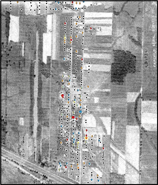 Figure 5. Aerial imagery from 1928 overlaid with the health map data. Data from this study is pretty scattered, and no discernable patterns appear in the locations of homes with illnesses and their proximity to historical wet areas. 1928 aerial imagery courtesy of SUNY Buffalo's photo archive. Figure 5. Aerial imagery from 1928 overlaid with the health map data. Data from this study is pretty scattered, and no discernable patterns appear in the locations of homes with illnesses and their proximity to historical wet areas. 1928 aerial imagery courtesy of SUNY Buffalo's photo archive.Since the 1928 aerial imagery was a little difficult to interpret and didn’t cover the entire study area, I decided to overlay my results on a DEM file and see if it was possible to see any of the historic streambeds. As the actual Love Canal dumpsite has been remediated, and part of the process involved covering it with a clay cap, it’s not helpful in this immediate area. When the point file layer is overlaid on the DEM, it appears as if there might be some trends, however, this area is relatively flat, and it’s hard to say for sure even with the contours overlaid on the map (Figure 6). Generally speaking (using a visual analysis), homes that were built in areas with higher elevations (or those that are in the lighter areas on the DEM) do not look as if they reported as many – if any – health issues during the study. In these areas of higher elevation, it seems as though the houses are less clustered that were reporting health issues, and those that did only fell into one of the health issue categories from this study. Those homes reporting multiple health issues, or areas where the reports were more clustered, appear to be in those areas that are lower in elevation, represented by the darker colors on the DEM. To try and verify this, I added elevation data to the points using the DEM information to see if I could discern any trends. Table 1 shows that even when converted to feet, there is no general trend in the elevation data. Actually, several of the health issue minimum elevations are greater than the minimum elevation for the residences with no reported health issues, and there are maximum elevations for those residences that had health issues that were greater than those that did not. As mentioned earlier, this area is relatively flat and shows a difference of under nine and a half feet. It’s also important to remember that the DEM is from data collected in 1995, so it’s almost two decades between the Love Canal tragedy and when this elevation data was collected. 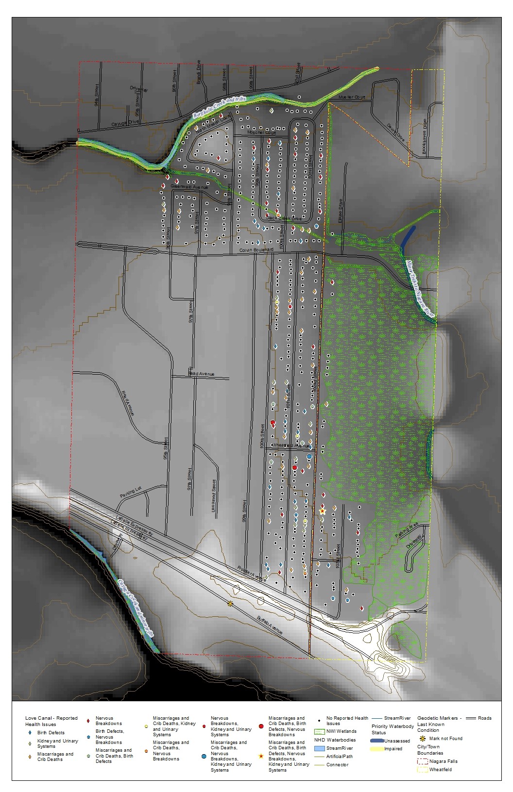 Figure 6. Love Canal study area overlaid on DEM. Inspection of the health map attributes shows that many of the homes reporting multiple health issues appear to be in areas of lower elevation. Current National Wetland Inventory, National Hydrology Layers, and New York State Priority Waterbody layers depict wet areas in the Love Canal neighborhood. 1995 DEM courtesy of Cornell University Geospatial Repository. Figure 6. Love Canal study area overlaid on DEM. Inspection of the health map attributes shows that many of the homes reporting multiple health issues appear to be in areas of lower elevation. Current National Wetland Inventory, National Hydrology Layers, and New York State Priority Waterbody layers depict wet areas in the Love Canal neighborhood. 1995 DEM courtesy of Cornell University Geospatial Repository.Table 1. Comparison of residences in the Love Canal Study area and the type of health issues faced versus elevation data for those ailments.
The Love Canal study area is also surrounded by several creeks and wetlands, and to the south by the Niagara River. Additional information that was available in the Priority Waterbody Status shapefile from the New York State Department of Environmental Conservation (NYSDEC) provides links to pdfs containing detailed information on the impaired waterbodies found in the Love Canal area. Both Bergholtz and Cayuga Creeks, and their minor tributaries, are considered to be impacted waters (NYSDEC, 2003 and 2010). Cayuga Creek and its tributaries are known to be contaminated with chemicals such as dioxin, nickel, zinc, and pesticides, and these are reported to come from toxic contaminated sediment, as well as urban and storm runoff. Officials advise not eating fish from these waters, and macroinvertebrate sampling that took place in 2005 showed that sensitive species were absent or in smaller numbers than would be expected in a healthy watershed (NYSDEC, 2010). Bergholtz Creek is known to have PCBs from toxic contamination and runoff, and is suspected to be contaminated with phosphorus, pathogens, metals, and pesticides from landfill and other sources. Fish consumption from these waterbodies is restricted, and macroinvertebrate sampling from 2000 showed that species in these waters were dominated by sewage-tolerant sowbugs (NYSDEC, 2003). The data for these creeks was collected over 20 years after residents first started being evacuated from the Love Canal area, and the effects of the toxins in the ground below are still being seen in the surrounding environment. Another aspect looked at was the general soil properties. Figure 7 shows the different soil types associated with this area, though, as mentioned above, it should be kept in mind that this is a developed area, and the soils here are highly disturbed. Unfortunately, a large part of the study area did not have data available, but for the areas that did, it was possible to look at some trends. Table 2 shows some of the general characteristics within the different soil types in the Love Canal study area. The residences built on top of Mandalin silt loam had the highest incidence of miscarriages and crib deaths and combined health issues compared to the other areas. These homes are located near the wetland in the eastern portion of the community (and also an area of lower elevation) observed in Figure 6. In review of the soil properties of Mandalin silt loam, it is a soil type listed as having a slow to very slow infiltration rate, which suggests that if chemicals enter the soils in this area, they may be prone to persisting there. Those homes found built on Odessa silty clay loam (another soil type that may detain chemicals in the ground) had the next highest percent of combined health issues, and also had the highest rates of birth defects and nervous breakdowns. These homes are also located near wetlands in the area, and a stream runs through the area as well. It should be noted that all of the soils in the Love Canal study area have a silty loam or silty clay loam surface texture, which may attribute the persistence of contaminants in the area. A complete table for the soil attributes reviewed in the Love Canal study area can be found below (Table 3), and all are shown to be of poor value for development. 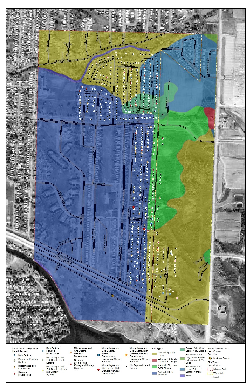 Figure 7. Map of the Love Canal study area with the various soil types present. Soils data courtesy of . NRCS. Figure 7. Map of the Love Canal study area with the various soil types present. Soils data courtesy of . NRCS.Table 2. This table represents the health issues reported in the Love Canal study area, and the soil types associated with the properties.
Table 3. Properties of the various soil types in the Love Canal study area.
Table 4. Distances of homes from various features in the Love Canal study area.
| |||||||||||||||||||||||||||||||||||||||||||||||||||||||||||||||||||||||||||||||||||||||||||||||||||||||||||||||||||||||||||||||||||||||||||||||||||||||||||||||||||||||||||||||||||||||||||||||||||||||||||||||||||||||||||||||||||||||||||||||||||||||||||||||||||||||||||||||||||||||||||||||||||||||||||||||||||||||||||||||||||||||||||||||||||||||||||||||||||||||||||||||||||||||||||||||||||||||||||||||||||||||||||||||||||||||||||||||||||||||||||||||||||||||||||||||||||||||||||||||||||||||||||||||||||||||||||||
|
Analysis When looking at the above data, there are multiple variables to take into account for the lack of trends that were discovered. It’s possible that the previous construction activities, groundwater movements, or soil or bedrock conditions may have come into play in how the contaminants spread; or maybe the vegetation at the time was an aid to removing the toxins from the land in certain parts. It’s also important to keep in mind that in the years since Love Canal was first evacuated, the landscape has seen a lot of changes with the removal of homes, remediation efforts, and the rebuilding of homes, so unfortunately, the resources collected are not 100% accurate, though together they can still tell a piece of the story. Also, the health studies conducted by CHEJ did not include all of the residents of the Love Canal neighborhood. Approximately 25% of the remaining households in the study area did not participate (CHEJ, 2009), and those that evacuated prior to this study and families in the surrounding neighborhoods were not interviewed, leaving potential gaps in the dataset.The difficulties with this report were varied, from being able to find complete datasets and aerial photos, to being able to get datasets that correlated to the years of interest. USGS EarthExplorer was able to provide some aerial imagery, but none of it ended up being used for this project. What ended up being most useful was New York state’s GIS web resources, which require more than a little bit of persistence to navigate. Between this resource and the SUNY Buffalo historical aerial imagery archives, I was able to find more than enough data, though in some cases, the best stuff I located (like high-quality imagery from 1978 or aerial imagery from 1928) did not cover the entire neighborhood. I was able to use these to some degree for my work, but not quite to the level I would have liked. The state website had non-georeferenced images that required you to use TWO shapefiles to find the appropriate photo to use, and that took a little be of work to figure out. The first shapefile you needed was a polygon layer, and this directed you to the appropriate series. Related to that, was a point file layer that had approximate locations for the part of the shoreline where the photo was taken, and you then used the identifiers in the general vicinity of where you were looking for imagery to then locate the photos you needed. While the polygon made it appear as if the entire area of interest received coverage, once you located the photo and started figuring out where it fell on the landscape, you soon realized it was only a portion of what you needed. Georeferencing some of the historical imagery was a little challenging, but all in all I think it worked out really well for my purposes, and I was pleased I was able to find as much as I did. The health maps from the CHEJ publication were their own whole unique challenge, since they were only hand-drawn maps, not entirely to scale, and designed to protect the project participants. I stressed a little when I initially took on the project of georeferencing and assigning attributes to the point layers, but I began to get the hang of it soon enough. In some cases, the way the dots were clustered it was hard to discern whether the houses were across the street from each other or next door, but I made my best judgments and compared the final layer and its locations to the four health maps, and was pretty happy with the overall results. I reminded myself throughout the process that this was more about conveying the Love Canal tragedy, and getting the point of the health problems it caused, not an exact replica of the original data, as nice as that would have been. | |||||||||||||||||||||||||||||||||||||||||||||||||||||||||||||||||||||||||||||||||||||||||||||||||||||||||||||||||||||||||||||||||||||||||||||||||||||||||||||||||||||||||||||||||||||||||||||||||||||||||||||||||||||||||||||||||||||||||||||||||||||||||||||||||||||||||||||||||||||||||||||||||||||||||||||||||||||||||||||||||||||||||||||||||||||||||||||||||||||||||||||||||||||||||||||||||||||||||||||||||||||||||||||||||||||||||||||||||||||||||||||||||||||||||||||||||||||||||||||||||||||||||||||||||||||||||||||
|
Conclusions The Love Canal tragedy is unfortunately only a single example of the potential dangers that have been buried by our past practices. As these locations emerge, it is our best hope to learn from these mistakes, and to be able to come up with better solutions to our waste disposal needs in the future. With the use of GIS, we can potentially predict areas that might be in need of remediation, or, those that may provide better conditions for disposing of these materials. Matejicek (2006) found practical applications for using water pollution modelling and connecting these to a GIS for analysis and display of seasonal variabilities at a site, which could be used to help determine the best time of year to remediate an area, or to see if there are times of year where the conditions might be more hazardous to human health. Matejicek also pointed out in this research that humans are so much a part of the environment, that it is important to look at these interactions at a small scale (such as the Love Canal Neighborhood), and at shorter time intervals in developed areas for proper analysis to take place. Zhang (2008) also felt that in the case of water pollution, it is important to include both a temporal and spatial scale, and that GIS could be an important analysis tool to assist in emergency response situations. Using a combination of system dynamics modeling and GIS, this work demonstrated the amount of time it would take a pollutant to travel the length of a river segment, and the amount of pollutant at the predicted location. In situations similar to Love Canal, this model could be applied to determine the potential range of contamination, and provide officials with not only the area that should be tested, but the potential extent of where health studies should be conducted as well. In terms of this project in particular, I think that these methods could be very useful for learning more about health issues in an area that seem to be related, if enough data can be collected and full analyses are conducted. Anecdotal information, historical imagery, land practices, and elevation, as examples, can be pieced together to help paint a picture of where something in the landscape might have potentially gone wrong and affected the community, while more thorough statistical analyses can be performed with data collected from wells, health reports, and soil studies in an area. Values like median and mode could be added to the above tables to provide more detail, and the data could be converted to raster format so that calculations can be done and a final weighted layer could be looked at to determine any potential trends that might exist in the distribution of illnesses. If further analysis were to be done on this area, it would be incredibly useful to have documentation of any health issues experienced by those that were evacuated first, and potentially to have conducted health studies of residents within a few blocks of the Love Canal neighborhood, and if any trends were observed, to canvas out a few more blocks, and then follow up with all individuals surveyed every few years to see if they experience any new conditions. If this type of research is to be conducted on future sights, planning of this level should be considered. | |||||||||||||||||||||||||||||||||||||||||||||||||||||||||||||||||||||||||||||||||||||||||||||||||||||||||||||||||||||||||||||||||||||||||||||||||||||||||||||||||||||||||||||||||||||||||||||||||||||||||||||||||||||||||||||||||||||||||||||||||||||||||||||||||||||||||||||||||||||||||||||||||||||||||||||||||||||||||||||||||||||||||||||||||||||||||||||||||||||||||||||||||||||||||||||||||||||||||||||||||||||||||||||||||||||||||||||||||||||||||||||||||||||||||||||||||||||||||||||||||||||||||||||||||||||||||||||
|
References
Beck, Eckardt C. 1979. The Love Canal Tragedy. https://archive.epa.gov/epa/aboutepa/love-canal-tragedy.html; accessed 2019.10.01 Center for Health, Environment & Justice (CHEJ). 2009. Love Canal FactPack - P001. http://chej.org/wp-content/uploads/Love-Canal-Factpack-PUB-001.pdf; accessed 2019.10.30 Dabkowski, Colin. 2018. A history of the Love Canal disaster, 1893 to 1998. https://buffalonews.com/2018/08/04/a-history-of-the-love-canal-disaster-1893-to-1998/; accessed 2019.10.01 Davis, J. (n.d.). Reading SSURGO Soils Data. San Francisco State University: http://online.sfsu.edu/jerry/geog317/Reading%20and%20Mapping%20SSURGO%20Data.pdf; accessed 2019. 11.01 Engelhaupt, Erika. 2008. Happy Birthday, Love Canal. Environmental Science and Technology – Perspective, 42(22):8179-8186. https://pubs.acs.org/doi/abs/10.1021/es802376z; accessed 2019.09.30 New York State Department of Environmental Conservation. 2003. Bergholtz Creek and Tribs (0101-0004). https://www.dec.ny.gov/data/WQP/PWL/0101-0004.pdf; accessed 2019.11.04 New York State Department of Environmental Conservation. 2010. Cayuga Creek and Minor Tribs (0101-0001). https://www.dec.ny.gov/data/WQP/PWL/0101-0001.pdf; accessed 2019.11.04 Matejicek, L. 2006. Modelling of Water Pollution in Urban Areas with GIS and Multivariate Statistical Methods. 3rd International Congress on Environmental Modelling and Software, Burlington, VT, USA. https://scholarsarchive.byu.edu/iemssconference/2006/all/71; accessed 2019.10.09 Soil Survey Staff, Natural Resources Conservation Service, United States Department of Agriculture. Web Soil Survey. https://websoilsurvey.sc.egov.usda.gov/; accessed 2019.11.27 United States Environmental Protection Agency. 2008. Five-Year Review Report: Love Canal Superfund Site, City of Niagara Falls, Niagara County, New York. https://semspub.epa.gov/work/02/103042.pdf; accessed 2019.09.30 Zhang, Bo. 2008. A Study of GIS-SD Based Temporal-Spatial Modeling of Water Quality in Water Pollution Accidents. The International Archives of the Photogrammetry, Remote Sensing, and Spatial Information Sciences: Volume XXXVII, Part B2, Beijing. https://pdfs.semanticscholar.org/1c43/56e8af80a8551b3709af5d281175057bf626.pdf; accessed 2019.10.0 Many thanks to M. Immel for proofing this document for me. It's always good to have a second set of eyes. :-) | |||||||||||||||||||||||||||||||||||||||||||||||||||||||||||||||||||||||||||||||||||||||||||||||||||||||||||||||||||||||||||||||||||||||||||||||||||||||||||||||||||||||||||||||||||||||||||||||||||||||||||||||||||||||||||||||||||||||||||||||||||||||||||||||||||||||||||||||||||||||||||||||||||||||||||||||||||||||||||||||||||||||||||||||||||||||||||||||||||||||||||||||||||||||||||||||||||||||||||||||||||||||||||||||||||||||||||||||||||||||||||||||||||||||||||||||||||||||||||||||||||||||||||||||||||||||||||||