American River College, Geography 350: Data Acquisition in GIS; Fall 2020
Austin Demshar, abdemshar@gmail.com
Abstract
This project aims to examine the recently approved Sacramento Regional Transit (SacRT) light rail improvements for the Gold Line against some basic demographic measures. In part, it also aims to enlighten any average rail user or person who is unfamiliar with the system and current projects for improvement. Demographic measures include population, median age, median household income, median per capita income and median house value. The outcome of this project is to examine some basic variables surrounding light rail stations in the Sacramento region to possibly gain a better understanding of the people who live within short distance of the terminals. Data was obtained from multiple transportation resources, U.S. Census Bureau and esri demographics. Queries and spatial joins were used in order to produce the exact datasets for the project. Results seems to show that there are some trends for age and income, however that across the line as a whole, there is no significance. The paper does not intend to provide a rigorous statistical analysis or demonstrate shortcomings of the light rail.
Introduction
This project was established to explore the Sacramento Regional Transit (SacRT) system’s Gold Line rail stations against some demographic variables related to the stations. There is a focus on the Gold Line because of recent funding for development and implementation of the “Light Rail Modernization Project”, most of which relates for the time being, to the Gold Line. Demographics examined include: population, median age, median household income, median per capita income and median home value. These demographics don’t necessarily relate to any specific study being carried out by any agency related to the SacRT project, but is rather a casual look at some general common statistics around the improvement of a public transit system. Though, there is some research in the area of urban transportation that will be briefly discussed. The outcome of the project is not highly statistical or inferential, but quite possibly a precursor to some other studies surrounding SacRT light rail usage and overall availability to the community.
The basic approach of this project is to gather transportation data and census demographic data, and compile the information into styled layers within multiple maps for examination. The data were fairly easy to work with, but multiple geoprocessing routines were needed in order to synthesize a product for this purpose. Most datasets were at the national level. Once the data layers were processed, symbolization, styling and labelling allowed for display of the multiple variables surrounding demographics.
Background
This project didn’t have any specific research precursors. Rather, there were a number of publications from SacRT as well as project documents that helped detail what was in development for the project. This is not to say the SacRT organization has not done due diligence prior to this, but it appears not publicly available.
The basic idea is that the SacRT is creating improvements to the Gold Line, which include, but are not limited to, increasing track capacity at two rail locations to increase train frequency, implementing low floor cars for broader accessibility and fitting stations with low floor car compatible terminals (SacRT, 2020). These improvements are collectively part of a greater project known as “Light Rail Modernization Project.” The state’s California State Transportation Agency recently approved two grants via the Transit and Intercity Rail Capital Program for the improvements (SacRT, 2020).
More specifically, the Gold Line running from the Sunrise area up to Folsom will be granted additional track to allow for 15-minute trains rather than the existing 30-minute intervals. While this only affects the eastern portion of the track from Hazel Ave. to Historic Folsom, the low floor cars and improved stations is broader, affecting the entire line. The new cars will increase accessibility for passengers, create less wait time and lower greenhouse emissions. Current rail cars are quickly reaching their 30-year lifetime. The overall project seeks to increase accessibility to passengers, decongest the traffic on the highway 50 corridor as well as decrease maintenance costs associated with an aging transit system (SacRT, 2020).
Aside from these publications, general transportation research seems to indicate that populations living within close proximity to rail stations tend to be younger, more educated and have higher average incomes, which creates a disparity in access (McKenzie, 2015). There is a growing body of research around the social aspects of regional transit, and understandably so. Transit should be broadly available, not disproportionately affect certain populations. On the other hand, some research has indicated that income inequality is not a factor in rail access (article relates to Portland, OR.) (Oh, S., Wang, X., 2018). Future research in this growing area of urban transportation will certainly be useful to determine the nature of these concerns.
Methods
The transportation data obtained needed to be queried down to the local rail lines and stations. This was performed through either definition queries on the feature classes or thru manual selection. In the case of the IPCD terminals feature class, I had to manually select stations based off of the SacRT transit map, due to the multiple stations existing in the downtown Sacramento area. The rails I was able to query based on location. These feature class layers were stylized in a simple fashion to make them easily stand out on the map, with the knowledge that other layers and symbology would be presented (see below maps for legends).
The demographic data also needed to be queried down to the Sacramento area due to the national nature of the datasets. The esri demographics were queried to Sacramento county. This data is a 2018 estimate, and is not U.S. Census data. Due to the information provided in the dataset, the lowest census denominator was at the block group level. This data included the income, age and housing information. The population statistics were from 2010 census data, at the block level. This was gathered through the census data website, but was not put together for my purpose. The data they provide is in the form of shapefiles which contain the polygons for the U.S. Census levels, to which one needs to go to the census tables data engine and sift through to get specific data. I was able to obtain just population as a table and after performing some Excel functions, append the population data to the polygon feature class. This was used for a more accurate population around the terminals, as it is block level.
Once the transportation and demographics information were prepared, I performed spatial joins to aggregate various demographic measures to the terminals. All spatial joins were performed with 1 mile “within a distance” parameters, as this seemed an appropriate measure for gathering who was within reasonable short distance from the terminals. The join layers include all of the above mentioned demographics, which include: population, median age, median household income, median per capita income and median home value.
Additional base layers for Sacramento county boundary and city boundaries were included for reference. Symbology was toned lightly to illustrate where the Gold Line transits.
Data sources: Rail terminals: Intermodal Passenger Connectivity Database, Bureau of Transportation Statistics
Rail lines: North American Rail Network, National Transportation Atlas Database
Population: polygon files, demographic tables, U.S. Census Bureau
Age and income: Popular Demographics in the U.S., esri, U.S. Census Bureau
Results
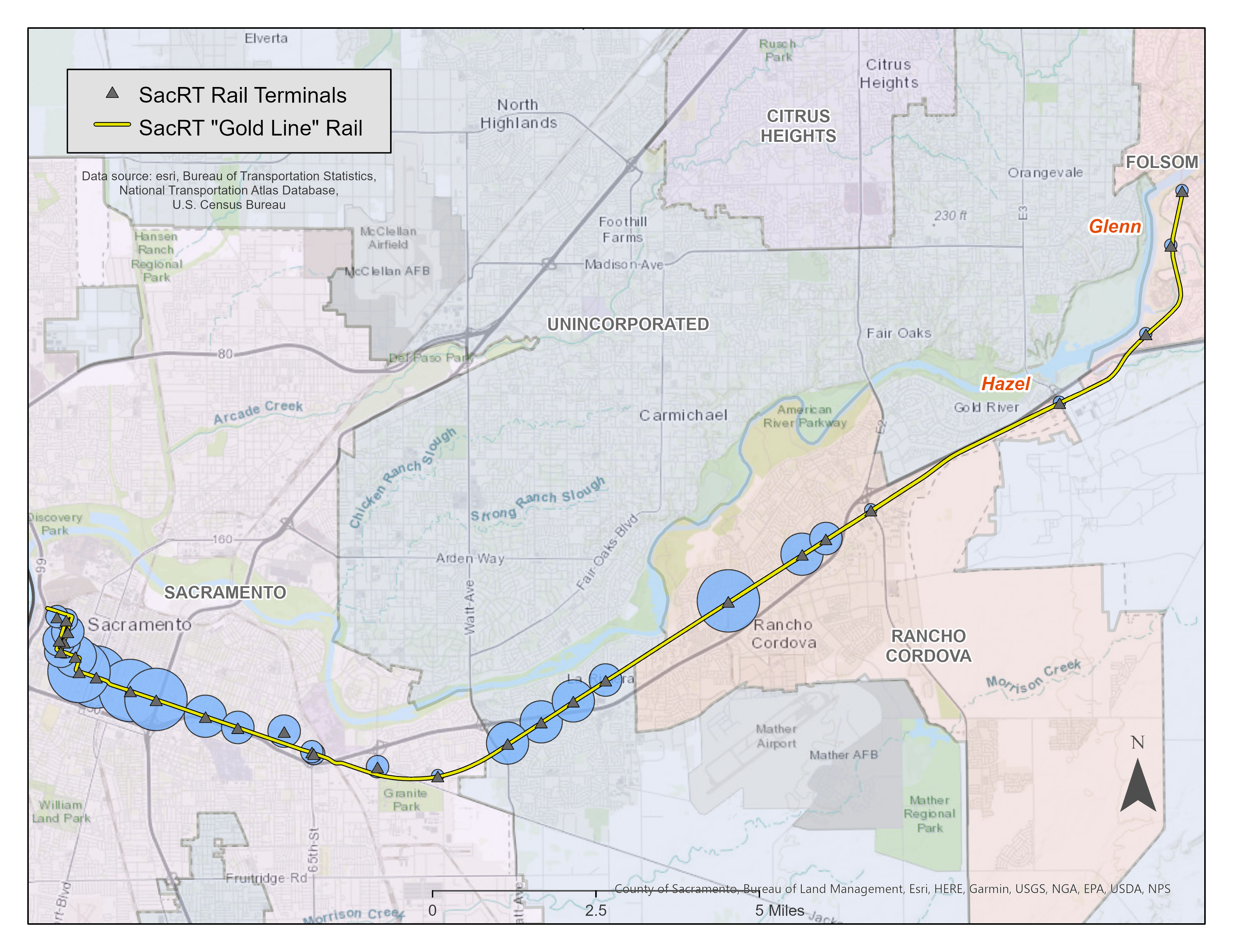
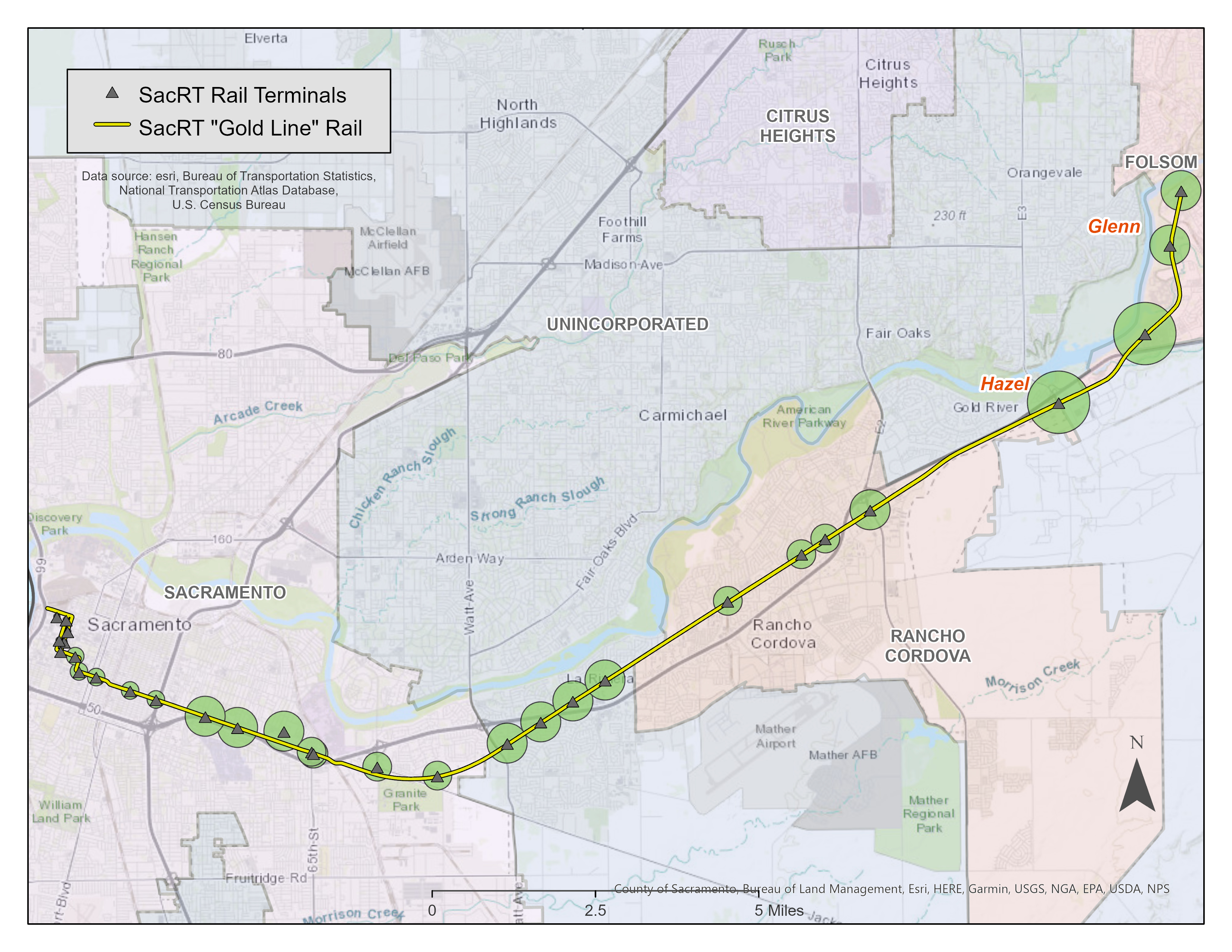
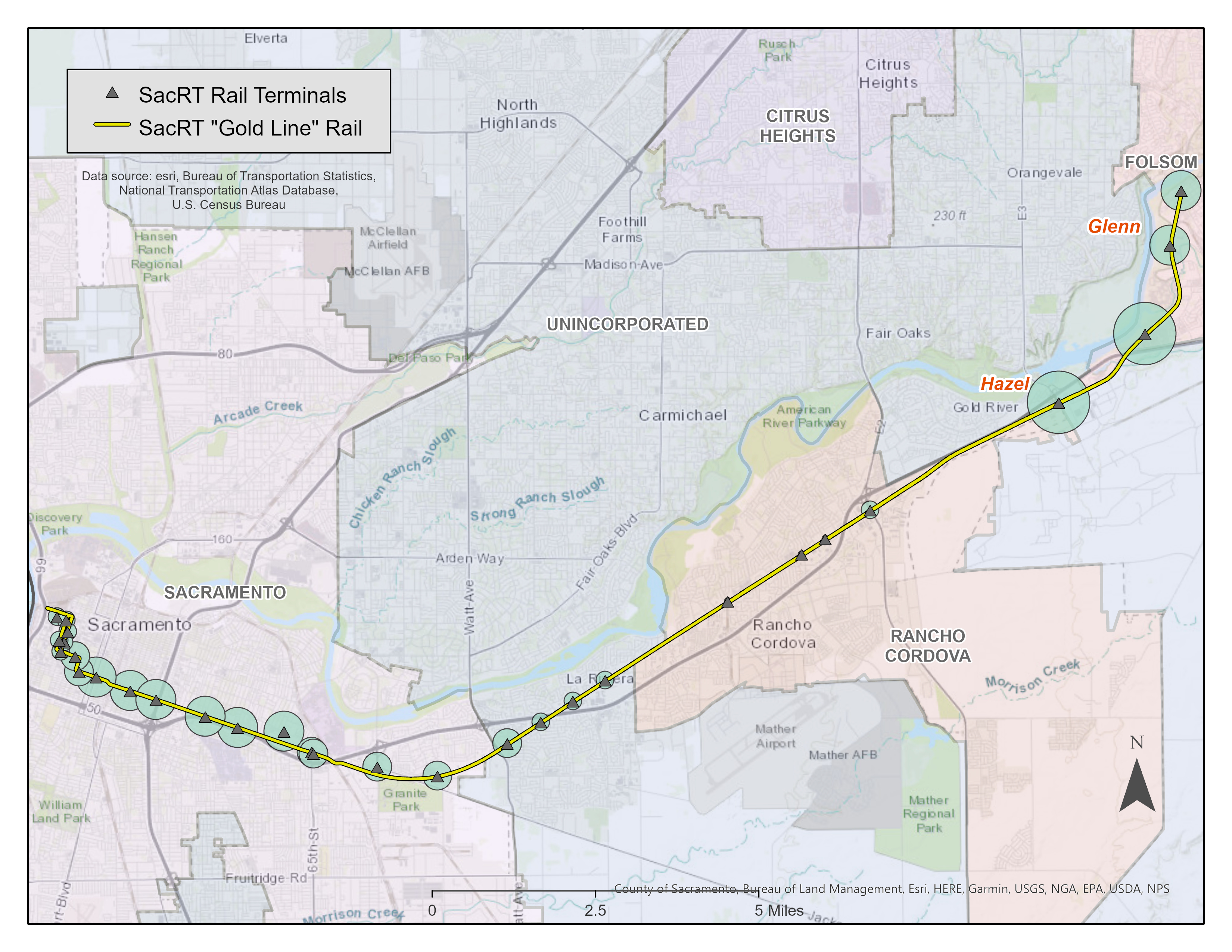
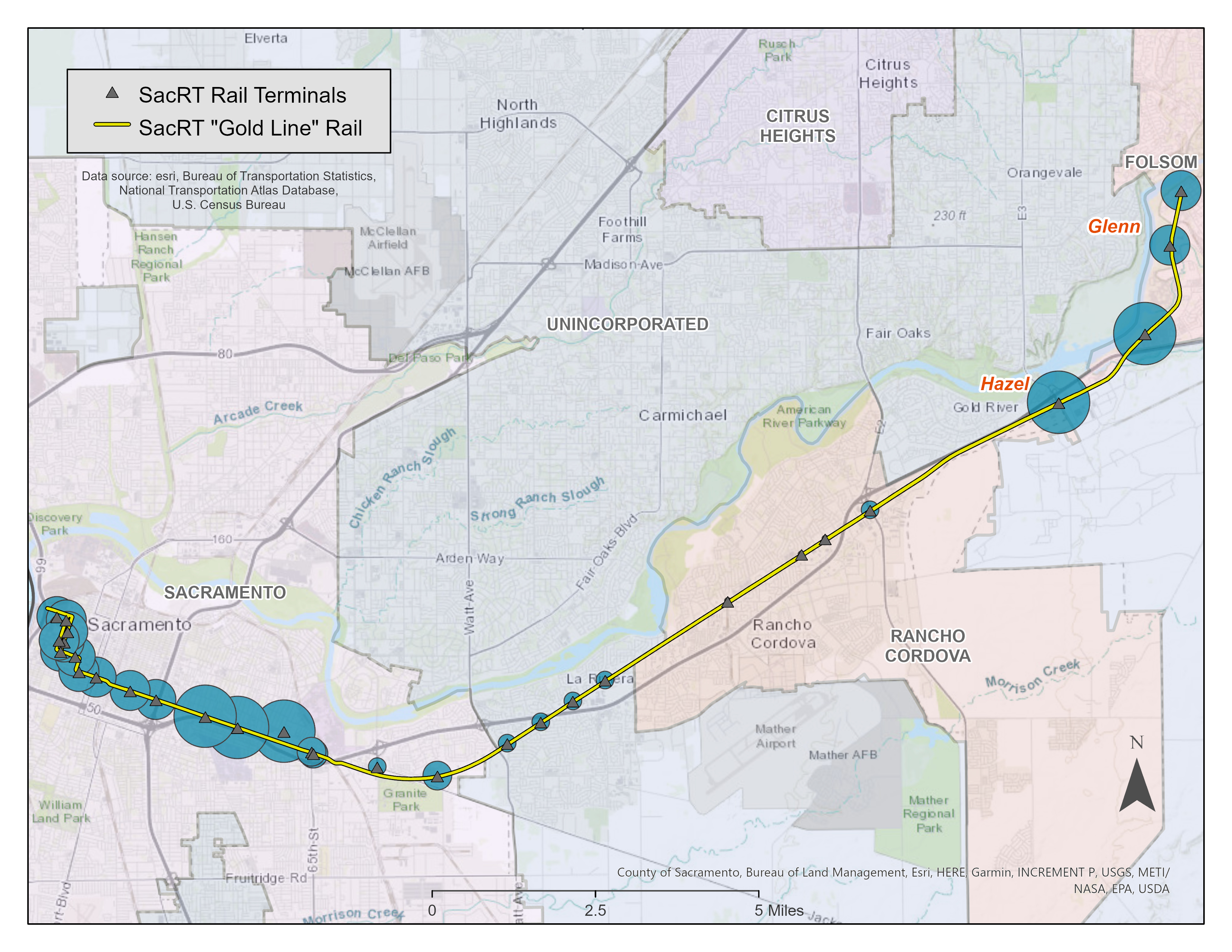
The following series of maps will illustrate the terminals along the rail line and the associated demographic measures of population, median age, median household income, median per capita income, and median home value. The graduated symbols can be taken to understand relative population and income amounts, rather than a display of actual values (the legends do not include symbol value ranges.) Also note, the Hazel and Glenn stations have been called out as these are the two stations where the second "passing tracks" are being added to increase train efficiency.
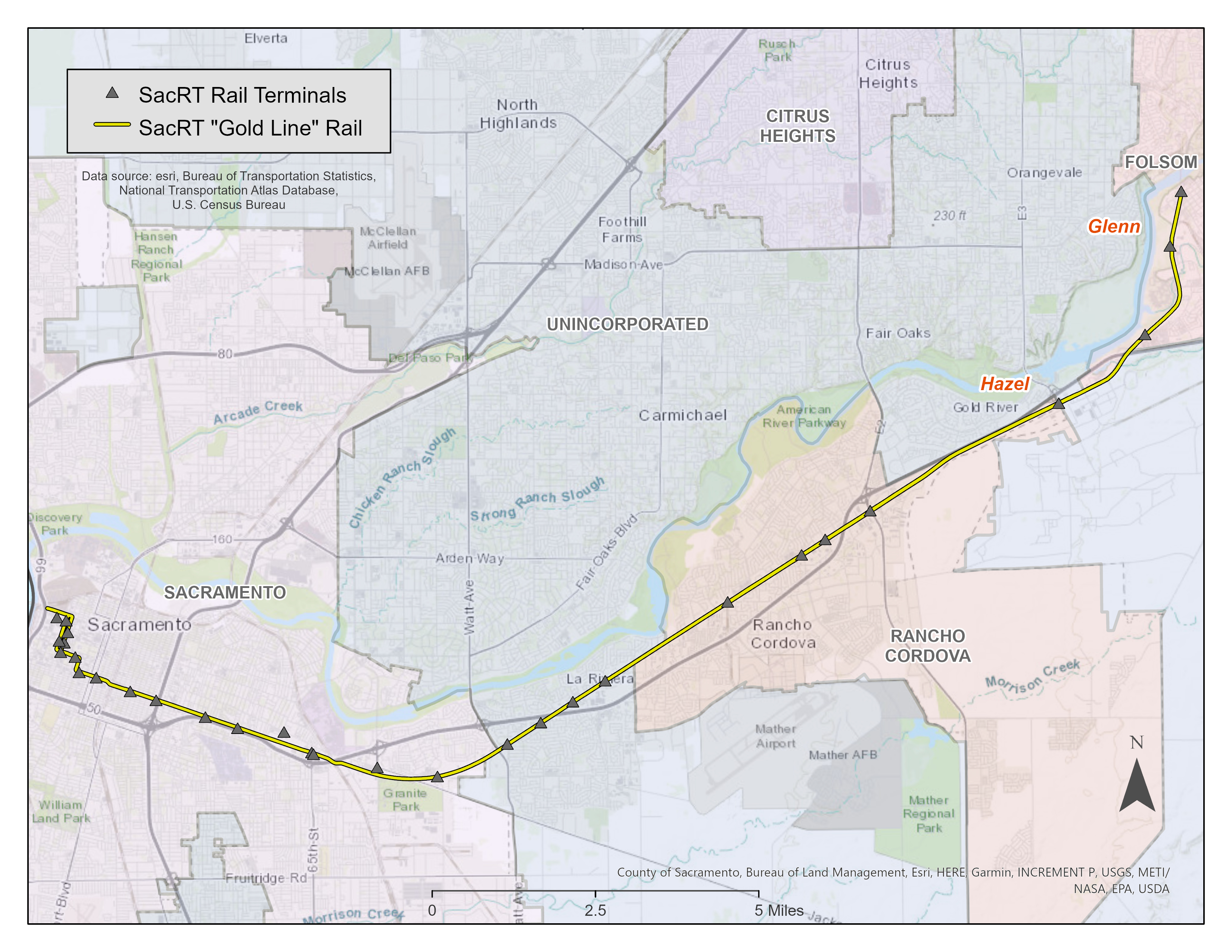
Map A: base map of SacRT Gold Line and associated terminals
The following map presents the base layer of the IPCD terminals along the Gold Line as well as the rail itself. The map excludes other regional transit lines and rail stations, and emphasizes the cities and unincorporated areas the current line runs traverses.
Map B: population
This map illustrates the population count at each terminal, within a radius of 1 mile. The population data for this is set at the block level, so this is a fairly accurate representation of the 2010 population in the area. Notice the lower population around the improved Hazel and Glenn terminals. Additionally, notice the population around terminals in Rancho Cordova.
Map C: median age
This map illustrates the median age of the population surrounding each terminal, within a radius of 1 mile. The data is at the block group level, so the distance from the terminal may vary depending on the block group size if part of the block was within 1 mile. The median age appears to trend up heading eastbound on the line.
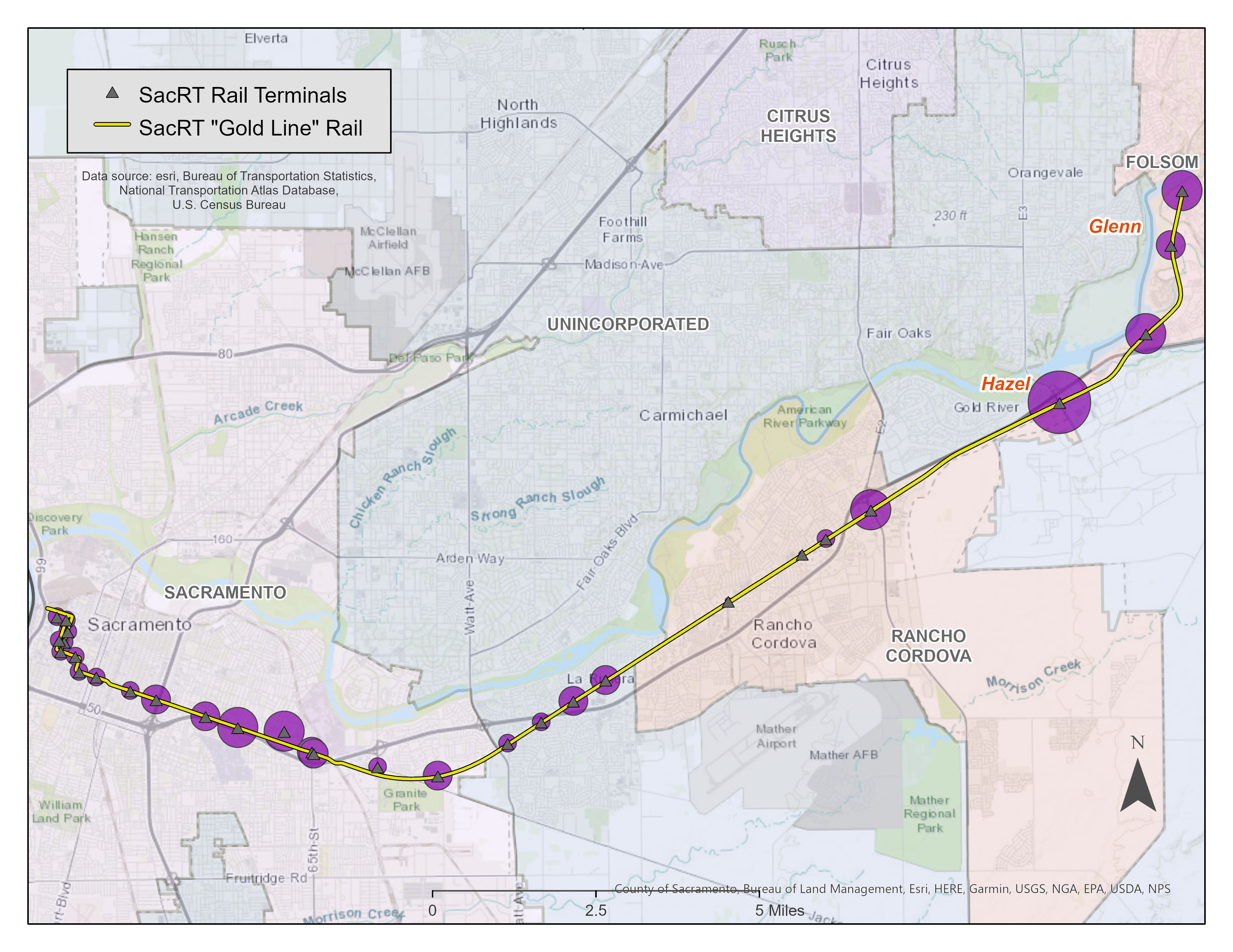
Map D: median household income
This map illustrates the median household income surrounding each terminal, within a radius of 1 mile. The data is at the block group level, so the distance from the terminal may vary depending on the block group size if part of the block was within 1 mile. The median household income appears to trend up heading eastbound on the line.
Map E: median per capita income
This map illustrates the median per capita income surrounding each terminal, within a radius of 1 mile. The data is at the block group level, so the distance from the terminal may vary depending on the block group size if part of the block was within 1 mile. The median per capita income appears to trend up heading eastbound on the line.
Map F: median home value
This map illustrates the median home value surrounding each terminal, within a radius of 1 mile. The data is at the block group level, so the distance from the terminal may vary depending on the block group size if part of the block was within 1 mile. The median home value appears to be somewhat balanced on either end of the line, but does appear thinned out in the central area.
Analysis
The study is fairly straightforward, with a look at some simple demographics against the rail stations. As mentioned, it doesn’t really allow for any type of statistical inference, rather just a quick look at local population and income information for one section of the SacRT rail line.
As a caveat to the below analysis, this is highly speculative without actual research over the entire Sacramento region, and without data that details the remainder of the SacRT light rail line. These statistical maps are merely a representation of the available demographic data. Any real conclusions about the location of the rails and who the rail improvements benefit would need to be much wider in scope and much more well researched. This project is really a display of spatial data for data acquisition and educational purposes.
One of the takeaways from this series of maps is that it appears the higher incomes are slightly skewed towards the eastern end on the line, towards Folsom, where the rail track improvements are occurring. Of course, there is nothing that can be satisfactorily pulled form this data. After reading some of the literature on the line improvement project, this was a targeted area for track volume increase because it was one of the few areas that only had one track going from Hazel to the end of the line in Folsom. So, improvements here would seem to be independent of any income disparity, but rather to just match the track up to the other areas of the system.
Another item of note is that when looking at all income and home value measures, there is no apparent skewedness of where the rails lie. In other words, it traverses both higher and lower income areas. And, looking the improvement plan, the entirety of the Gold Line will benefit from improved low floor stations and the newly purchased highly accessible low-floor cars being implemented.
Conclusion
As caveated above, further research and industry data would be needed to draw any conclusions that would have an impact on potential future development. However, spatial representation like the above can help citizens, employers, governments and other officials understand the use of the local infrastructure and who it impacts. Who has access to trains and buses? Is it reasonably located and does it really help the people who need access to these types of services? Is it efficient? The question of efficiency can be answered at this point. It appears the improvement project by SacRT is going to dramatically increase not only the accessibility to trains, but all improvements will help to speed up train frequency. And, this current project is only part of a longer-term project to make the lines serve people better.
Part of the goal of this project was to enlighten any average rail user or person who is unfamiliar with the system and current projects for improvement. My hope is that this quick look at the publications of the regional transit has informed some. Additionally, the maps I’ve used may help some people get a better sense of where the rail line travels, which communities it affects and possibly use the train to see how improvements feel. I’ve created this project with the hope that I can make some determination of how the line operates and feels at this point in time, and a few years down the line see where it has gone. There is no doubt however that once these improvements have occurred, it will feel like the region has moved ever so slightly in the direction of a larger metropolitan city.
References
Sacramento Regional Transit: Light Rail Modernization Project Note: other project documents included within article https://www.sacrt.com/apps/modernization/ accessed 12.09.2020
McKenzie, Brian, 2015. Transit Access and Population Change: The Demographic Profiles of Rail- Accessible Neighborhoods in the Washington, DC Area, 1-5. Social, Economic, and Housing Statistics Division, U.S. Census Bureau. https://www.census.gov/content/dam/Census/library/working-papers/2015/demo/SEHSD-WP2015-23.pdf
Oh, S., Wang, X. Urban Rail Transit Provides the Necessary Access to a Metropolitan Area: A Case Study of Portland, Oregon, USA. Urban Rail Transit 4, 234–248 (2018). https://doi.org/10.1007/s40864-018-0095-3