Abstract
The distribution of limited supplies of coronavirus disease 2019 (COVID-19) vaccines must be prioritized among groups of people with different vulnerabilities to the disease. For California, the area of interest, a simple tiered ranking of counties in terms of priority need is calculated as an average of each county’s rankings from 1 to 10 along three dimensions: current COVID-19 infections, hospital capacity, and demographic risk profile. All county health and demographic data were obtained from Esri’s Living Atlas. The county most in need of vaccination is Riverside County, followed by Kern, Los Angeles, Merced, and San Bernardino Counties.
Introduction
Because the supply of COVID-19 vaccine in the United States is expected to be limited at first, supplies of the vaccine must be allocated on a priority basis. State governors have final say over how the vaccine will be distributed in their states, and their decisions will be informed by different factors, including which sectors of the population are at most risk of death or serious complications from getting sick.[1] Other factors to be considered might be unrelated to public health; for example, vaccinating teachers could make schools safer, which would free up many parents to return to work. Prioritizing the entire state population is beyond the scope of this project, but a simple geographic perspective could be interesting. Looking at California, which counties should be prioritized for more or fewer vaccine doses? A straightforward solution is to rank in tiers all 58 counties in terms of vulnerability to increased COVID-19 infections. The most vulnerable counties should be prioritized.
Background
The COVID-19 pandemic and lockdown policies have disrupted society around the world. The United States has suffered the most infections and deaths of all nations, and California has suffered the most of all American states. As of December 19, 2020, California has 1,854,456 cases with 22,593 fatalities.[2]
Vaccines to prevent further COVID-19 infection are perhaps the best hope for ending the pandemic. Three vaccines (from AstraZeneca, Moderna, and Pfizer) have recently become available in Europe and America, but are in limited supply. They could be developed quickly because of new techniques with mRNA and adenovirus vectors, but they also require two doses for effective treatment.[3] The number of vaccine doses reported in the news should really be divided in two to arrive at the number of people that can be vaccinated.
The Advisory Committee on Immunization Practices has recommended that initial vaccinations should be allocated to frontline healthcare personnel and long-term care facility residents.[4] As the vaccine supply is expanded over time, most of the adult population can be vaccinated by June 2021. (As current vaccines have not been tested on children, pregnant women and children under 16 should not be vaccinated yet as the side effects are unknown.[5]) Of the general population, research suggests that different people are at different risks of getting serious symptoms from COVID-19.[6] Some groups are vulnerable because they are in frequent contact with other people: healthcare personnel and essential workers. Other groups are at risk because inherent physical or social conditions, such as age, race, underlying illnesses or activities, and housing or homelessness problems. See Figure 1.
Methods
Critical populations should have priority in getting vaccinated. Geographically, counties can be ranked in terms of need for vaccinations by ranking the relative vulnerabilities of their populations, that is, the sizes of their critical populations and their capacities to care for them. All relevant county health and demographic data are obtained from Esri's Living Atlas in ArcGIS Online and downloaded to ArcGIS Pro for analysis. The attribute tables of all feature layers (described below) were joined into single feature layer, keyed on counties. Numerical data for each representative attribute field were ranked from 1-10, and then all the attribute rankings were averaged (without weighting any single ranking) to arrive at final county priority rankings. The three attributes are:
- Current COVID-19 cases (more cases = more likely infections)
- Hospital capacity (fewer staffed hospital beds = less ability to handle infections)
- Demographic risk factors (vulnerable populations = more likely serious infections)
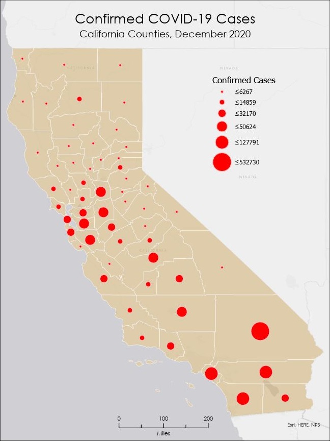
The first category is the individual county COVID-19 caseloads. If a county has a high number of cases, then it is reasonable to project that the county has a greater likelihood to see more infections and thus has a greater need to vaccinate its population. Coronavirus infections and mortalities are collected and confirmed by county public health departments. County case data was downloaded on December 14, 2020.[7] See Figure 2. Higher caseloads are assigned larger rank numbers.
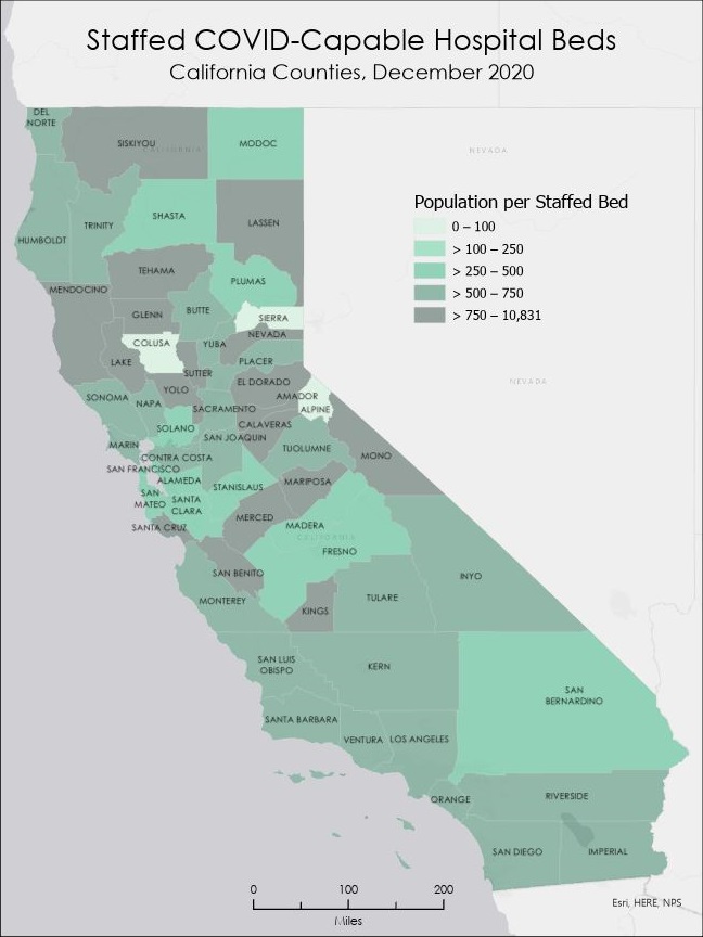
The second category is county hospital capacity. The total number of hospital beds in each county proxies as a measure of the ability of that county to treat a local epidemic. The fewer beds that a county has, then the greater need for the county population to get vaccinated. Intensive care unit beds are required to treat patients with the worst COVID symptoms, therefore some hospitals without ICU departments, such as psychiatric hospitals, are excluded. The hospital personnel to staff each bed is what really matters, so the actual measure used is the county population per each staffed bed available.[8] Larger population per staffed bed means the hospital gets more "crowded", so a larger measure (lower hospital capacity) means a larger rank number (higher vulnerability). See Figure 3.
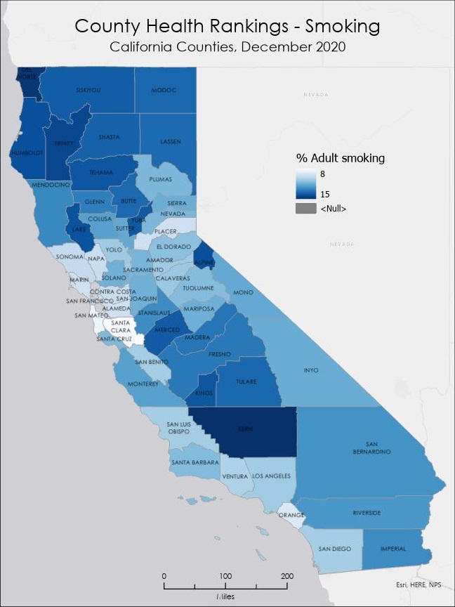
The third category are county demographic risk factors. If a county has more critically vulnerable populations, then the county has a greater need for vaccines. The county demographic vulnerability is the average ranking of six different risk factors that research suggests show greater risk of contracting serious symptoms from COVID-19.[9] One of the risk factors -- the percentage of the adult population that smoke -- is illustrated in Figures 4 to 7. The six county risk factors tracked are:
- Aged 65 and Older (% pop)
- Smokers (% adult pop)
- Obesity (% adult pop)
- Diabetes Prevalence (% pop)
- Non-Hispanic Black (% pop)
- Severe Housing Problems (% households)


Results
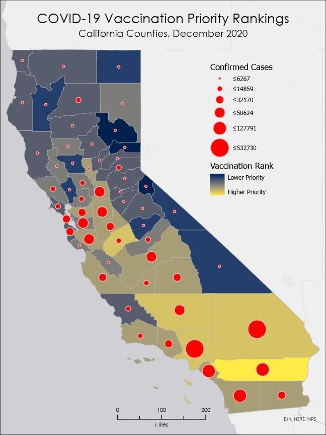
- Highest priority tier
- Riverside
- Second tier
- Los Angeles
- Kern
- Merced
- San Bernardino
- Third tier
- 15 counties
- Fourth tier
- 10 counties
- Fifth tier
- 18 counties
- Sixth tier
- 7 counties
- Lowest priority tier
- Plumas
- Alpine
- Sierra
Analysis
Also, the choice of risk factors might be misleading as some risks are related to each other. For example, African-Americans are at greater risk of diabetes, so checking both Black and Diabetes attributes would be overvaluing those attributes more than others.
Finally, averaging "washes out" extreme values: very high and very low scores cancel each other. A county with ranked 1 in one attribute and 9 in another would have a middling rank. See Figure 9. Initially I used a 1-5 scale, which created final rankings of mostly 3 and 4 with little differentiaton.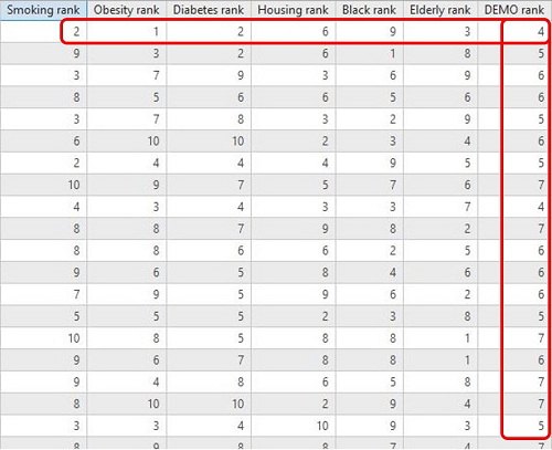
Conclusions
The counties with the highest vaccination priorities are Riverside County, followed by Kern, Los Angeles, Merced, and San Bernardino Counties. While the populous Southern California and Inland Empire counties were expected, the Central Valley counties, with their much lower COVID-19 case totals, were unexpected. One of the risk factors recognized by the Centers for Disease Control for critical populations is from "rural" regions.[1] Being "rural" is a risk factor because of infrastructure (less hospital capacity) and maybe poverty (related to housing problems).
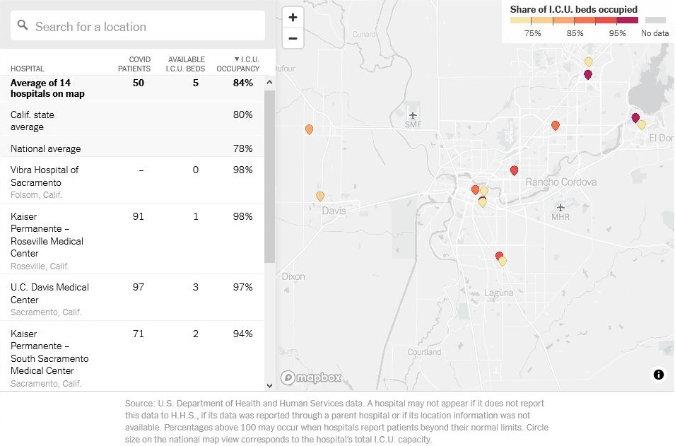
A more realistic analysis using the same ranking framework would exclude the priority groups that would receive the initial vaccines (healthcare personnel and nursing home residents) and rank the remaining "general" population. A more accurate measure of vulnerability would use actual ICU bed occupancy as a measure of hospital capacity, because occupancy would measure how much hospitals could handle more infections and thus the need for vaccinations. As of December 15, 2020, the California state average ICU occupancy is 80%, with many hospitals already at near full capacity -- the regional stay-at-home order triggers at 85% local occupancy.[10] See Figure 10.
References
^ Centers for Disease Control and Prevention. Dec. 13, 2020. “Frequently Asked Questions about Vaccination.” https://www.cdc.gov/coronavirus/2019-ncov/vaccines/faq.html. Accessed Dec. 15, 2020.
^ California Department of Public Health. “COVID-19 by the Numbers.” https://www.cdph.ca.gov/Programs/CID/DCDC/Pages/Immunization/ncov2019.aspx#COVID-19%20by%20the%20Numbers. Accessed Dec. 20, 2020.
^ Maggie Fox. Nov 30, 2020. “Here’s a look at how the different coronavirus vaccines work.” CNN. https://www.cnn.com/2020/11/24/health/covid-vaccines-design-explained/index.html. Accessed Dec. 15, 2020.
^ Advisory Committee on Immunization Practices. Dec 3, 2020. Interim Recommendation for Allocating Initial Supplies of COVID-19 Vaccine — United States, 2020. http://dx.doi.org/10.15585/mmwr.mm6949e1. Accessed Dec. 15, 2020.
^ Chas Danner, Matt Stieb. Dec 15, 2020. "What We Know About the U.S. COVID-19 Vaccine Distribution Plan." New York Magazine. https://nymag.com/intelligencer/2020/12/what-we-know-about-u-s-covid-19-vaccine-distribution-plan.html. Accessed Dec. 15, 2020.
^ California Department of Public Health. Oct 16, 2020. “COVID-19 Vaccination Plan.” https://www.cdph.ca.gov/Programs/CID/DCDC/Pages/COVID-19/COVID-19Vaccine.aspx. Accessed Dec. 15, 2020.
^ Johns Hopkins University Center for Systems Science and Engineering, World Health Organization, Centers for Disease Control and Prevention. Dec. 14, 2020. “COVID-19 Cases US.” Living Atlas. https://services1.arcgis.com/0MSEUqKaxRlEPj5g/arcgis/rest/services/ncov_cases_US/FeatureServer. Accessed Dec. 15, 2020.
^ John Nelson. Mar 30, 2020. “Hospital Beds per County and per capita.” Living Atlas. https://services.arcgis.com/nGt4QxSblgDfeJn9/arcgis/rest/services/HospitalBedsPerCounty/FeatureServer. Accessed Dec. 15, 2020.
^ Esri. Oct 30, 2020. “County Health Rankings.” Living Atlas. https://services.arcgis.com/P3ePLMYs2RVChkJx/arcgis/rest/services/CountyHealthRankings2020_WFL1/FeatureServer. Accessed Dec. 15, 2020.
^ Matthew Conlen, et al. Dec. 15, 2020. “How Full Are Hospital I.C.U.s Near You?” New York Times. https://www.nytimes.com/interactive/2020/us/covid-hospitals-near-you.html. Accessed Dec. 15, 2020.