EMPHASIS ASSIGNMENT
PART ONE
|
|
|
EMPHASIS ASSIGNMENT |
||
PART ONE |
||
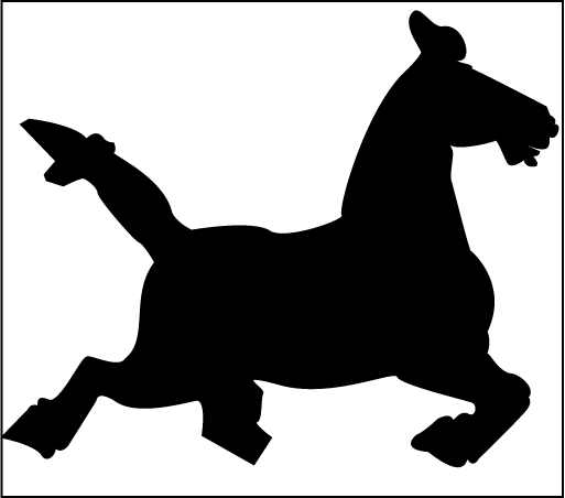
Part One of the Emphasis Assignment begins with a photograph or a drawing of an object that is neither too complex nor too simple, but has some visual variety of shape. This could be a tool, a plant, an animal, or a grouping of several things. You will download the photo (that you have taken yourself) to your desktop or scan the photo or drawing and PLACE the image into Adobe Illlustrator. Read how to do this from the instructions in the TUTORIAL ON EMPHASIS ASSIGNMENT and also the TUTORIAL ON SCANNING. Inside the Tutorial on Emphasis is the required Pen Tool Test. Take this test and upload it to Assignments in Blackboard. The purpose of this project is to introduce you to using the pen tool in Illustrator, as well as to use the design Principle of Emphasis. |
|
|
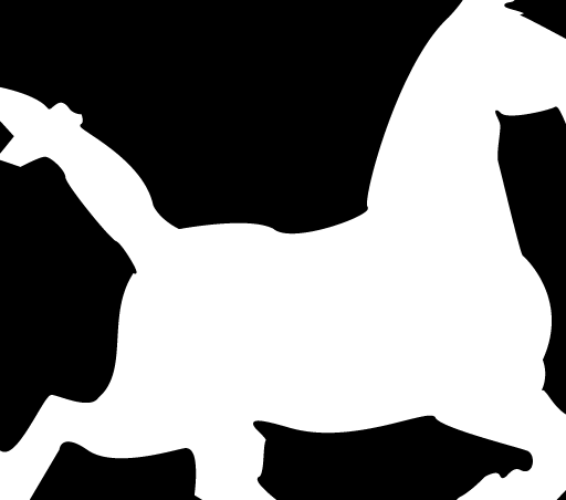
In Figure 2.2, the horse object was increased in scale. The two objects (rectangle and horse) were selected in the pathfinder palette, and divided, using the divide button (the first button in the pathfinders tools). In addition, the white and black shapes were reversed. The horse shape has now become a negative space shape, but its silhouette still ‘reads’ as positive. See the TUTORIAL ON EMPHASIS ASSIGNMENT for instructions on how to do this. It is not a requirement to reverse the positive and negative areas in Part One, only a design decision I made on this example. |
|
|
|
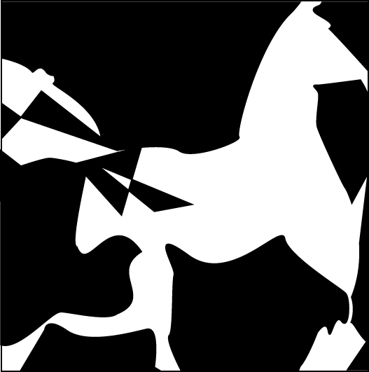
In Figure 2.3, the finished design became an exaggeration of the horse image. Only one shape was duplicated. Several of the black shapes were altered. By changing the picture frame to a square, the negative space and positive shapes were redefined. Figure 2.3 creates emphasis by contrast of shape. The triangles inside the horse shape are in stark geometric contrast to the other ‘organic’ or curvilinear shapes. What other areas attract attention? Part One of the Emphasis Project is mostly concerned with creating a structure through the use of emphasis and one or more of the gestalts. This design uses the gestalt proximity (the group of triangles). The goal was to create a design that uses emphasis, variety and harmony in a balance that promotes unity. The anomalous shape (the triangle) pushes the eye to the hip area. This is the driving engine of the horse. The distorted shapes seek to enhance the muscular curves and grace of the animal, while maintaining its shape identity. |
|
EMPHASIS ASSIGNMENT |
||
PART TWO |
||
Part Two of the Emphasis Assignment, shows an increase in the awareness of the factors that influence emphasis. The goal of this assignment is to show how the use of color can be applied to the exact same design, while creating a whole new area of emphasis, or focal point. Begin with a "save as" of the original emphasis design in Illustrator. Decide on a planned use of color in your composition. You have studied both color harmonies and color contrasts in your text and/or the lecture: www.wheelofcolor.com. As each shape is selected, start with an approximation of the color family that you want to use to fill the shape. You can change or tweak those colors as you build your overall composition. The preferred palette to use is RGB, since we are not printing the finished image. The final version of both parts of the emphasis assignment is a form that begins as a realistic image of some object or group of objects. It develops into abstracted shapes with the simplification of two values (black and white), and with the ultimate color solution. The word Abstract in design or art means that an image or form is derived from that which is real, but is changed from that reality through distortion. This differs from design or art that is Nonobjective, because the source in this type of design is wholely invented. |
|
|
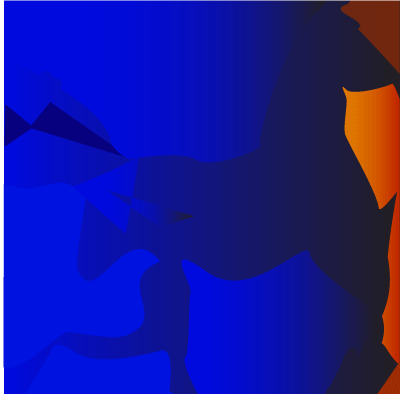
| Some points to remember in this project:
The scanned object in Part One should not be copied too literally. Before you begin, choose the type of emphasis you intend to use: emphasis by contrast; isolation; or placement. Label it accordingly when you upload your work. In the color design, select a color harmony or color contrast you intend to use before you begin your composition. The five color harmonies are: monochromatic, similarity, dyad (complements), triad, and tetrad. The seven color contrasts are: hue, light/dark, saturation, warm/cool, simultaneous contrast, extension, and saturation. Which contrast was I using in figure 2.4? Is there more than one in use? Additionally, the principle of figure/ground can become more of an issue. How was the figure ground relationship affected by my choice of colors? You may use gradients in the filling of shapes in PART TWO. How does the use of color and the change of emphasis affect the content of the work? In my composition, the horse image is partially "fogged" into the space by the blue figure on the blue ground. So the lateral movement of the compositon is softened spatially, but the strong orange presence on the right side visually slams a wall into the equine image. Almost as if the horse is now running into the fire. The two final designs show how abstract shapes can suggest emotion or a visual message. Variety is createdby the use of contrasting types of shapes, large and small, curved and sharp. They also suggest movement to the right and a feeling of tension.
|
||